
Email marketing deep dive with Megan Boshuyzen
Matt Helbig and Mailgun’s Megan Boshuyzen unpack Email Camp, showing how accessibility, live text, and smart CTAs turn event emails into signups.
July 11th, 2025
Adrien Grey shares Sundays for Dogs’ email marketing strategy, highlighting creative copy, mobile-friendly design, and personalized customer experiences.
What makes a great email experience stick with subscribers? It's not just smart design or clever copy. It's thoughtful communication that builds trust, delivers value, and feels genuinely personal.
Enter Sundays for Dogs, a fast-growing DTC pet food brand known for its playful tone, educational content, and customer-first approach. From fun facts in the footer to dynamic modules that adapt to each purchase, their emails are carefully crafted. But how do they use design, copy, and timing to create a seamless and engaging customer journey?
In this Feedback Friday episode, email experts Matt Helbig and Adrien Grey explore Sundays’ email strategy across key moments like Black Friday promotions, transactional touchpoints, and post-purchase onboarding. They share what makes these emails both effective and delightful.
TL;DR:
Watch the full breakdown or read the transcript for actionable tips and inspiration you can apply to your own email strategy.
Matt Helbig: What's up, email geeks? Welcome back to another episode of Feedback Friday. This week, we’re joined by a fantastic guest from Sundays for Dogs. Adrien Grey is behind some of your favorite emails in your inbox. He’s here to break down Sundays for Dogs’ email strategy and give a sneak peek at their upcoming rebrand. All right, please sit back, pet a dog, and let’s get right into this.
Adrien Grey: Hey, everyone, great to be here. I’m Adrien. I’m a creative director, and I’ve been working in email for almost two decades now. I do a lot of other things outside of email and the digital space, creative direction, but email has always, you know, stolen part of my heart. I’m always going to keep working on it.
Matt Helbig: Alright, so we’ve got some emails from Sundays, an amazing pet brand. It’s kind of a DTC brand, bringing some interesting food to people’s dogs. I’m really impressed with all the different touchpoints. It’s a very high-touchpoint type of campaign, so I thought we could walk through some promotional emails, look at some confirmation emails, and maybe some post-purchase emails as well. Sounds good?
Adrien Grey: Amazing. Let’s do it.
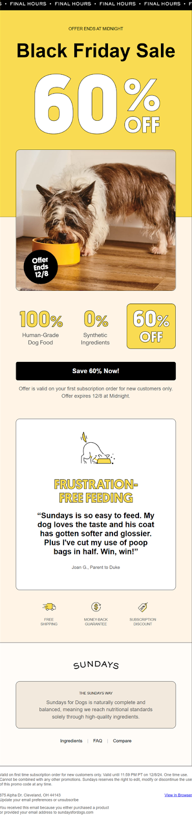
Matt Helbig: Sweet. Alright, this first one is a Black Friday email. We’re seeing this banner, very trendy. We covered this in one of our design trend webinars. It’s a fun way to bring in some last-minute urgency to the design without overwhelming the entire email. Yeah, I like this one. What stood out to you?
Adrien Grey: Yeah, this one’s interesting. With Black Friday, we really wanted to get out of the way of the sale. This is the biggest discount the brand offers all year. Sixty percent off is huge. I think this was the final email in the flow. Probably a handful went out. Black Friday keeps creeping earlier and earlier in November. We wanted to make sure people knew this was the last chance, these were the final hours, and this was the discount.
If you scroll down, we’re highlighting some benefits: one hundred percent human-grade dog food, zero percent synthetics. We’re playing a little with that percentage language. Then, we lean on a quote—always a real customer quote. This one’s great. It hits a lot of the benefits we try to elevate, and helps people know what to expect if they want to join Sundays and start feeding their dogs.
Matt Helbig: Yeah, it’s pretty unique. I like seeing a review or testimonial in a promotional email. It reinforces the message and adds value. Overall, I’m super impressed with this one, good use of live text, nice hover effects on that button. I also like the balance of illustration and product photography. It’s a cool, clean, soft look. I’m a big fan of this one. And I noticed a little callout at the bottom. I’ve seen it in a few different emails, almost like a fun fact.
Adrien Grey: Yeah, we’ve been doing that in pretty much all our footers. Some kind of fun fact to give people a reason to scroll all the way down. It’s like an Easter egg. You never know what’s going to be down there. Sometimes it’s about food, sometimes just a fun dog fact. It’s a little moment of surprise and delight.
Matt Helbig: Very cool. Those small details really add up. When people talk about great emails, that’s what they’re talking about. It’s not just the promo, it’s the details.
Adrien Grey: Exactly. It's the same with the final hours GIF. It doesn’t have to be a GIF, but it adds extra attention. Hover states on the button. Anything we can do to push it further is always the goal.
Matt Helbig: Is there anything you’d change on this one? I know Black Friday can be hectic and marketers are often strapped for time, but anything you’d tweak?
Adrien Grey: I don’t know. This one’s been really successful for us. We did something similar last year. The main difference this time is that we’re playing around with different imagery. As we update the brand, we’re expanding our asset library. We know images with dogs perform really well. We didn’t do that as much last year, so that’s why you’re seeing this little guy here.
Matt Helbig: People love dogs.
Adrien Grey: No surprise there.
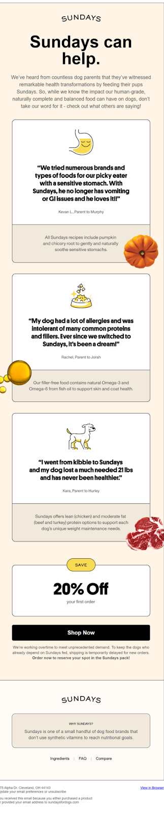
Matt Helbig: Nice. Okay, let’s transition to another type of email. I think this one was sent a while ago. It’s kind of a newsletter, but also a helpful tips email that stood out to me. Can you walk us through this one?
Adrien Grey: Sure. We wanted to explain things from the customer’s point of view, how their dog reacts to the food, and then back that up with reasons why. People say their dogs with allergies are doing better or that their dogs love the taste, but they might not understand why. This email balances the customer perspective with more technical explanations. In the first section, we’re talking about digestive issues and how pumpkin and chicory root in the recipe help. We try to visualize that and make it scannable, because not everyone will read every word. So we make sure they can find what’s relevant quickly.
Matt Helbig: I love that, using illustrations and product photography that align with the message. Not just stock imagery, it really brings everything together. And then I like this section. I think this email is really cool, especially how it talks about different pain points or benefits of the product. Then it wraps up with this 20% offer down at the bottom.
It's really nicely done, and I really like this line that calls out the demand and how people might experience a shipping delay or something similar.
Adrien Grey: So yeah, that was something we put in our emails over the summer. We had so much demand, and it was kind of impacting the customer experience. So we wanted to get ahead of that and make sure we communicated, set expectations from the jump.
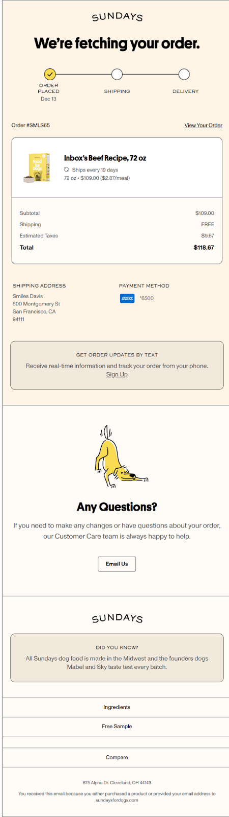
Matt Helbig: Great. Let’s move to some purchase emails. I don’t have a dog, so I named our fictional dog "Inbox," thought that was clever. But yeah, I like the tone here. Confirmation emails are a great opportunity for personalization or added communication, and a lot of brands miss that.
Adrien Grey: I agree, a lot of them are not that interesting to look at. Especially as everyone has kind of trended toward using Shopify, most people just stick with the default templates. They’re not adding any thought, effort, or care to them. But these are some of the most opened emails you send. People care about the information in them.
And it’s a moment where you can say a little bit more. There are some restrictions, like not being able to include marketing-specific messages, but that doesn’t mean you can’t do something extra. So yeah, we take a lot of care with the copy that goes into these. We try to keep everything as short as possible, while still adding a little bit of delight and keeping it as clear as possible.
“Fetching your order” is a prime example of that. We added these checkmarks throughout the entire transactional journey to let people know what they can expect as they go through it, where they stand with their order, and we also included visuals. Another goal here was to give customers a written description of what they should expect and show them what they’ll receive in the mail. Again, it’s all about scannability. If I’m opening this, I want to make sure: Is that price right? If it’s a subscription, is that cadence right? It’s all in there and easy to find.
Matt Helbig: I really liked the layout here. How it has those rounded borders, which again, feel a lot like a receipt. And like you said, small details, like adding this kind of tracker, really help. I think it gives people a sense of trust, like they know you're actually working on their order. And then, again, you’ve got this "email us" option so that if they have any questions, they can easily reach out.
What I like to see in post-purchase or triggered emails is that they make people feel like they made the right decision and get excited about their order. So I think this email does a really good job doing that. Alright, well, here's the next one. Here we have “Your order has shipped.” It includes tracking information with a big CTA right at the top. I really like that. And then again, I think just pulling in some additional information here, you know, letting people know what to do if they have different questions or run into any issues.
Adrien Grey: Yeah, this was an interesting one. The primary goal here is for people to click that button. That’s what they care about, so we put it right at the top. Easy to find. There’s also a little summary of their order. They don’t need all the same receipt details as in the first email, so we condensed that. We know that many customers have questions. So, before they reach out to the CX team, we try to get ahead of it, answer some of those questions, and let them know they have complete control over their subscription. If they need to change the ship date, no problem. If they’re moving, no problem. Everything is available to them.
Matt Helbig: I’m not sure if you did customer interviews, but it feels like you’ve really thought about the process and the end user, and how they would interact with the email. I really like seeing that. So, very nice job with it.
Adrien Grey: Absolutely. The customer is at the forefront of our minds in every single email we create. We have to understand where they are in the journey, what their problems are. If you don’t intimately know what your customer is thinking, then you need to do that work before you even think about email.
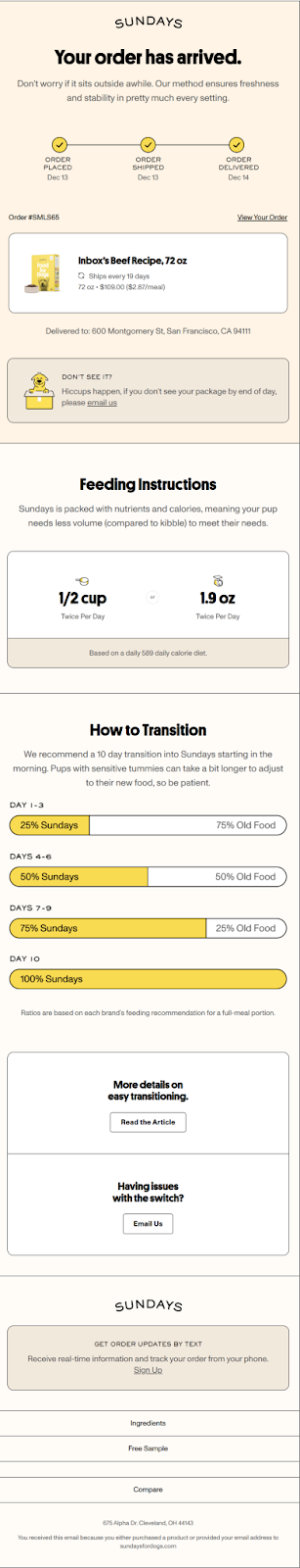
Matt Helbig: Here’s the next one. Your order has arrived. There is some nice little copy here, helping people feel okay about their purchase. Maybe it’s been sitting out for a little bit, and this brings in some additional information. I really liked scrolling through it. It almost feels like an onboarding experience, which I haven’t really seen before in this type of email. So very cool here.
Adrien Grey: Once you receive that order of dog food, your transition starts. And the transition can get really complicated. We want to make sure people understand how to go about it. Even the feeding instructions are in there so customers know how much they should be feeding their dog. Sundays is an air-dried dog food. It’s not as intuitive as kibble or fresh food. So if you’re coming from one of those, it might be a little surprising — it can feel like you’re getting less to give your dog.
And the transition itself is important. We recommend a 10-day transition period. It’s a little different for everyone, but it really matters. So we wanted to make that clear in the transactional email. This is something that’s repeated not only in this email but also inside the box and even on the bag. When a piece of information is that important, repeating it is actually helpful. We don’t want people to miss it, so that’s why it’s included in several places.
Matt Helbig: Yeah, really smart. I feel like this is the right place for that. People can be nervous about their dog or unsure about what the right thing to do is. So I think using a friendly tone and reminding them that they can always email you if something comes up really helps. That kind of handholding and being there for the customer throughout the process is great to see.
Adrien Grey: This transition module is also a dynamic component of the email. You only get it with your first order. After that, once your dog has transitioned, you don’t need that information anymore, so it disappears. We’re just trying to find different ways to build one email that can serve multiple purposes.
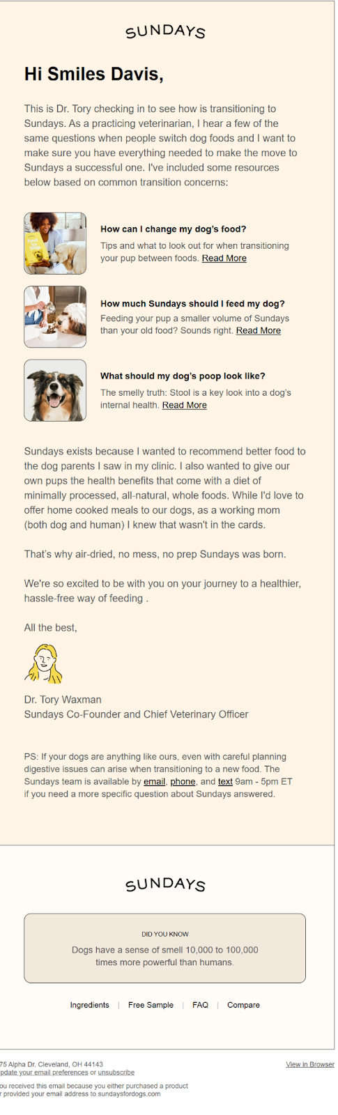
Matt Helbig: Yeah, really smart. I feel like all the other emails I’ve seen, like around subscriptions, letting people know in advance about renewals or any shipping delays. It’s all very customer-focused. Great work. Alright, and then a very interesting email. I haven’t seen one like this either — a kind of post-purchase check-in from this doctor, which is pretty interesting. I really like the fun illustration.
Again, it’s about making people feel good about their purchase and reminding them they can reach out if they have questions. What was the thinking behind this one?
Adrien Grey: Yeah, we actually tested a couple of versions of this email. One was a more traditional, plain text version. This one features Dr. Tory, who founded Sundays. She’s kind of the face of the brand and appears at several points throughout the customer journey.
This email is part of the post-purchase welcome flow. People are transitioning their dogs, and that can get complicated. For some dogs, it’s smooth. For others, it can get really messy. We wanted to give people a heads-up and answer questions before they even ask. We also have a really comprehensive blog with a lot of useful content. So we wanted to elevate those articles and make them easier to find. What’s nice about using something more designed instead of plain text is the scanability. You can open this email, not read every word, but still spot an article that applies to your experience and click right into it.
We’re also using this as another opportunity to introduce Dr. Tory to the customer. If they don’t know exactly who she is, this is the moment for them to learn. They need to understand why she founded the company, that she exists, and then we end with another chance for them to reach out to us. The company strongly values customer service and always wants to be available to people. So we reiterate that often, whether it's by email, phone, or text, anytime, we’re here to answer questions, especially during the transition period, when things can be a little trickier.
Matt Helbig: Yeah, that’s great to see. I think it would be awesome to see that approach used in other products that require a bit more handholding. Yeah, and this is a great fun fact too. It's good to know that I’m now smarter because of it. But seriously, I love this one. As you said, this styled template is one of my favorites. Plain text doesn’t always work for me — I just don’t connect with it in the same way. So I prefer something styled, with more of a letter format, a signature, and an image at the bottom. That really captures my attention. It lets me learn a bit more about the brand, and I feel more connected to it.
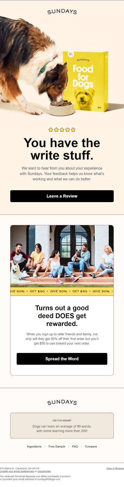
Alright, this last one was sent in a little while ago. It was submitted to the site, and I thought it was really smart. It’s a fantastic email, one of the most popular on Really Good Emails, to be honest. A great, attention-grabbing headline and a clear call to action to leave a review on your site. So yeah, this one’s a lot of fun. It’s much more visual, and it’s nice to have some of those moving elements. We’re having fun with the copy, and it checks a lot of boxes for us. It lives at the end of the post-purchase flow. Once people have gone through their second reorder, that’s probably a good moment to ask for a review.
Adrien Grey: So yeah, this is a really fun one. It’s a lot more visual, and it’s nice to have some of those moving elements. We’re having fun with the copy, and this one checks a lot of boxes for us. It kind of lives at the end of the post-purchase flow. Once people have moved past their second reorder, that’s probably a good opportunity to ask them for a review. At that point, they seem to be happy with the product. So let’s invite them to share feedback and gather some quotes we can start using in our other emails. We also let them know about our referral program. You can give 50 percent and get 50 dollars. It’s a pretty great reward, and we want to make sure it stands out and people are aware of it.
Matt Helbig: Yeah, fantastic. Honestly, I think it’s a perfect email. It really does the job you intended. And I think this whole flow — from getting people into the brand, guiding them through the experience, and ending with this last email as a final touch — is really great to see. So, fantastic work. Anything else about Sundays that you'd like to share?
Adrien Grey: As we mentioned at the beginning, we launched our rebrand a couple of days ago. So, if you like these emails, you’re going to love the new ones we’ve created. I’ll start getting those up on the site so more people can see them. We’re really proud of the work we’ve done over the past few months.
Matt Helbig: Nice. Was there one thing you had in mind going into the project?
Adrien Grey: We started by focusing on brand positioning. Why do we exist? What do our customers care about? How are we differentiated in the market? That led to the redesign. We changed everything about the brand. We’re keeping the vibrant yellow, and of course, all the dogs are still just as happy with the food. The food hasn’t changed. From there, it was a matter of carrying the new branding through every single touchpoint. I think it’s a rare opportunity for any brand to do a complete overhaul of all their emails at once. Altogether, a rebrand is one of those rare instances where a full reset becomes not only possible but necessary. It’s a chance to take a step back, really understand the customer, and then update everything to tell that story in a meaningful way that adds value to the experience. It’s just a really cool process to go through.
Matt Helbig: Awesome. Thank you so much for walking us through all of this today. I really appreciate it.
Adrien Grey: Of course.
Matt Helbig: I love Sunday’s brand. Keep an eye out for those new emails — definitely a brand to watch. Some fantastic, well-done emails. So thanks again.
Adrien Grey: Thank you!
Categories:
Feedback FridayMatt Helbig and Mailgun’s Megan Boshuyzen unpack Email Camp, showing how accessibility, live text, and smart CTAs turn event emails into signups.

Accessibility, applied: Matt Helbig and Kelsey Yen reveal how inclusive design turns real emails into better user experiences.
Dive into the world of unmatched copywriting mastery, handpicked articles, and insider tips & tricks that elevate your writing game. Subscribe now for your weekly dose of inspiration and expertise.