


Email marketing deep dive with Megan Boshuyzen
Matt Helbig and Mailgun’s Megan Boshuyzen unpack Email Camp, showing how accessibility, live text, and smart CTAs turn event emails into signups.
August 8th, 2025
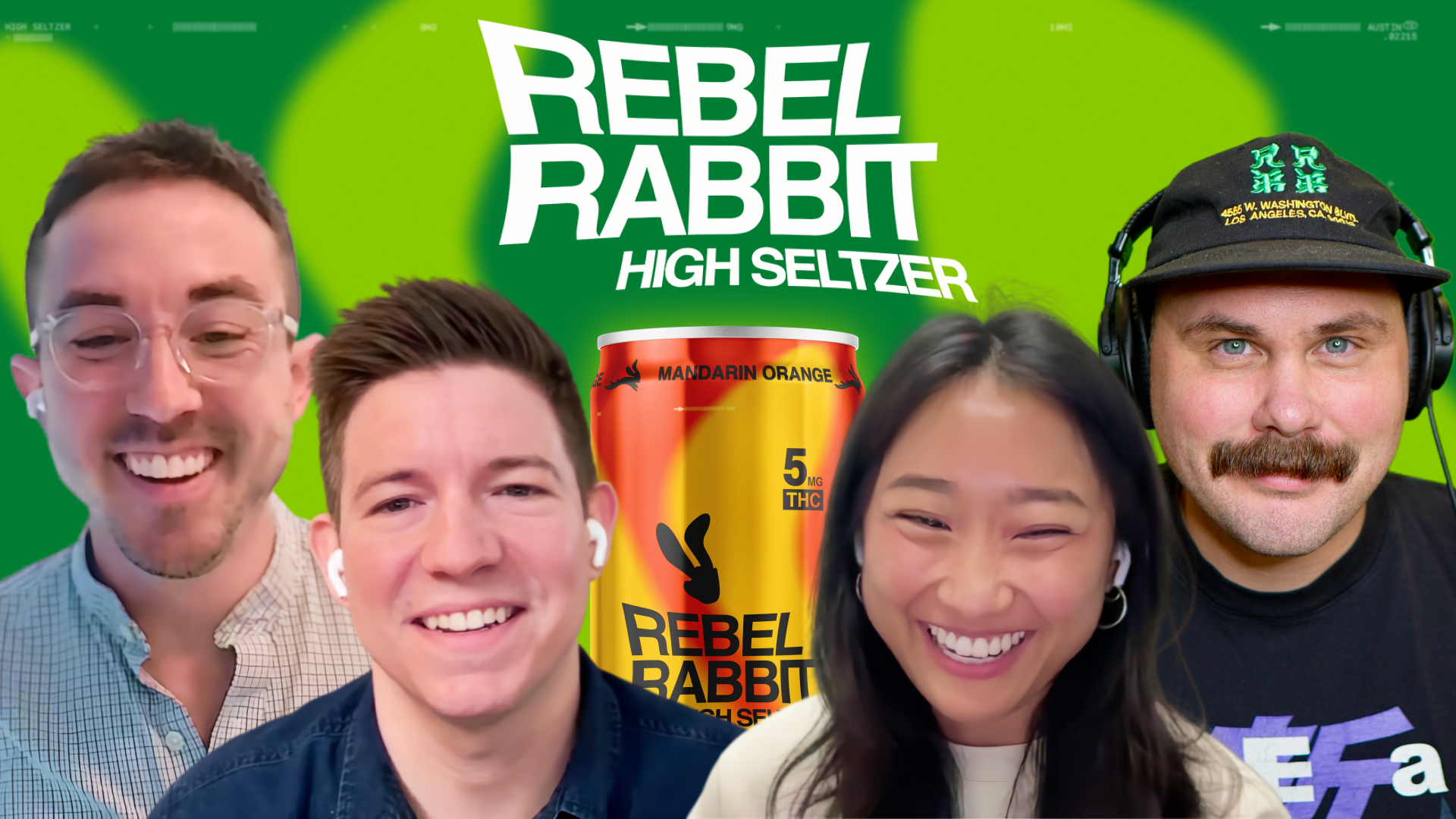
Matt Helbig and Marketing Rhythm break down Rebel Rabbit’s email strategy, highlighting how retention tactics and hybrid templates drive engagement.
What does standout email marketing look like in 2025?
For Rebel Rabbit, it’s all about clear strategy, bold design, and a little disruption. This fast-growing THC seltzer brand is redefining social drinking, as well as how to connect with customers in the inbox.
In this episode of Feedback Friday, Matt Helbig chats with the team at Marketing Rhythm: Robbie Fitzwater, Jesse Godfrey, Kathy Do. They explain how they’ve helped Rebel Rabbit build a standout email program focused on retention, lifecycle personalization, and GIF-rich design. From hybrid templates to playlist content and restock logic, they walk through real campaigns that blend creativity with performance.
If you work in ecommerce, retention, or lifecycle marketing, this episode is your blueprint for how to craft emails that not only look great but drive results.
🎥 Watch the full breakdown or read the transcript for proven strategies you can steal for your next campaign.
Matt: What’s up, email geeks? Welcome back to another episode of Feedback Friday, where we break down some of the best emails in the game and chat with the creative minds behind them. Today I’m super excited because we’ve got the full squad from Marketing Rhythm in the house. Joining us this week are Robbie, Jesse, and Kathy—a killer team that’s been pushing the boundaries in email and retention marketing for some pretty disruptive and fun e-commerce brands. We’re diving into their work with Rebel Rabbit, a CBD seltzer brand that’s rewriting the rules on social drinking. If you’re curious how to make your brand stand out in a crowded inbox, you’re gonna want to stick around. Let’s hop in.
Robbie: My name’s Robbie. I started Marketing Rhythm a little while ago, and we mainly help e-commerce businesses with email and retention marketing. We get to work with a lot of really smart people and do a lot of really, really fun things with some cool brands. We like to push the boundaries of what we can do. On the design side—especially Jesse, Kathy, and our creative team—they do a lot of amazing work. We like to think we’re doing some innovative things on the strategy side, and hopefully on the design side too. And I’ll kick it over to Jesse.
Jesse: Jesse Godfrey. I’m a partner and creative director for Marketing Rhythm. I’m focused on the design and brand aspects of our clients and making sure that we’re translating their beautiful brands into the email space.
Kathy: And I’m Kathy, I’m on Jesse’s team. I freelance for Marketing Rhythm and work mainly with Rebel Rabbit and Plus Plus. I’ve been here for over a year now, and it’s been fun learning about the email industry and how much goes into it. I’m excited to dissect our emails today.
Matt: Awesome. You guys do amazing work. Is it specifically just email marketing, or...?
Robbie: It’s kind of like anyone who works in the email space. We get into client strategy at some point and work with clients in that capacity to a large extent. But we focus on email. We also get into SMS, but it’s the medium we’ve spent the most time in.
Matt: Right on. Cool. Alright, we’ve got some great examples from Rebel Rabbit—a standout brand, I’d say, from some of the emails we’re looking at. It also touches on some THC-related stuff—Delta-8, Delta-9—so I’m curious about how you work within those constraints. Okay, cool. This first one from Rebel Rabbit looks like a fall email. Very eye-catching GIF up top. Maybe talk a bit about this email—what the challenges were, any creative design decisions, or anything you’d want to share.
Robbie: So, kind of a 10,000-foot view: Rebel Rabbit is a THC seltzer brand based in Greenville, South Carolina. Jesse and I are based in this area, and Kathy was here for a little while, but she’s in Charlotte now. One of the things we always try to do with clients once we get into a consistent sending rhythm is implement what we call the Hygiene, Hub, and Hero model. We introduce certain pieces of hub content on a consistent basis.
So every quarter, we release one of these playlist emails. It gives us a way to bring the personality of the brand to the audience through a slightly different lens. It deepens engagement, and when we can act as tastemakers, the audience really appreciates it. It’s low-hanging fruit—quality content that lets people connect with the brand in a deeper way.
From a retention perspective, that’s what we’re really focused on with this group.
Jesse: I was just going to say, Rebel Rabbit makes it super easy on us. They’ve got a fun, disruptive brand—very much against the grain—so it’s always fun to design their emails. I’d love for Kathy to talk specifically about how she came up with the idea for the record in the header. GIFs are something we try to use as often as possible, especially in the header, to grab attention and drive people to scroll. I thought this was a beautiful execution. Kathy, want to speak to that a bit?
Kathy: I always try to add some subtle movement, like little product animations. For this one, I had the idea of the vinyl because I love pulling in nostalgia. They use a lot of disposable film images, and I think that ties in well with that “blast from the past” vibe. For the label, I kept it green—Spotify’s logo is super recognizable, but we can’t actually use it.
Robbie: And subtle brag here—Kathy’s been on fire lately. You’re the GIF queen right now.
Kathy: Thank you!
Matt: They all look great. Just to be a little nerdy—what kind of programs do you use? What’s your process for making these GIFs?
Kathy: It’s definitely evolving. We build everything in Figma right now, but sometimes I pull it into Photoshop to add a little polish and clean it up. This one took a while to figure out in Photoshop. I had to rework it a few times—swapping out backgrounds, changing the can—but it came together.
Matt: It looks great. Some brands think they need long, elaborate GIFs, but you can do a lot with just a couple of seconds looping. Like you said, it grabs attention and adds movement and engagement.
Jesse: Yeah, definitely.
Matt: Sweet. And like you said, I think for a brand that needs lifestyle elements, this is a really effective approach. We've seen some brands use the playlist format, and I think it works pretty well. People are interested in adding something different, and I think it helps break up the content rather than it being purely promotional all the time.
Robbie: Yeah, we usually have them publish those playlists on their blog, embedding the content there. That way, we’re sending users to a blog where they can engage more deeply. They can click into the playlist from the blog, but ultimately, we want to drive traffic back to an owned channel whenever possible. This has become a core process that we follow every time one of these goes out.
We also talk a lot about context—always trying to position the brand based on where the audience is at. Especially seasonally, playlists are a really clever way to talk about fall, the holidays, or whatever theme they're building around. It makes the content feel timely and relevant to the people receiving it.
Matt: Yeah, and I really like the transitions between sections. You do a great job using simple design techniques to keep the sections distinct while still maintaining a consistent design system across emails. I’m a big fan of the “Shop by Category” feature too. We’ve been talking a lot about navigation and how it’s evolving. So I love seeing something like this—something super shoppable and tappable on mobile, instead of a big, heavy navigation bar at the top.
Robbie: Shout out to Jesse on those. For any new client, we create a few variations of these “Shop by Category” blocks. Some might look like buttons, others like clickable squares—just to make it easy and shoppable within the email itself. With this group, we’re using some different tools that let us serve dynamic content. For example, if someone is a subscriber, they won’t see a restock button.
If they’re not a subscriber but have purchased before, they will get a restock button. If they’ve never purchased, they won’t see one at all. It makes the experience more personalized and lets us vary the content a bit. We don’t want to include the same “Shop by Category” section in every email over and over again.
Matt: Got it. And just one last question on this one—I noticed the footer is pretty minimal. Circling back to some of the THC-related stuff, are there any legal requirements you have to think about? Or how are you able to get away with such a short footer?
Robbie: Yeah, that’s a good question. We’ve worked closely with Rebel Rabbit and leaned on them for some added context around this. Their team is really buttoned up and ahead of the curve when it comes to understanding what disclaimers are necessary. They’re actually involved in some of the regulation discussions around these kinds of products. Because it’s a Delta-9 product and based on how it’s derived, it doesn’t require the same disclaimers that other types might.
Matt: Yeah, I'm always curious: do brands that promote those types of products run into issues with things like ESP selection? I feel like some platforms have specific limitations. But like you’re saying, I think it really depends on the product. Still, I’m always interested in how brands market to an adult audience. It's just a really interesting communication challenge.
Robbie: And Rebel Rabbit has such a unique angle. They’re walking a fine line. For example, they can run paid ads on Facebook and Google, but SMS has been a challenge. Getting approved by carriers is tough—some are still pretty cautious. So email ends up being a really powerful tool for them. But even then, it still feels like the wild west in terms of regulation and knowing where things fall.
Matt: Alright, cool. Let’s move on to the next one. I’m a big fan of this one—the sexy fall glass vibe. I’m really liking it. It definitely stood out. I love the subtle shadows. It makes the image pop. I also really appreciate when brands break the mold by using 3D visuals, animations, or anything that visually separates sections. I‘m a big fan of this.
Jesse: Since you mentioned it, that “breaking the plane” technique on the header image is something we use across the board, with all our clients. It’s kind of a design philosophy for me. If you can break that visual seam and create more spatial interplay, the whole email feels more dynamic—not just one box after another. You’ll see that approach whether it’s Rebel Rabbit, Plus Plus, or anyone else. Kathy does a great job taking that concept and making it even more beautiful with the images she selects.
Robbie: Yeah, this is a great example of a content type we use for Rebel Rabbit that fits into our hub content strategy. Every month, we release one of these mocktail recipes. Rebel Rabbit’s mission isn’t anti-alcohol—they’re focused on redefining social drinking. They want to be an alternative, not a replacement. Because they’re still growing and only have a few flavors, we want to give people multiple ways to use and enjoy the product. So these recipes let customers explore the brand from different angles. And again, it helps maintain relevance depending on where the audience is at the moment.
Matt: Yeah, it’s a really versatile product. And this kind of content is super effective. We’ve actually seen a big increase in people searching for recipe-themed emails on Really Good Emails. I think there’s a trend happening where more brands are including content like this. People love being inspired in the inbox—even to try something at home.
Robbie: Totally. And we love working with brands that are willing to invest in content. Email gets boring fast if it’s just transactional. If we can educate, empower, and inspire our audience in ways that are relevant, they’ll engage more deeply. People want to know how to use, enjoy, and get more out of what they buy. So we care a lot about content—not just to retain customers, but to keep them coming back. Especially for replenishable products, that top-of-mind preference matters a lot.
Matt: Yeah, and I really liked this section: “Choose your Buzz”. It felt like a fresh switch-up from the previous footer. That pop of color at the bottom really ties the whole email together. Have you seen strong engagement on sections like this?
Robbie: Yes, definitely. Those sections usually drive a solid amount of traffic. We think of emails kind of like giving directions: your primary CTA is the main route you want people to take. But we always want to provide alternate paths too. The "Shop by Category" block gives people other ways to engage. And like I mentioned earlier, there’s another category block a bit lower in the email for customers who’ve purchased before but aren’t subscribers. That one sends them to a tool called Repeat, where they can easily rebuild their cart. Among all the buttons, that restock button usually gets the most engagement from those who see it.
Kathy: I just wanted to mention something about the header, too. Sometimes the product doesn’t need to be the primary focus of the email. That’s why I pushed it to the background a bit here. Presenting something more aesthetic than just a can can really entice the reader to keep scrolling.
Matt: Nice. And how do you usually get your product photography? Is that something the Rebel Rabbit team provides?
Kathy: That’s something we sometimes struggle with as designers. We’re often supplied with photography and assets when we onboard a client, but we also have to get creative—using stock images or building things from scratch.
Jesse: We’re usually supplied with a lot of photography and assets upfront when we onboard a client. But a lot of the time, it comes down to being nimble. You might find something recently updated on the brand’s website, or come across a great piece of content on social media. With email, the resolution isn’t super high anyway, so you can be flexible with that kind of stuff. Sometimes we have great assets already in our repository, and other times we’re making it work with whatever we can find. I think that’s part of the fun.
Matt: Nice. Well, it looks great. It feels very natural and on-brand. But I totally agree—it can be tricky when a brand just gives you a homepage link and says, “Figure it out. Make an email from this.” It’s always a bonus when brands provide more to work with, but you’ve done a really good job of making everything feel consistent with what you had. Nice work.
Alright, moving on—this next one feels more balanced, kind of like a plain-text-style template. I really like when brands switch things up instead of making every email look the same. This one has a nice letter-style feel, especially with the co-founder photo. It feels personal. I think that can be really effective. Can you walk us through the thought process behind this one?
Robbie: Sure. This is what we call a hybrid template email. We usually think in terms of three types: fully designed emails, hybrid templates, and plain-text emails. This one gives you all the bells and whistles of an HTML email, but with the human touch of a plain-text message.
From a brand engagement standpoint, this format gives us a lot more flexibility. If we want to build a more intimate connection—invite someone to become a VIP, ask a question, or go for a more direct sell—we can usually get away with more in this format. It also allows us to use a different sender name. For example, this one comes from "Pierce at Rebel Rabbit." Over time, the goal is to build recognition around that persona.
We always joke that we know it’s working when someone replies to the email asking for Pierce specifically, or even calls and asks for him. That’s when you know there’s trust and connection. People buy from people, not just brands. So building that personal relationship as early as possible is a big part of what we try to do. And we keep it fun, lighthearted, and engaging too.
Matt: Yeah, I really like how scannable this email is. You all did a great job of keeping the content tight, short, and relevant. It’s very easy to skim through—bullet points help, and spacing makes it a lot easier to read. Some brands cram everything together, but this format keeps things clean. And then you’ve got a clear CTA to drive traffic.
Robbie: Exactly. We want it to feel like a personal email, not a wall of text.
Jessie: From a templating perspective, this is super useful for automation flows. It lets us alternate between designed and hybrid emails so things don’t feel repetitive, even when the behavior or message is similar. That sequencing keeps the experience fresh. It's worked really well for us.
Kathy: The little "mark the calendar" visual is a fun way to engage with customers and help them track their Sober October journey.
Jessie: We sent a few of these emails, so over time you’d see more days getting checked off as the month progressed. It added a nice interactive element.
Matt:Oh, nice. I really like that. I was going to say, some animation could’ve worked here too, but I like that it ties the number of checkmarks to the actual day the email was sent. That’s a cool touch.
Robbie: Yeah, the context around this series was really strong. It turned out great. I think we had three, maybe four different emails with the calendar included, and each one marked the current day. It was a great way to keep the campaign going and add a milestone-like experience for the audience.
Matt: Definitely. Okay, moving on—we’ve got another amazing GIF here for Sober October.
I was curious about how you approached this from a messaging standpoint. For people who aren’t sober but enjoy the product to relax, is this the kind of content they might want to opt out of? Or does it still resonate across the audience?
Robbie: We’ve gotten a lot of feedback from the audience on this. They tend to fall into a few categories—people looking for alternatives to alcohol, people transitioning away from drinking, and people who are into higher performance and don’t want the hangover. We see a little bit of everything. A lot of people are just experimenting with options.
Surveys we’ve done show strong interest in themes like Dry January and Sober October. These months perform really well, and the messaging resonates. But the key is, we’re not trying to be preachy. We’re not saying, “You should do this.” We're just saying, “Hey, this is something a lot of people are doing. If you’re trying it out, that’s awesome—we’re with you on the journey.”
Matt: Yeah, as someone who’s now sober, I think it’s cool to see brands operating in that space. I haven’t seen many that really lean into it like this, but it makes a lot of sense. I’m a huge fan of this next section “Why we started Rebel Rabbit”. I love when brands incorporate a format that mimics social media stories or Reels into email.
That aspect ratio just really pops. It makes the content feel familiar, almost like you could go check it out on Instagram right after. I really like this layout. Sometimes it's tricky to get it to feel right in an email, but the color blocking and overall structure work really well here. Nice job.
Jesse: Thanks. We always try to use as much available content as we can, and sometimes that means using things we didn’t create ourselves. That’s a big part of our model. If something already exists and it’s good, let’s find a place for it. Rebel Rabbit has an awesome social media presence. They create a lot of content, so we’re able to pull from that and naturally integrate it into our campaigns. It makes it fun.
Matt: Love it. And sticking with the October theme, let’s talk about this Halloween email. We're a bit past Halloween now, but the GIF in this one is just awesome. Honestly, it would look great any time of year.
Kathy: Yeah, this one was fun. I had to do a bit of research because I hadn’t really made Halloween graphics before. There are so many trends out there now, but I decided to take a vintage-style approach. The skeleton hand was meant to feel realistic and tie in some nostalgic vibes.
The typeface is bold and loud, and I used a typewriter-style animation to reveal the message slowly. I didn’t want it to feel too in-your-face right away. I figured if someone opened the email and missed the hand at first, they might catch it as it moved while scrolling, which would draw them back up to it. That was my take on it.
Jesse: Kudos to Kathy for thinking through the text animation. Having it appear one word at a time keeps the viewer on the GIF, anticipating the next part. If it had been static, people might have just scrolled past it. This execution really holds attention. It gave me those old-school stop-motion holiday movie vibes, like Rudolph. Kathy totally nailed the aesthetic.
Matt: Yeah, I’m a big fan of those little details. The spiderwebs, the ripped-paper effect—those touches really show appreciation for the email format. They make the piece stand out. One technical question: do you use any tools to help reduce the file size of these GIFs? They seem pretty detailed. Does that ever affect email load times?
Kathy: Oh yeah, definitely. When I have abstract or detailed GIFs, keeping the file size down can be tricky. You get lucky sometimes if the original is small, but I usually use EZGIF.com to optimize everything. For this one, I didn’t run into any major issues. My process is to build each frame individually in Figma, then bring them into Photoshop to reduce size and clean it up. That usually helps a lot.
Matt: Nice. That’s a great tool. We use EZGIF too. One other thing I wanted to point out—across all these emails, you’re using center-aligned text, but you’re keeping it at that sweet spot of about four lines, which helps with readability. I think it works really well for this brand and helps tie everything together.
Robbie: Yeah, once we get past that line count threshold, we usually switch to left alignment. Jesse’s really focused on accessibility, and I always joke about this—Jesse and I have worked together for years, and I call him Dr. Frankenstein because he brings things to life in all kinds of wild ways. But honestly, when I saw this one, I thought, “Jesse has some competition.” It was so good.
Matt: For sure. Jesse, are there any accessibility tips you keep top of mind when designing emails like this, especially for brands that are new to that space?
Jesse: Lately, dark mode has been the biggest challenge. We’re really trying to figure out how it impacts things. A lot of users are still in light mode, so it can be easy for designers to overlook dark mode unless they’re thinking about it intentionally. It’s especially tricky with transparent or overlapping elements. You need to know how dark mode will invert things.
We test a lot—both on platforms and manually by switching phones to dark mode to see how everything looks. You’re mainly watching for contrast issues. That’s what’s top of mind for me right now.
Matt: Awesome. You all have done a great job using live text, smart color choices, and good contrast. Those details really elevate the email experience.
Matt: Rebel Rabbit is a very cool brand. Drinks are actually one of the most popular categories on Really Good Emails right now. I feel like this market is really emerging, and people are excited to learn more. You’ve done a great job marketing this product to a broad audience. Nice work. It’s an underrated brand. I hope it blows up—it’s really cool.
You guys are doing amazing work. Rock and roll.
Robbie: Thank you, Matt.
Categories:
Feedback FridayMatt Helbig and Mailgun’s Megan Boshuyzen unpack Email Camp, showing how accessibility, live text, and smart CTAs turn event emails into signups.

Accessibility, applied: Matt Helbig and Kelsey Yen reveal how inclusive design turns real emails into better user experiences.
Dive into the world of unmatched copywriting mastery, handpicked articles, and insider tips & tricks that elevate your writing game. Subscribe now for your weekly dose of inspiration and expertise.