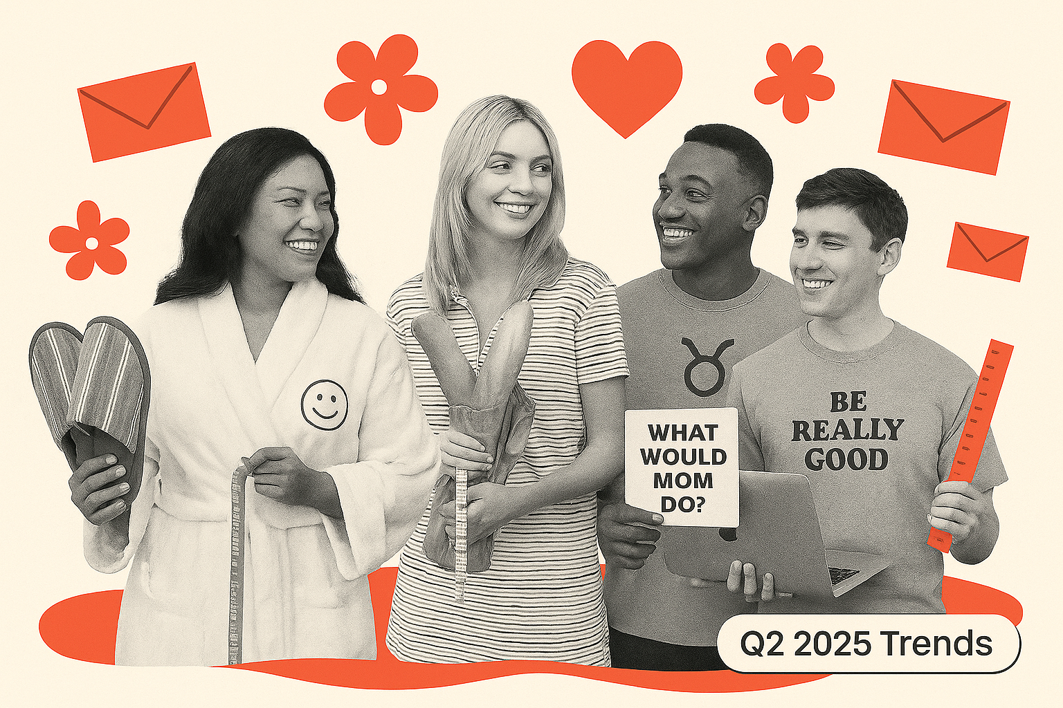
Trend 1: Making scarcity way more fun
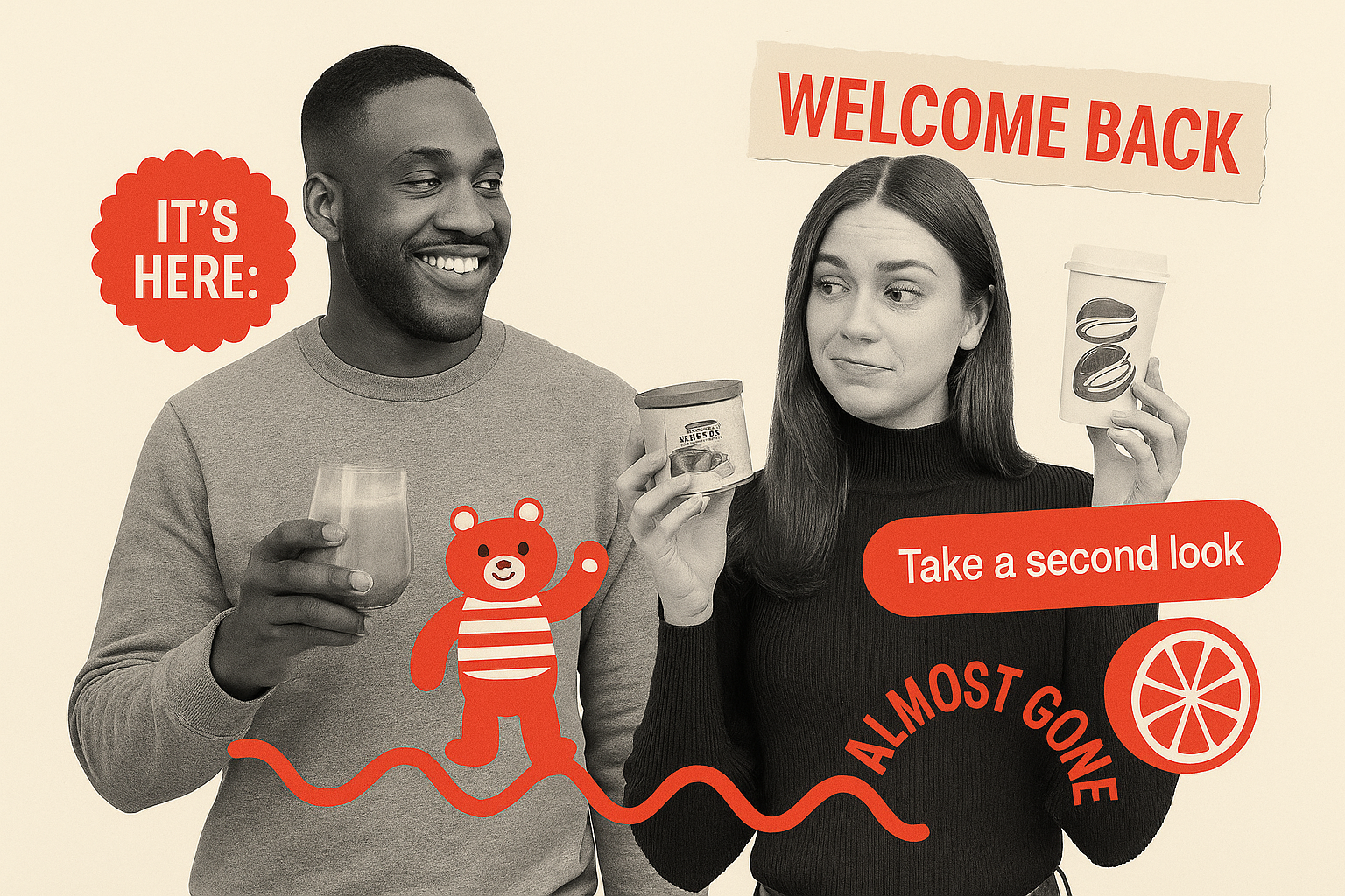
Scarcity is still a powerhouse, but it’s evolving. This quarter, brands blended classic urgency with playful “farewell tours” and nostalgic flavor comebacks: Shamrock Smoothie is back, Pistachio’s returned, Tamarind Citrus says goodbye. Meanwhile, “Last Chance” is getting polite. Instead of panic, we get “Take a Second Look” or “We Noticed You Had Your Eye on This.”
This taps two behavioral truths: loss aversion (we hate missing out) and the peak-end rule (we remember the final moment more than the mundane middle). Combining them gives us a gentle push to act, minus the pushiness. The messaging feels like a friend putting aside your favorite snack before it’s gone.
Where It Shows Up:
One CPG team told us they now keep a “flavor vault” just for these comeback moments — it’s a year-round tactic to drive off-season sales without inventing anything new.
Try This:
Marry urgency with warmth: “Last Chance to Taste This Again.” Save your bestsellers for a seasonal cameo, and let your copy do the hugging, not the harassing.
Trend 2: Early access is the new status symbol
“Early access” went mainstream this spring. Not just for big annual sales, but for micro-drops and surprise launches too. From spring fashion to wellness, “be the first” is being used like a badge of honor, often tied to SMS or loyalty email sign-ups.
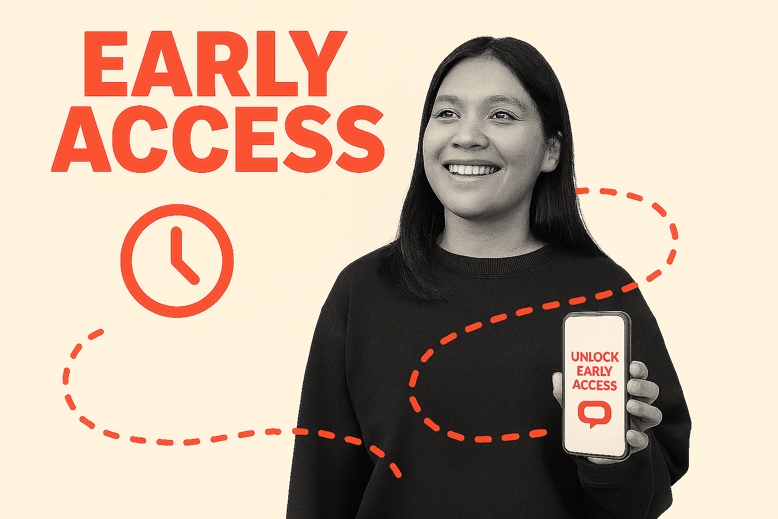
Status hits different than discounts. Scarcity works better when you know you’re in the club and it scratches the same itch as VIP concert wristbands or beta invites. Behavioral economists call this the “velvet rope effect.”
Where It Shows Up:
Try This:
Next launch, test a “secret list” or “first to know” angle instead of just a code. It costs nothing but makes people feel like they’re getting more.
Trend 3: Playful horoscopes, quizzes & prediction hooks
Boring emails just tell you things, while these Q2 emails ask you to guess, play, click, and then reward you. Horoscopes, quizzes, “What Would Mom Do?” or even “Can’t Decide?” give readers a low-effort dopamine hit while quietly collecting preferences. The payoff is entertainment and segmentation.
Also, no one wants to fill out a boring form. But people will click on a quiz, horoscope, or game that tells them something fun or personal. Smart brands are turning these moments into ways to learn what customers like (and making it feel like play, not paperwork).
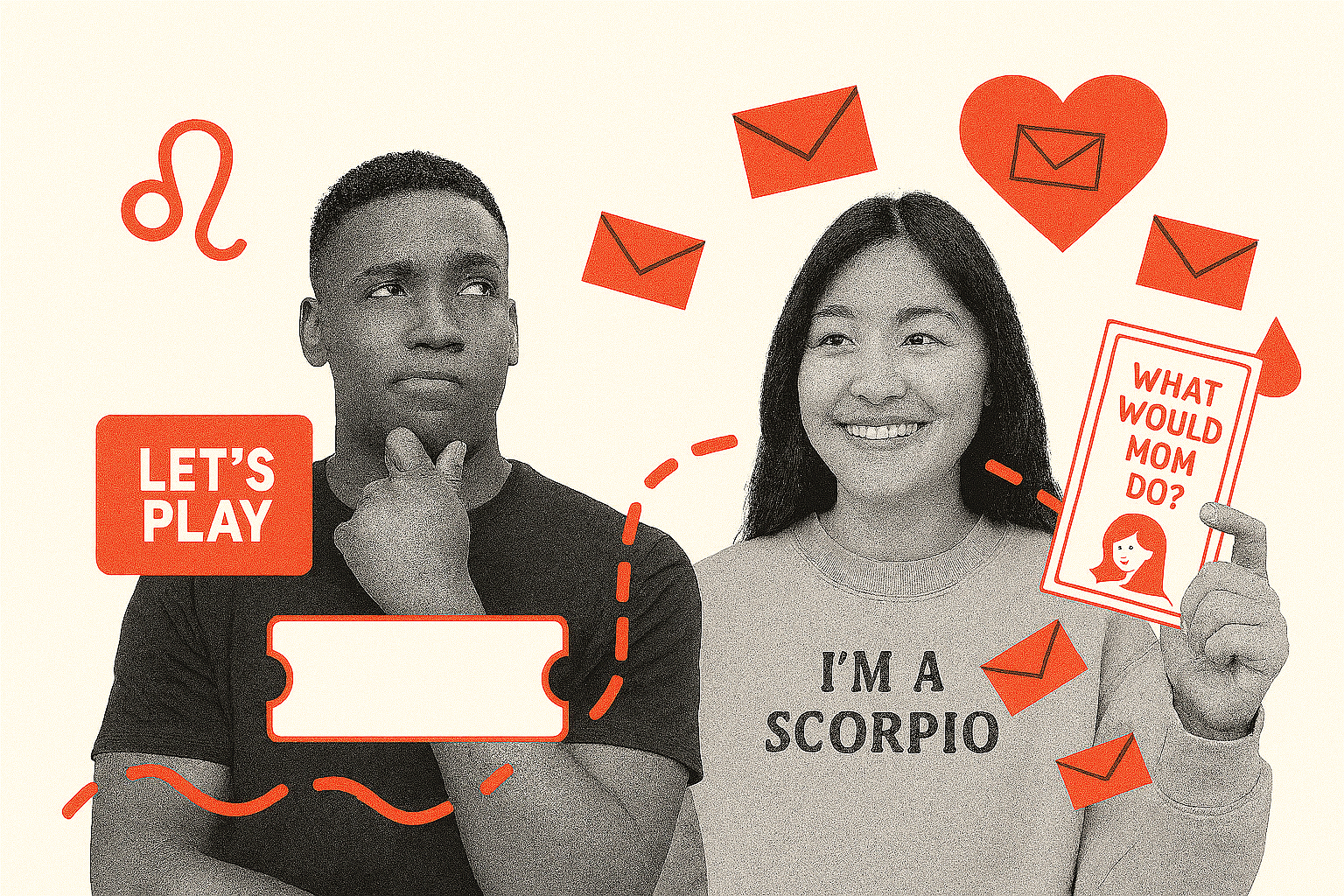
This taps the Barnum Effect: we believe broad statements that feel personal. It also lowers friction to share info because it’s more fun to “find your flavor soulmate” than fill out a dull form.
We also see the hidden upside: these formats generate zero-party data without any forms. Every “Tell Us Your Mood” or “Pick Your Flavor” builds a first-party vault that privacy laws can’t touch, which is all volunteered by the customer.
Where It Shows Up:
Try This:
Don’t overthink it. Start with a simple “Which [X] Are You?” quiz or a zodiac spin on your product line. Keep the visuals modular, the tone playful, and the result shareable. Bonus: ask one clarifying question that reveals a preference you can personalize later.
Trend 4: Cultural significance
This quarter, some of the most-saved emails didn’t just sell a product; they sold a vibe rooted in real places and cultures. Instead of shouting generic discounts, they leaned into local flavor and regional authenticity. Mas Margs Por Favor, Offerta Piccante, Festeggia il Papà con i Sapori della Sicilia — these aren’t just headlines; they’re mini invitations to a table you want to sit at.
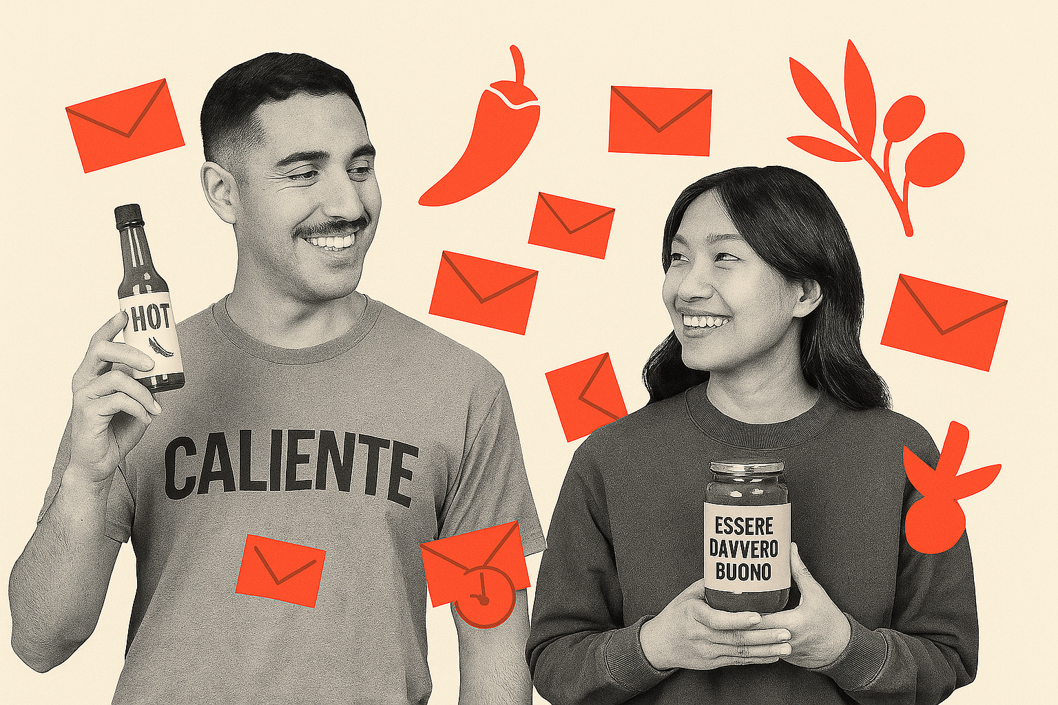
Research shows that cultural specificity is more shareable than generic promotions. When people see something tied to their hometown, language, or family traditions, it feels personal. And that sense of insider pride drives word-of-mouth. Psychologically, it taps our social identity theory, where we love showing off what makes “our people” special.
Even more interesting? This works brilliantly for food & drink, because taste is the quickest nostalgia trip. The best “culture drop” emails made you crave the real thing and feel like you were part of an authentic moment.
Where It Shows Up:
Try This:
Don’t just sprinkle in a foreign word. Anchor your email in a real story. Name the region, show a local ingredient, or drop in a cultural reference that your audience connects with. The more specific, the more shareable. Authenticity > gimmicks.
Trend 5: The rise of micro-escapes
Forget big “Summer Getaway” blowouts. Q2 emails tapped into something smaller: the micro-escape. Brands embraced the idea that self-care and travel don’t have to mean booking two weeks off. You saw subject lines like It’s Still Vacay Even If It Lasts Two Days and Ever Want to Just Get Away? that repositioned mini-breaks, day trips, and even self-care rituals as the break you can take, not the one you keep postponing.
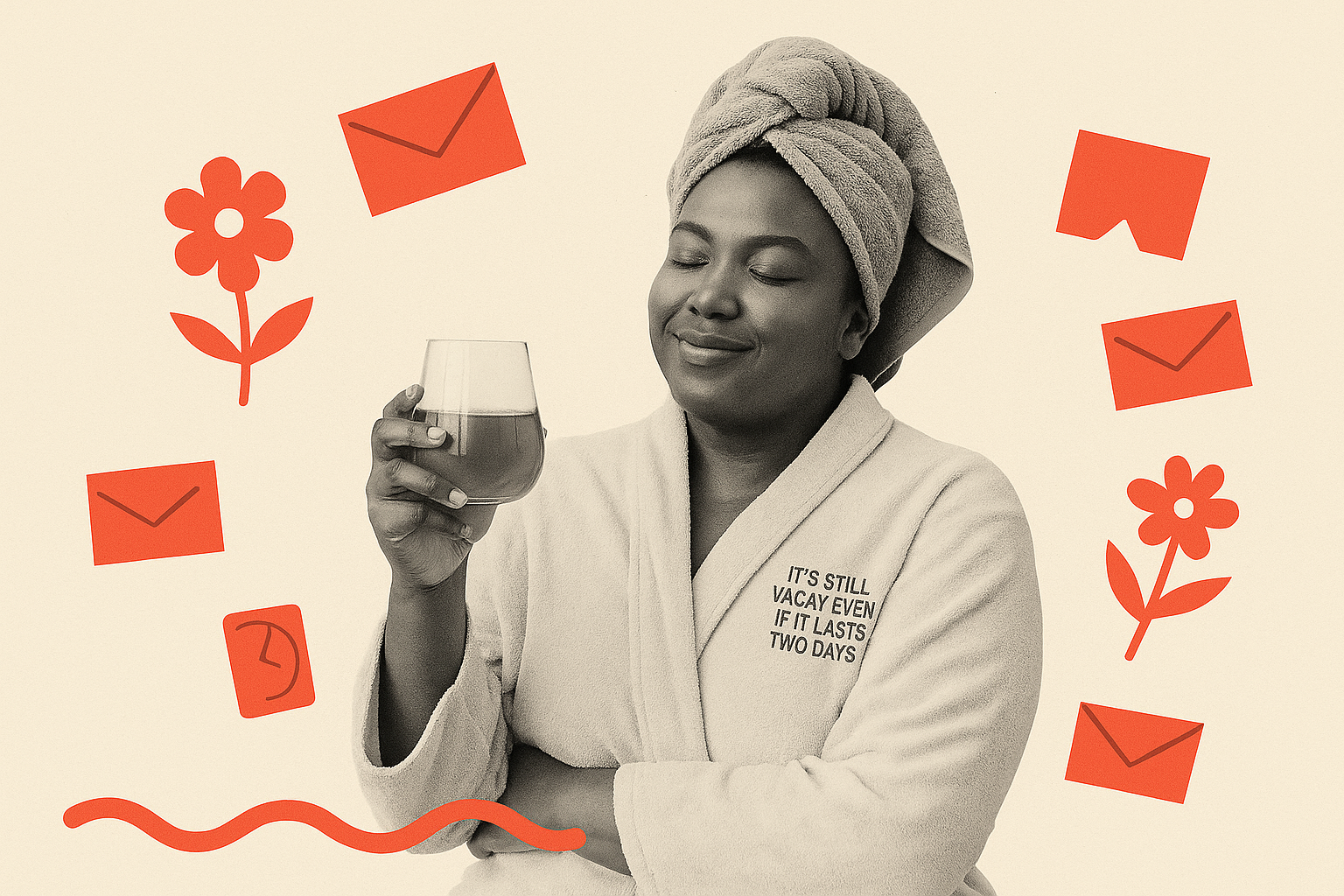
Psychologists call this effort justification: when something feels achievable and low-pressure, you’re more likely to actually do it (and value it more). A spa day or cabin weekend is more realistic than a Bali blowout when your calendar’s full. These brands tapped into that mindset with visuals that felt inviting, not aspirational, and language that framed mini-indulgence as enough.
Where It Shows Up:
Try This:
Reframe your product as a mini break: your moisturizer isn’t just skincare. Nope. It’s a pause button. Use cozy, real-life visuals and phrases like “a break you can take.” Big trips inspire wanderlust; tiny escapes get added to cart.
Trend 6: Practical explainables for “Wait, how does that work?”
Not every email in Q2 screamed “NEW DROP” or “SALE NOW.” Some of the most saved ones leaned into practical education. These explainers felt less like a pitch and more like a helpful nudge to demystify everyday things. How Much Does a Dental Cleaning Cost Without Insurance?, Stock Up on SPF with Your FSA/HSA, Step Into the Forest of Stories to Develop Reading Skills. These are all examples of brands embracing teachable moments to reduce purchase friction.
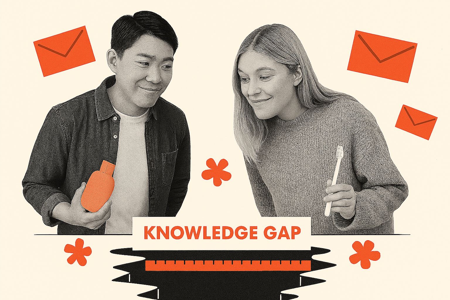
This works because of the information gap theory, which is where humans strive to close the gap between “what I know” and “what I don’t.” We’re wired to click when we think we’re missing a basic fact. Plus, brands that explain practical details position themselves as partners, not pushy sellers. The more you reduce uncertainty, the more likely people are to trust the next CTA.
Where It Shows Up:
Try This:
Look for points of confusion in your category (e.g. payments, plans, usage, even ingredients). Then write an email that says: “Here’s what you probably wish you knew.” Keep visuals simple, headlines clear, and your tone: “Hey, we got you.”
Two Design Takeaways for Q2:
The best designs didn’t get louder. They got clearer, warmer, and more human. If you zoom out, it’s soft minimalism with personality: airy space, confident type, real context, and tiny moments of visual charm. No template-y walls of text, no hyper-polished showroom shots. Just simple, friendly, and real.
In other words: they looked simple and human, like something a real person would send. That’s what people are drawn to. It’s less about polished perfection and more about creating something worth saving, sharing, or remembering. This shift changes how we think about success. It’s not just about click rates anymore. It’s about whether your email became part of someone’s week.
Email is turning into a space for real connection, and that opens up new ways to build community and create moments that actually matter.
But if we were to call out a couple design trends that stood out to us in Q2, we’d go with these:
1. Soft, airy backgrounds gives a space that feels luxurious
Across wellness, food & bev, and onboarding emails, there’s a clear pivot away from dark, heavy blocks. Hero sections favor white or pastel space, lots of breathing room, and subtle gradients that feel fresh and seasonal. It’s not minimalism for minimalism’s sake — it signals lightness and approachability.
Where It Shows Up:
2. Product photography with real, messy context
Food brands in particular are ditching overly styled, sterile shots in favor of lifestyle scenes that feel casual and snackable. Hot sauce on brunch eggs. A sticky bun pulled apart. Herbs growing in real pots. This works because it feels attainable and saves inspiration folders for future purchases.
Where It Shows Up:
Outliers:
When an email doesn’t fit a trend, it’s often because it scratches an ultra-specific itch: a random question answered, an oddly compelling vibe, or a community ritual that feels tiny but sticky. They’re the little weird bits that make a brand human (and worth saving for later). Here are a few that didn’t seem to follow the trends or holidays in Q2:
Hormbles Chormbles Welcomes You: This is an outlier for sheer color. A quirky name and a tone that’s delightfully short and punchy. It doesn’t really fit the “tribe onboarding” trend because it’s more about vibe than a real community hook. It’s memorable because it’s… well, Hormbles Chormbles.
Mod Shop - Free Upgrades: While the subtle “last chance” may have thrown it in our first trend summary, the reason we are using this as an outlier is the more for the personalization or customization hook. It’s not just “sale ends soon.” It’s “your chance to tweak this thing exactly how you want it.” The visuals (most likely) highlight the custom options or upgrades, giving the reader that “I’m getting something better for free” dopamine hit.
So, What Do We Make of Q2?
If Q1’s most-saved emails hinted that email marketers were craving more warmth and restraint, Q2 made it clear: subtle beats shouty. Scarcity got friendlier. Loyalty perks turned into status symbols. Nostalgic flavors, local references, and playful predictions gave people something to feel, not just to click. Even the design followed suit: softer space, honest photos, headlines that do more storytelling than screaming.
And sure, there were the outliers (weird, oddly specific, or just plain charming). Those are reminders that not every email needs to fit a trend. Sometimes the best thing you can do is break your own rules, send something people didn’t expect, and make your next “save” folder worth opening again.
Keep what works. Toss what doesn’t. And remember: the best emails aren’t just good-looking. They’re the ones someone thought were good enough to save for later.