Carnival Cruise’s email team should be the poster child for the motto: mo’ data, mo’ people.
When we requested an interview, we had no idea how many awesome folks they would round up to talk to us, but it goes to show that to really leverage your list, you need a sizable team.
It felt like they threw a party to talk to us, rounding up a whole posse in their Miami offices. Massive thanks to all the folks on the call (pictured above, left to right): Andres Sanchez (Email Marketing Lead), Jermaine Rowe (Digital Marketing Developer), John Albisu (Senior Marketing Developer), Jennifer Acevedo (Director CRM), Ana Di Iulio (Email Marketing Manager), Monika Molina (Visual Designer), Christine Alfaro (Customer Marketing Supervisor), and Hugo Castillo (Creative Director).
One of the especially cool things about Carnival is that in spite of (or perhaps because of?) the massive team that puts it all together, they’ve got a lot of freedom to experiment, and they really focus on keeping their email fun. They’re constantly testing, leveraging their data, and working together to find the best ways to reach their customers.
So, Carnival. What makes you different from the other cruise lines or travel agencies that are out there, doing email?
One of the biggest things is that our main vision is to have fun and embrace who you are — every aspect of who you are. And we really push that. We push the being crazy and laughing a lot and enjoying time together whether it’s your family or a couple of friends. We have this irreverent, fun brand tone that we can do a lot of more edgy stuff with than the other cruise lines can. Plus, we’re approachable.
So, give us an example of maybe something you guys do that other brands don’t.
Our new campaign is rooted in choosing fun and being yourself. You look at the vast ocean (no pun intended), of ships out there in the travel space… they tend to want to elevate it and make it seem kind of high-brow. We’re more about, “this is for you, this can be personalized to your needs in your life. This is an invitation to be among friends or like-minded individuals.”
How are you conveying that message into those emails — to get the branding across, versus being just like anyone else?
We like to use really engaging images. Images that not only make you want to say, “I wish I were there,” but that also make you smile. And we focused that in our copy, too, where we like to use quirky, fun, personable copy that gives you that little smirk when you read it.

The Carnival Cruise email that really caught our attention.
We also like to use really bright colors. We’re rebranding, so we’re introducing new colors to our brand and playing with the layout. We’ve been trying to give more airiness, a more fun flow to things.
Also, the chances the team takes — the email that caught your eye [note: RGE fell in love with the long scroll email pictured above], a lot of companies would have said, “You know what? We’re not willing to take this chance, because the CTA has to be here, and we have certain rules and protocols that we’ve established over time.”
The team here feels confident enough to embrace the brand philosophy and to take those kinds of chances. And it turns out, it actually works. I think that might really set these folks here in the room apart.
What’s the thought process behind your design, and how does your team go about thinking about design, both from a marketing perspective and transactional perspective?
It’s very important to think of our design in terms of a mobile format, because a lot of our subscribers are opening our emails through mobile. It’s really important that that experience is great, intentionally.
What we have here are not rules but principles. So there are times that there will be things that we know work, but we give ourselves flexibility to test and experiment, to try things out that may or may not work, and we learn all the time. If it doesn’t work, we’ll analyze why and move forward.
What’s a design that didn’t work and how did you change it to work?
We tested redesigning our header and footers. Through testing, we saw what our subscribers liked, what they didn’t like, what they reacted better to. With that information, we’ve really been able to accurately create a header and footer that is nice, but also works well.
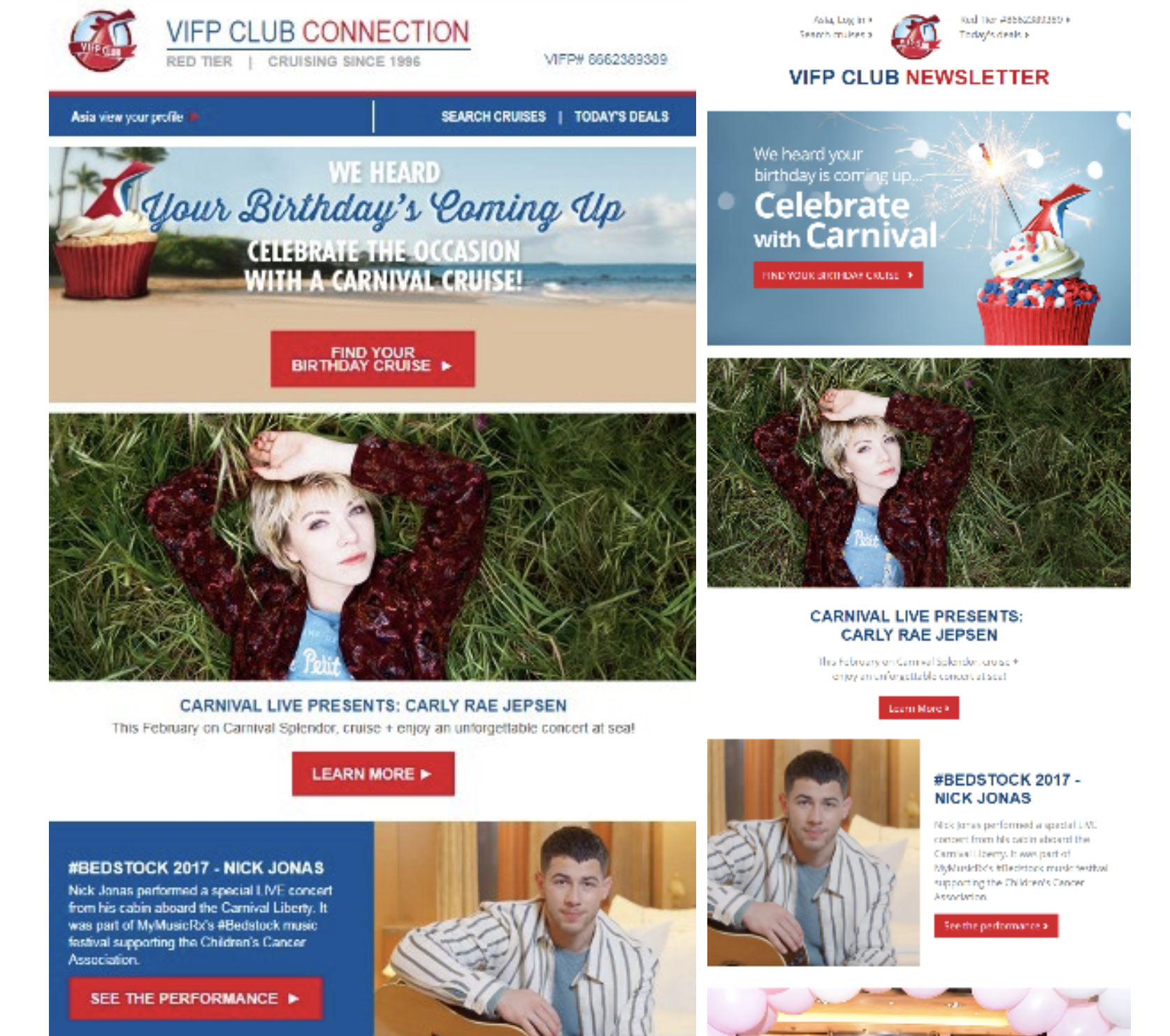
Carnival uses some A/B Testing to see which layouts and formats work best.
We try to make our changes iterative, but it doesn’t always work that way. So, we have had situations where we redesigned, for instance, a newsletter or something, and the new design looks amazing, we’re all excited about it, and the click rating is low. It’s tough when you’re completely changing it. So, we just really look at click maps and start testing different elements of it, and we continuously optimize it.
Awesome! Let’s dive into that a little deeper [yay puns!]. In terms of imagery, are you testing your images, are you commissioning those images to be made for email, are you pulling images from your database? How do you guys go about choosing images for email?
It’s a combination. We do have a database of proprietary images from photo shoots that we often use. Sometimes we absolutely have to go to stock imagery and we use some of that as well. We also use a lot of user-generated content (UGC) in our emails, too.
Do you find that there’s more engagement when it’s UGC? Or do you kind of see the same amount?
We’ve tested some of the UGC. It doesn’t always necessarily improve engagement in terms of click through rate, though sometimes it does. But, it just gives such a fun feel to the email in general, and it’s really what our brand’s about: picturing yourself there and opening up and embracing being your fun, irreverent self.
Are you dynamically inserting those images based out of Salesforce segments, or are you doing it with another program?
So everything is done in Salesforce via AMPscript. We dynamically code everything on all kinds of data points — anything from age to location.
With the UGC though, we use Pixlee. Pixlee pulls in images depending on the tag, and we insert those into emails that make sense. For example, we have a recipe email, and we show off food pics from our customers on board.
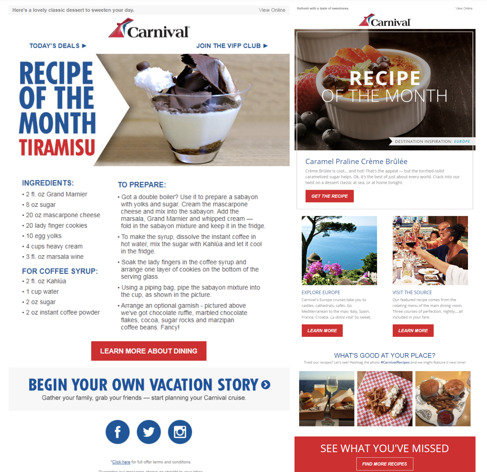
Recipe email before (left/top) and after re-design — with user-generated content (right/bottom)
That’s awesome. Do you find that it’s difficult, when you have so many different segments and different images and probably different copy… do you have different segment owners that are building different emails for each segment? Or are you trying to dynamically do that as much as possible?
Most of those emails are dynamic. The emails are getting more complex, and I imagine they’ll get even more complex, the more we develop our data.
In terms of segments, do you segment out by guest, or VIP members, or how the customer was acquired in the first place, or the channel it came from?
We target either past guest or prospect. We do geo-locations, depending on the region. We do family, non-family, and all those are done with imagery and also with copy.
Does each segment get a different welcome email?
We’ve really been working on our welcome strategy, our lead nurture strategy in general. We are trying to make it dynamic and differentiate it based on the lead source.
We’re always testing — to see whether differentiating the message for different segments maybe we haven’t thought of yet, or any new idea that comes up, any new information we may get from a partner that may drive different type of personalization we haven’t done. We’re always just testing and seeing how it works.
Can you share anything surprising that you’ve learned from those kinds of tests?
Yeah! We recently tested some age segmentation. The entire messaging was really driven around whether you were in the senior group, or a millennial, or whatnot. We were very excited about it, because we put a lot of work into variations of the copy, the imagery, and the different messaging we were putting in. And we found that results were inconsistent. So, we haven’t found that there’s been as big a lift by targeting specifically to the age group.
We also added some modules to our emails with different destinations. For example, the Caribbean, the Bahamas, or Mexico. We also added by duration, so short and long-term cruises, and we found out that has done really well for us.
So, you’re using the data somebody inputs into a quote functionality or widget, and you’re using that data to figure out destination or duration of the trip?
In some cases we do. In other cases, we’re just testing with a general audience. We have learned that geo-targeting in emails, depending on your location, has worked well for us.
How do you target vacations (destinations) to different audiences? Let’s say, I cruise quite often in the Caribbean, but now I’m kind of burnt out on the Caribbean. I’m thinking of somewhere else. How do you guys know what to serve up in an email to give me inspiration of where to go next?
In our targeted offers, we know who you are and your past cruises. So, we target based off what departure port is close to you, and we make sure to give a variety of different locations that you might be interested in. We’ll shy away from the more remote locations — Alaska will be when it’s seasonal, or the Northeast will be every now and then.
Is there anything interesting that you guys have noticed when you’re looking at ports or geo-targeting, in terms of how that helps the conversion rates or engagement or opens?
We’ve noticed, in particular, when we’re focusing on closer inventory — where it’s a little easier for somebody to get away, if they’re closer to port — when we geo-target, it drives huge lifts both in open rate and click-through rate. We’ve seen bookings lift as well.
Once somebody has booked that cruise, walk us through the process or the flow that you knew you put them in to give them hype to get them going on their cruise.
We have a completely separate series dedicated to booked guests. It’s basically this very flexible and dynamic program where we target guests based off of who they are, whether they’ve cruised with us before, if they’re sailing with their family, if they have spent money in the casino in the past… We make sure to target them with very relevant messages that both engage and excite them — whether it has to do with onboard activities specific to the ship that they’re sailing on, ports of call specific to the itinerary that they’re sailing on, or onboard entertainment, etc.
How many emails are you typically hitting someone with, before they leave, after they’ve booked?
We have perfected a specific cadence, so that we can hit specific dates based off of how long the booked-to-sail window is, which is essentially how soon before they’re sailing did they book their cruise. That’ll determine how many emails they get. We send our first email out three days after you’ve booked, and we’re going to send you emails up until the day before you leave.
Does the messaging change based on the season that they’re traveling in?
We make sure to target our messaging, specific to where you’re going to be, what the temperature’s going to be like, what you need to pack, etc.
The booked-guest series of emails is probably our most sophisticated emails, just because we know so much about the itinerary you’re booked on, and also if you’ve cruised with us before, we know information about past behavior. So, there are over 1300 of permutations that you could get within the series.
I just feel bad for who’s putting together that logic tree…
We have an amazing data team, and the logic tree is built, and it actually, without giving too much detail, does use a different system in the middle of it that helps us kind of manage all the dynamic elements.
Lesson Learned: Geo-targeting is where it’s at, kids. But if you aren’t selling anything geo-specific, then at least tell your boss to let you experiment more, test all the things, and hire a team (or at least a buddy) to get your data working for you.
