Email marketing deep dive with Megan Boshuyzen
Matt Helbig and Mailgun’s Megan Boshuyzen unpack Email Camp, showing how accessibility, live text, and smart CTAs turn event emails into signups.
April 10th, 2020
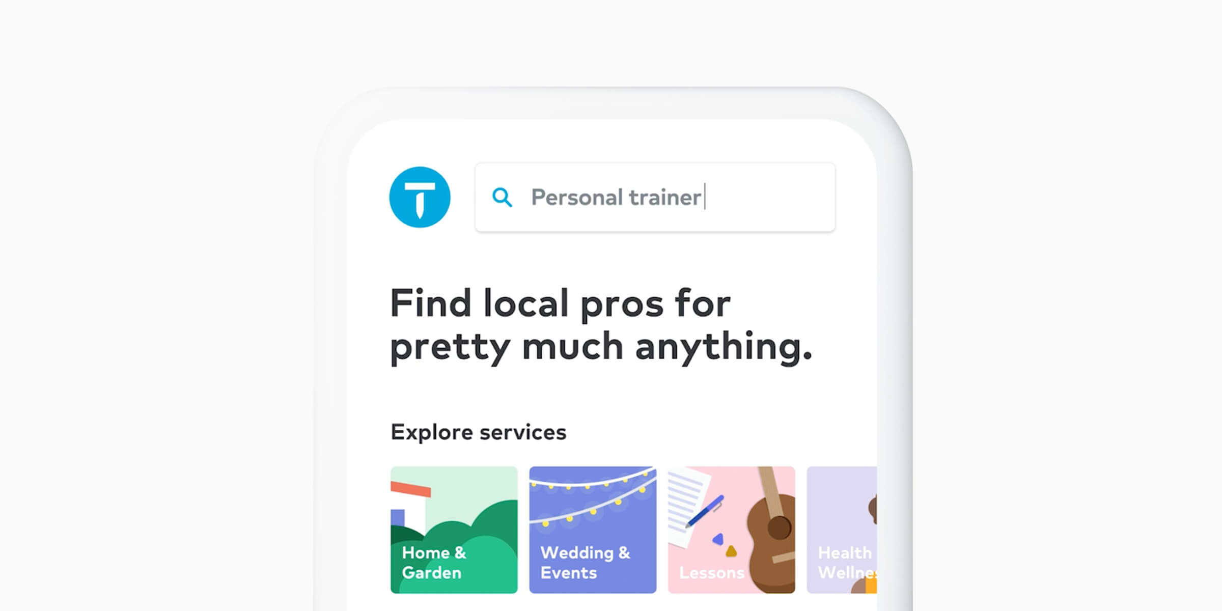
This week we look at Thumbtack emails.

Matthew Smith: Hey, happy Friday everybody . Hope that things are doing well out there in crazy land. Things are wild right now, right? We're in this crazy pandemic, but Feedback Friday is still here. Just happy to dig into some emails today. So let's check them out together.
A set of emails that I'm excited about, that I've been following along with and I've been super impressed by is from Thumbtack.
So let's browse through these here today. This first one is a little bit older. I've had it sitting around, so it's not exactly present, but it's from the summer and just beautiful, in the way that they pulled a bunch of things together. I love this clever illustration style that's really done by paper and then we've got this opportunity to see what else is going on.
These little call outs. One of the things that I think is effective here is just the simplicity. The typography, right? They make things so easy to read and see. I get a jump in with a home services or services oriented business, you know, very quickly I want to start a summer project.
It just gets out of the way. I think that so many emails are just overly complicated, right? This promotes some simple ideas and helps you do something very clearly. There's an opportunity to follow up here. What's on your to do list that might be not a summer project, but again, these little paper illustrations are fantastic. They just catch my eye, you know? And I think that something fun is happening there. I kind of want them.
Simplicity is something that we can all keep in mind for a lot of our emails. How can we reduce the clutter? How can we get things down to the lowest common denominator and focus on that and then test on that and try a new thing.

So let's jump over and see some of what else they're doing. So this is a more transactional email, right? I asked for a fireplace and chimney cleaning situation. Didn't end up finding anybody in my local area. I live in a small city. This was just a fantastic transactional email to help me see where I was at.
Notice that they have a style here like of their heavier, stronger CTA, and I appreciate that they didn't overdo it here. These ghost buttons. There's some debate about, whether they work or not. I think that they work well. Here it gives me options. Hey, what happened? Did I find what I was looking to do? Am I done with my project? I found a pro. I'm still deciding. I'm on hold or canceled, like I get it sort of see where in the path I am and then that choice is going to put me into the right segment to help them understand what they need to do for me. They're asking me, they're like trying to get to know me and then, Hey, do you still need to do more of this?
They put that into a separate section. Look at the hierarchy and the topography here. It's just simple to keep track. Now everything's sort of center aligned and I think it works. This measure here, the number of characters in a line is called a measure in typography. So the measure here is a little long, especially when it's so short here.
I would probably make that a little shorter to fit a little better. Like this, to keep it a little tighter. You can even just do that with a hard return or a breaking rule, <br> tag. They follow it up with, recommended for you. Now this is a little wacky. I know they'd probably have a component here that is always left aligned.
The line here helps that, that makes it look okay. It's a little weird that we go centered, centered, centered, and then this is the only thing that doesn't feel centered, even though these are left aligned, which is appropriate. So if I were going to do that, I would sort of put a little different section type on here.
But I mean, I'm being super duper picky there. It looks good. I'm pretty impressed with it and I think it gets the job done right? Like I'm hiring this email to remind me, Oh yeah, I still haven't found that person, so I'm gonna get more help. This serves me. This is a service oriented email. It's about me, and of course it helps them as a business.
All right, let's jump in another one. So let's see what we think of Thumbtack, right? Like they want to know if Thumbtack is working. So I can follow up on that and get a bit more dialed in. Different set of illustrations here, but in the same family, right? Like, not a total derivation from where we were before.
And then they just gave me some, probably some different components that they have in their system where this is a component that says, Hey, gives me some ideas. Right? Like, Oh wow, I didn't think about hiring movers through Thumbtack or carpet cleaning or house cleaning. So this is jogging my brain. If I don't have those tasks on my mind, it helps me think about what's next and I think that's impressive.
Another way of doing that is talking about. What other people are doing something that's popular. Interior painting, massage, dog training, fence and gate installation. But look how simple these are. They have such a reduced sort of palette for everything, and I think that's impressive.
The only thing I would say here, I think doing two up even in mobile would've worked just fine. Many times people default to just a huge list. I think that when you're on your phone, oftentimes you can reduce the size of like an image like this and stack them. And I think you can do just as fine.
So I would keep the same relationship there. But anyway, I'm just super impressed. Good job. Thumbtack, simple, simple set up here. They follow all the great rules that I like, which is, you play design golf, get things as simple as possible. Note that they have a strong CTA here and the same color for their sub CTAs.
I think that's impressive. The only thing that I would probably push on them would be. To get a little content that feels a little less stocky. This photography feels pretty stock photography. I think that they might be able to convert a little better if it was a little less something that just feels like they got it off of a stock site.
That's an interesting test. Some of these, again, still feel fairly stock oriented, right? They don't feel personalized. And my guess is that, based on my experience with stock photography, that something like that would convert a bit better if you had photography that felt more like real people receiving services, but that's also harder to scale.
Anyway, good job, Thumbtack. Feedback Friday over and out. I hope everybody has an awesome weekend. Somehow enjoying their lives and enjoying this new thing that we're doing. Reach out @whale. Let me know if there's anything I can do to help and keep sending fantastic emails and let me know what you'd like to hear differently or what I can cover that would help you make your emails all that much better.
All right, bye everyone!
Categories:
Feedback Friday
Matt Helbig and Mailgun’s Megan Boshuyzen unpack Email Camp, showing how accessibility, live text, and smart CTAs turn event emails into signups.

Accessibility, applied: Matt Helbig and Kelsey Yen reveal how inclusive design turns real emails into better user experiences.
Dive into the world of unmatched copywriting mastery, handpicked articles, and insider tips & tricks that elevate your writing game. Subscribe now for your weekly dose of inspiration and expertise.