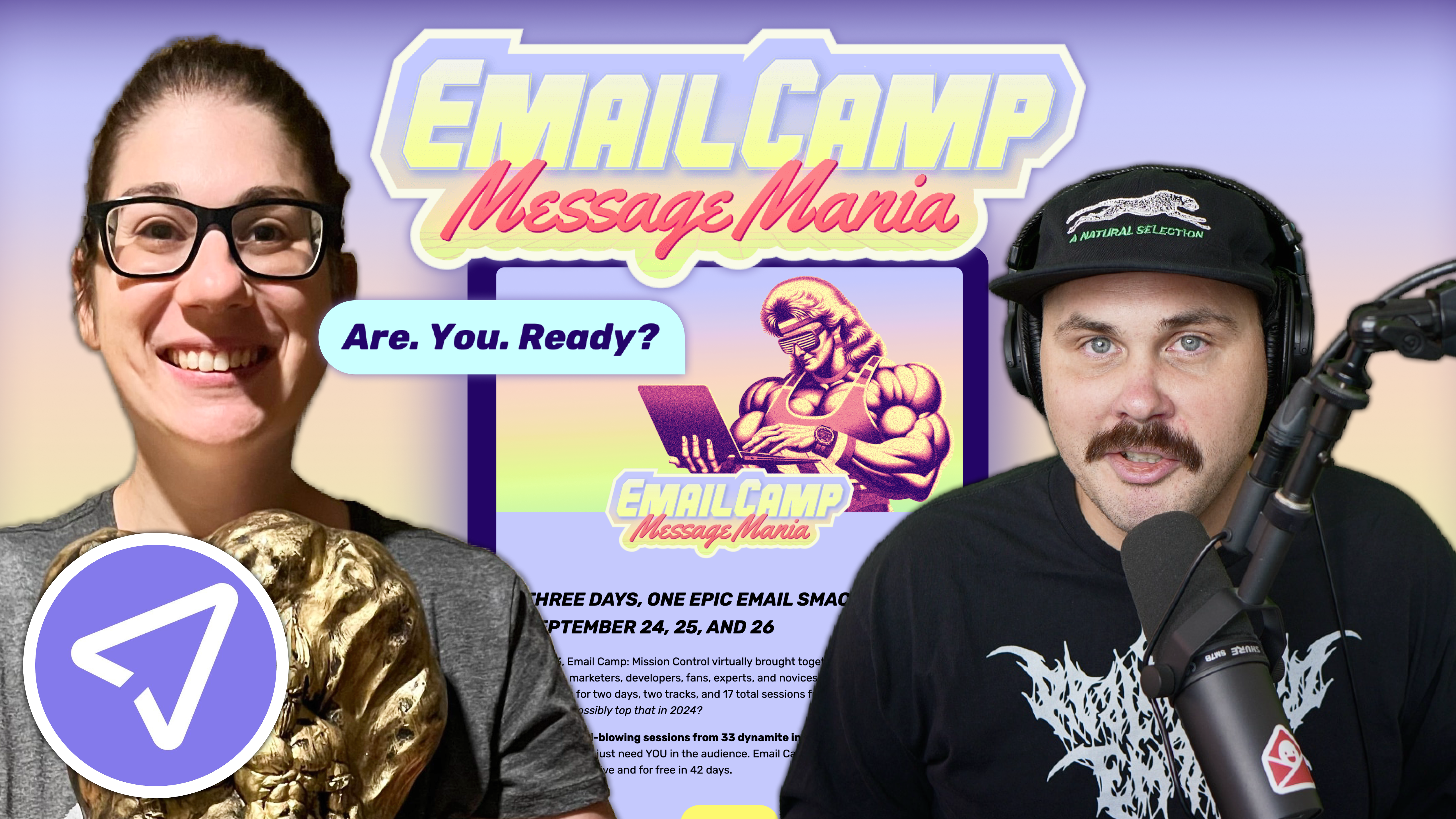
Email marketing deep dive with Megan Boshuyzen
Matt Helbig and Mailgun’s Megan Boshuyzen unpack Email Camp, showing how accessibility, live text, and smart CTAs turn event emails into signups.
October 27th, 2021
This week we look at Output's SaaS emails for musicians.

Hey, what's up, Matt Helbig from Really Good Emails here. We've brought Feedback Friday back from the dead for a spooky Halloween episode. There are no Halloween emails this week, but there is a new brand that we've been featuring on the site that I've been digging. So I thought it would be fun to take a look at these emails.
I have these Output emails uploaded into my private library on Really Good Emails. Output is a software service for musicians and their emails just really caught my eye. So let us walk through a couple of examples.
So in this example, great use of live text here. Very simplistic email. I enjoy this inverted pyramid driving into that "Check it out" call to action button and keeping the center text short. This color combination of the background and the text is making it almost pop out to me.
It's a perfect fit for keeping your header a particular color and then switching it up in the body. That CTA is super clear and bulletproof. It would have been nice to see a little hover effect on that. Very techie imagery showing off some of their software. Rounded corners on the imagery leading down into a very clean footer down here.
The footer shows some of these additional links, a little grayed-out privacy and terms and conditions, taking your focus away from them, which is fantastic—then leading down into this bottom social section right here. Nice branded colors to match the rest of the email. Very clean email, very simplistic. A lot of these follow the same layout but switch up the background color. Sometimes really using color like this yellow, but I think some of this all-black sort of dark theme are some of my favorites.
So I know this one has a GIF. They cycle between these different sections. It looks like they locked it up into an image just because of this gradient that they wanted to try out. I know gradients can be hard to do with code, especially to have that support everywhere. So they locked it up on an image, which isn't the best, but I think it works out pretty well for this use case.
They do have this GIF to catch your attention. It looks this all goes to the same place. I guess it's a fun way to catch your eye and show you some different examples of what the software does. A clean image here using those rounded corners, again, really makes this stand out to me. They have that same footer on this all-black template, and it looks super clean. I'm a fan of this shorter style of email.
Let's look at one more example here. I think we're going to try this yellow one to see how Output handles that. So for this one, they didn't do live text again, which is a bummer. I'm guessing they had some difficulty doing the 50/50 layout. But this could easily be live text like they had before.
You might have to figure out, within your template, how to split these two sections. Excellent use of drop shadow here with the rounded corners. Again, I liked this inverted pyramid to the "Buy it now" CTA. Pretty solid CTA copy.
Unique play button. We do say to try out a play button on videos. It gives you an indicator to click on something, a little different here with this unique shape for this video, but it stands out to me. I think it would be cool if this had a few seconds of the video playing as a GIF. Unique style of play button here. A good idea to add both the "Check it out" button and this play button if your goal is for your subscriber to watch a video.
Overall an excellent brand to check out. Take a look at their emails and if it matches your brand, try some of these layouts and use colored backgrounds. I'm a big fan of this brand.
If you're interested in getting more email examples to inspire you for your next campaign or adding some of your own, subscribe to the pro account on Really Good Emails. Create an account, and start collecting different email examples, like this Output one. You can save this one right into a collection, and it will be ready to go once you start your next email campaign.
All right. That's it for this week. Thank you all for joining this special Halloween edition of Feedback Friday. Not very spooky, but I hope you all have a great weekend full of haunts. See you. Bye.
Categories:
Feedback Friday
Matt Helbig and Mailgun’s Megan Boshuyzen unpack Email Camp, showing how accessibility, live text, and smart CTAs turn event emails into signups.

Accessibility, applied: Matt Helbig and Kelsey Yen reveal how inclusive design turns real emails into better user experiences.
Dive into the world of unmatched copywriting mastery, handpicked articles, and insider tips & tricks that elevate your writing game. Subscribe now for your weekly dose of inspiration and expertise.