Email marketing deep dive with Megan Boshuyzen
Matt Helbig and Mailgun’s Megan Boshuyzen unpack Email Camp, showing how accessibility, live text, and smart CTAs turn event emails into signups.
January 10th, 2019
Airbnb is a vacation rental company that offers online booking arrangements for lodging, homestays, and tourism experiences.

This FF episode was sponsored by Email Monks.
📋 TL;DR key takeaways from this episode:
1. Using imagery with personalized data can celebrate customer appreciation, making your audience feel closer to your company and the community.
2. Create a clear hierarchy for scannable text. Use big, bold headings followed by subheading text and then illustrations or icons with chunks of info to help balance the content. This structure can help lead your audience into your message.
3. Make your social share ask compelling. Provide stats, include a fun GIF, create interesting content. Give your audience a reason to post your company news on social media in a way where it’s a natural share.
Matthew Smith: Well , Matt Helbig and Email Geeks its another Friday another Feedback Friday.
Matt Helbig: What's up?
Matthew Smith: I'm such a big fan really like fanboy fan of what Airbnb has been doing for a long time and their emails. They and Pinterest I think are always pushing the limits of what's possible.
This week just like last week, I want to talk about some things that are happening that are actually in this really really good category where things are interesting, they're doing great personalization, they're doing great typography, good design. It's intelligent and it serves the customer.
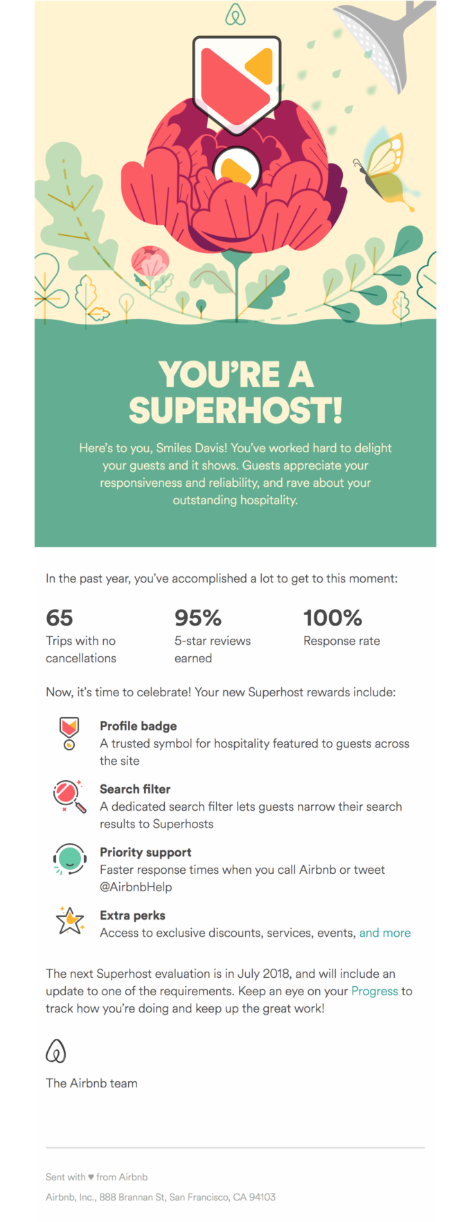
I got this email. You know, I'm a host and really interested in building more. I'm going to add another one this year and hopefully some more in the coming years and I was watching this little GIF here play out over and over and then it dawned on me wait.

This little coin this little badge actually shows up in South Carolina and I'm thinking hey, that's where I live. It's like oh damn, they actually do that intentionally. And so this is a unique GIF for me. It's subtle. They don't even point that out. And in fact, I would argue they could probably point out a little better.
Maybe they didn't because if they get it wrong, it looks bad but in this way if I catch it's freaking cool, right.
Matt Helbig: I'm impressed. Even if it's not it's still a very nice GIF. But yeah, that's like a interesting level personalization.
Matthew Smith: I hadn't thought about it until we started talking about it.
I wonder if that's why they left the text off about it being, you know your space in South Carolina. I guess they should know because it's being sent to me based on my ID based on my booking. The question would be what how what do they do if I've got bookings in different states? I don't know, but regardless I was pretty impressed. I would venture to guess that for most Airbnb hosts, they have one or two places in one city, but this is very cool. And also note that the map when it's further out into the world. All those little dots are places from people that have stayed at my Airbnb.
Matt Helbig: This is like what people should be using this image personalization for. We always see like hey FNAME. That works okay, but this stuff is really like surprise and delight sort of stuff.
Matthew Smith: That's right. It feels intentional. It feels thoughtful. It feels connecting to me. The other thing too is I think that there's probably a business for somebody to start right here, which is developing motion graphics that can be converted into video or GIFs or other things that is personalized.
It's using data but being able to translate that to email and or our friends at NiftyImages could develop something like this. They're obviously doing so much personalization in e-mail already. If you haven't used NiftyImages, we definitely recommend it. It's a really interesting tool to create or to utilize this kind of thing.
Not this sort of level of motion graphics, but using imagery with personalized data. It's fascinating stuff. So as we keep going one of the things that I really like about this email is we've talked about it before but it's just real clear hierarchy and everything is in text.
Airbnb. They already have a Sans serif font to start with so they can utilize some basic system fonts without having to go cuckoo. I think probably this lightweight. It might be a system finally didn't do inspector, but just right off the bat like they're just taking care of those details and it keeps their emails pretty light.
I imagine that GIF up top is fairly heavy size-wise. So some these things keep the email size for the kilobytes low. They're just doing a great job of leading me and telling me what's what if all I want to do is just see this. Wow, that's neat. Okay, I can react to it right here. And that's kind of fun.
Matt Helbig: Those social share things are a lot more compelling than emails we've seen in the past that ask you to share right away. They really provided you some cool stats a fun GIF. Now I'm really motivated to share this with my network.
Matthew Smith: That's a really good point Matt is it's really interesting when there's more of an opportunity to say.
Hey here is this interesting information. Would you like to share i? Rather than share. And like what am I sharing ? It's almost like somebody walking up to you and be like, hey, hey Matt, it's nice to see here for lunch. Will you yell out to everybody how much fun you're having but we just we haven't even started lunch.
Like what are you talking about? It's weird. So why would we do that? So instead create enough content create enough interest where that's just a natural enjoyment where somebody would want to share. Hey look at all the cool places I've had guests from. That kinda stuff. Digging in, again, we've talked about this with the Coinbase email last week, but really great simple heading hierarchy so darker and bold and bigger headings and then a nice subheading or subtext that goes across the view and kind of create some balance and then just really simple little chunks of information again, when we use headings we create scannable content, right?
So oh marketing to guests that interests me, or maybe it doesn't. Social Spotlight meh don't care. Ohh Airbnb magazine. Yep. I want to read more about that. Tell me more So that scan-ability helps me to pretty quickly decide. What do I want to read? What do I don't? I don't have to digest the entire thing.
Which for a busy person like. Yeah, man. I get bored easily. I have some ADD and I'm like, I don't think so. I'm not going to read this too much to read so scan-ability helps a ton. Illustrations, icons, they just feel like they all belong. They're all the same type and then like what we talked about last week.
You've got nice white space between these I would even increase that if it were me by another 10 pixels or something like that between these just for a little bit more breathability. Now the heading really helps like create. Okay. This is the next chunk of information and the fact that the space underneath social Spotlight here is less than what's above it that makes all the difference. That's really all you need. But again, I would probably increase it just a little bit.
Matt Helbig: My only feedback in that section would be I thought there would be links on each of these sections but that bottom. if you're going to mention Airbnb magazine maybe link to it or something, but I think that bottom kind of catch-all link that says, the Superhost week. yeah, definitely captures all those points and probably puts you to a nice landing page.
Matthew Smith: Yeah. That's a good point. Some of this stuff isn't real actionable, but I wonder if they could say like we did last year or like this article we wrote and those kinds of things right? I think learn more about this change and Superhost week. I would have put a little bit stronger CTA. On something like that, but maybe somebody along the line said now that's too strong to do a button.
One thing that I've noticed that Airbnb has is they have a design system. So they're extremely tight about the topography which means that they're able to create and send their emails much more rapidly They are worrying more about content rather than how it looks because they figured out the system for how it should look so that's pretty cool.
Matt Helbig: Yeah. I really like that sign up. There's a lot of really great copy throughout this entire email. It's really thoughtful it seems like. As you said, I think a lot of their emails are built on that same templating system. They all feel really consistent across both the host and the guest side. They all feel very thought out and mindful.
Matthew Smith: Yeah, that's right as we mentioned last week. I'm impressed with a big company like this not having a bunch of legal mumbo jumbo in the bottom. That's always something that I think is really valuable if Airbnb can do it without a bunch of legal. So can you. If legal on your team says you need a bunch of copy see if you can get away with just linking to the legal on your site.
I think that is my hypothesis. I have no legal background. My hypothesis based on working at a lot of big startups is that legal just needs to be available. It doesn't have to be readable in that email. So don't obfuscate it. Don't try and hide it make it a clear link, but there's other opportunities.
And again, it's more kind to your visitor. It's more thoughtful. They can see the legal if they need to because most of that legal is not about the customer. It's not actually serving them. It's just covering the companies butt. Cover your butt in the back room not in front of everybody. Well, maybe that doesn't work out.
I don't know maybe that metaphor falls apart. Cover your butt all the time probably but just in real life, not legally.
Matt Helbig: The entire idea behind this email is customer appreciation. Airbnb doesn't seem to have a business goal in this entire thing. They want you to share on, Twitter and maybe get some additional hosts to sign up that way or something like that.
But this is a just a very customer centric email to send its really celebrating the Superhosts and their community and everything else. Compared to a lot of the other promotional emails that we see people do or things around holidays. This is just a celebration of Superhosts and building Airbnb as a brand and they do that super successfully with this email
Matthew Smith: 100% I think you're right. As a Superhost I've been really thankful for the way that they treat us. It's a lot of hard work to get there and to maintain that but it's worth it. It's good for them to support those of us who try harder and like push it further, but you feel it you feel well supported. So this is cool.
Matt Helbig: They have so many ways to communicate with you and it's interesting that they pick email pretty consistently to communicate a lot of these messages to you. They have the app. They have the web everything else but I think their focus on email especially definitely stands out compared to a lot of other brands .
Matthew Smith: I hadn't thought of that until you said that but you're absolutely right. I don't get any of these kinds of messages in app. This is the way they communicate to me. They do have a all-hands-on-deck host community event where you can watch online and I've not done that I'd like to but this is how I learn about that too.
It's funny to hear people always talk about like email some day going to die and I just think no. We haven't even hit our stride. There's so much opportunity and the more that people communicate thoughtfully like this more I believe that. All right dude have a great weekend. We'll see you next week.
Matt Helbig: Great. See ya.
Matthew Smith: Chow.
Categories:
Feedback Friday
Matt Helbig and Mailgun’s Megan Boshuyzen unpack Email Camp, showing how accessibility, live text, and smart CTAs turn event emails into signups.

Accessibility, applied: Matt Helbig and Kelsey Yen reveal how inclusive design turns real emails into better user experiences.
Dive into the world of unmatched copywriting mastery, handpicked articles, and insider tips & tricks that elevate your writing game. Subscribe now for your weekly dose of inspiration and expertise.