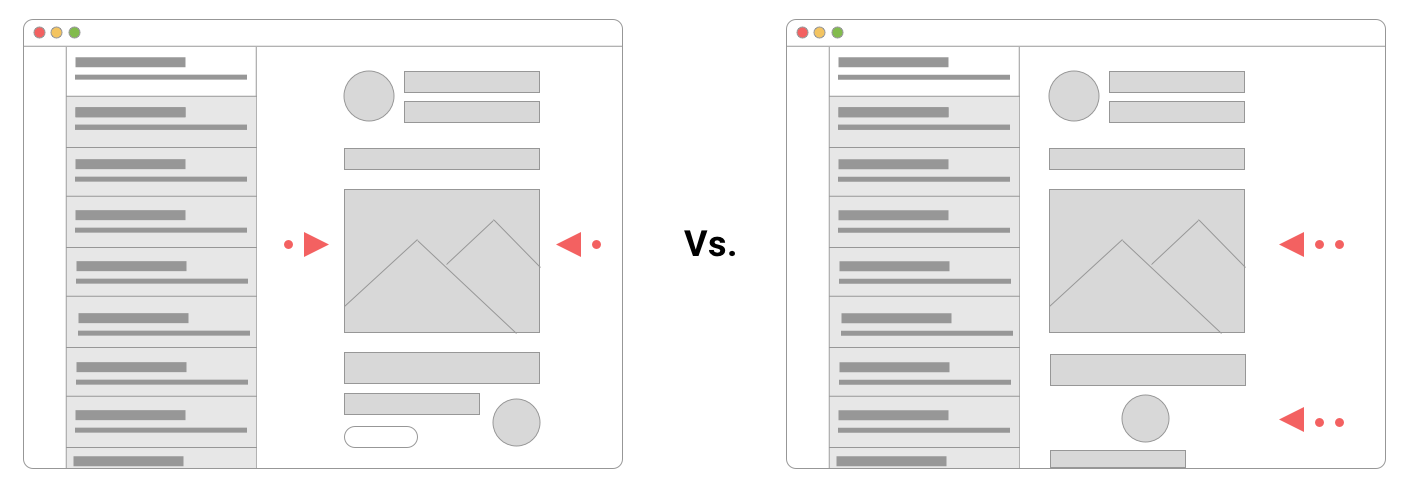
Let's imagine that you just spent hours conjuring up a kick-ass email. But as you go to send it, you notice that the preview that just hit your inbox looks off. Maybe an image is misaligned, there are broken layouts, text is underlined when it shouldn't be, or there's more added to the footer that makes it look terrible. Welcome to the world of email rendering. You would think that after almost 50 years of emails being sent that we'd have a solution for this.
You'd be wrong.
Unlike other visual mediums, email's complications come from how different systems interpret the code of the email. If we bundle webmail clients together with browsers, there are five major factors that determine how an email renders:
- Email service providers (ESP)
- Operating systems
- App and web-based email clients
- Screen sizes
- Images enabled/blocked/dynamically inserted
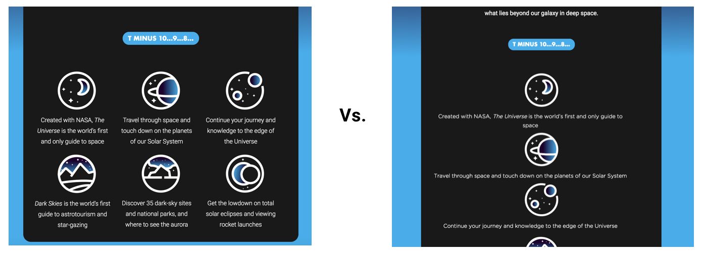
Unfortunately, when emails are submitted to RGE, we view them as if they were made for the web - meaning that we don't take into account all the issues that may come from the designs appearing in different places.
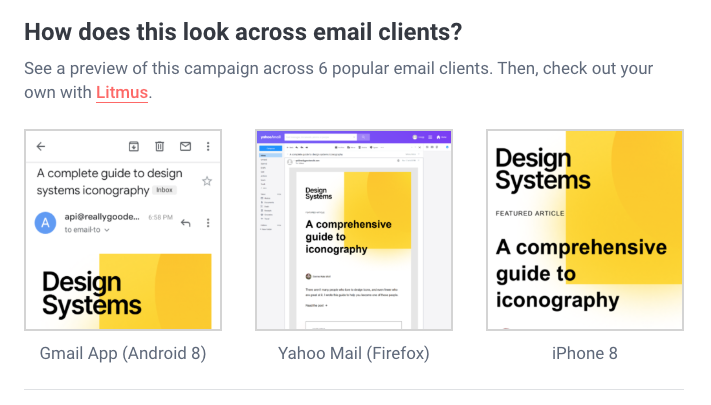
That's why we teamed up with Litmus to grab the inbox previews of some of the most popular clients (more of that below) so that everyone can use this information when they are basing their inspiration off of an email on RGE.
To get started, just simply click into any email and look to the right hand side. You'll see something like this:
By simply clicking into the preview, you'll see the full view plus three other popular clients including Outlook, Outlook.com, and iPhone X.
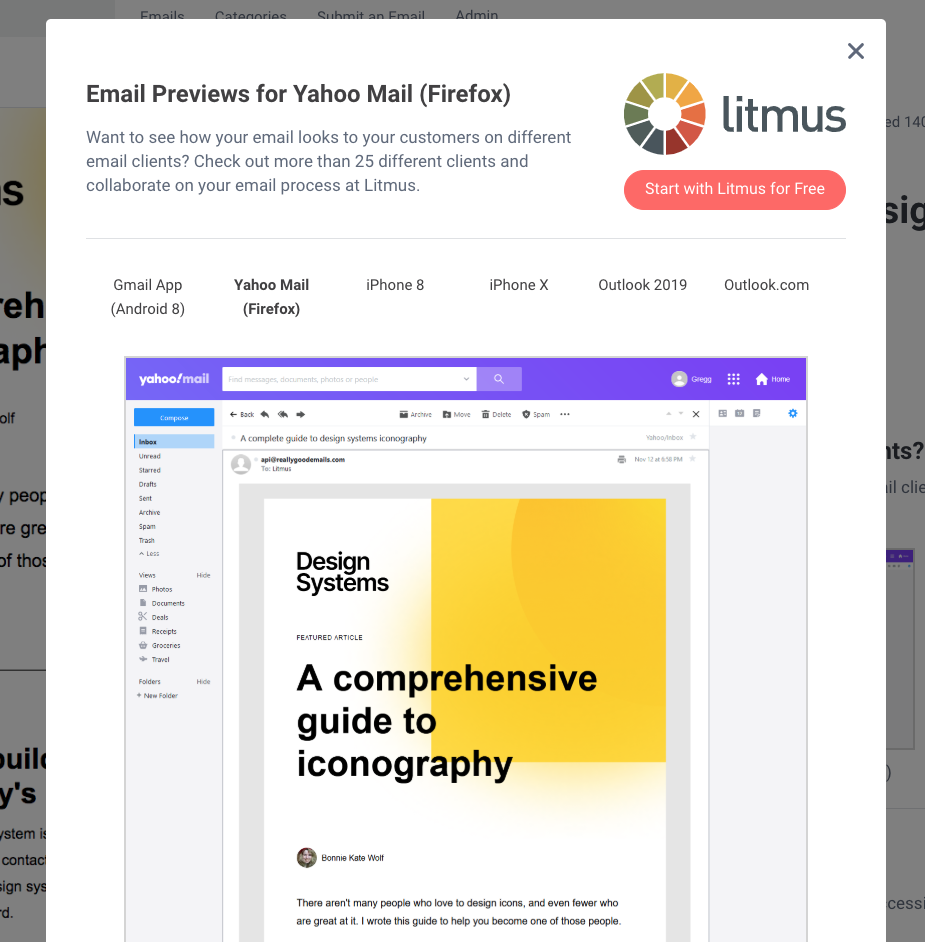
Now, geared with information on how the design looks in the most popular clients, you are ready to rock-and-roll with the code of the email to make your own version or be inspired to take certain elements and use them for your own reasons.
But, we know you didn't come here just for that. You came here to know why emails look differently based on where you open it. Here's how those 5 factors we mentioned earlier impact your emails:
Email Service Providers (ESPs)
Did you know that your ESP often will change your email's code as you send an email? This is typically a good thing so that they can add tracking pixels, rewrite links or remove code that gets emails stuck in spam filters. But, as with any unchecked changes, these can also be bad for how emails show up.
When the typical brand uses about 2 different email marketing platforms to create an email, that is double the places that an email can go wrong.
Operating Systems
The OS of your subscriber’s computer, tablet, smartphone, or other device limits or enhances the capabilities of the email client that sits on top of it. While a handful of major OSs dominate the market, many different versions of those OSs are in use by consumers. For instance, Windows 10, 8, and 7 all have considerable market share.
App and Web-based email clients
If you want to get to the heart of email rendering, then the client is where you want to focus your attention. Email clients, such as Gmail, Hotmail, Outlook, and others can run in desktop, mobile, and web environments. Web-based email clients have an extra layer of complexity because they render differently in different browsers. For example, Gmail functions a little differently depending on whether a subscriber is using Chrome, Firefox, Internet Explorer, or Safari.
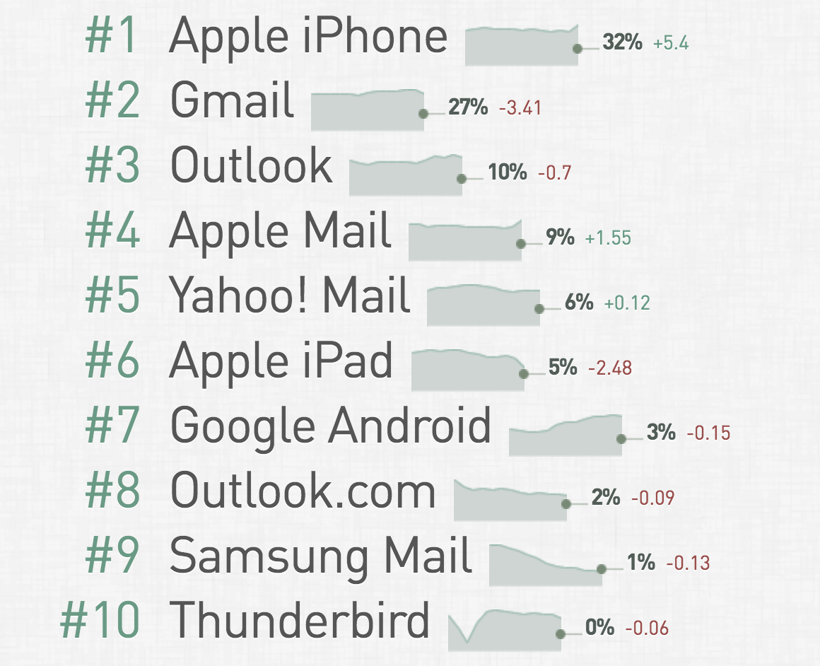
Litmus has identified about 1,000 webmail clients around the world, plus roughly 250 mobile email apps, along with a much smaller number of desktop email apps. Realistically, Apple holds the largest amount with the most market share.
Screen Size
The size of the subscriber’s screen or monitor also has a big impact on email rendering. Interacting with an email on a 21-inch monitor and a smartphone with a 4-inch screen are dramatically different experiences.
In the smartphone category alone, there are hundreds of unique screen dimensions. To simplify things, let’s assume there are just 5 screen size categories that we care about: desktop, laptop, tablet, phablet (phone-tablet hybrids), and smartphone. That is still 5 different things we need to check to make sure that a design is being responsive.
Disabled Images
Images can be enabled and blocked in many email clients. This generally creates two very different renderings of an email—sometimes wildly different renderings. Usually, due to their email client’s default setting or a personal preference, images are blocked automatically for many subscribers, leading to emails that lack the ability to immediately communicate and make an impact, or even looking broken.
Dynamically inserted Images
Lastly, if you are running an email that has personalization (such as tailoring images based on the user's preferences), then you are looking at even more issues that could arise if your data and images are not standardized.
--Let's do the math--
If we put all those factors together, we get…
2 email marketing providers x 15 operating systems x 50 email clients x 5 screen sizes x 2 image states = 15,000+ potential renderings.
It's important to keep in mind that you don't need to test for all 15k potential renderings. That would take way too long. However, you should notice where your subscribers are opening and make sure that your email doesn't look like garbage when they open it up. We hope by providing a few previews with our growing catalog of really good emails that you can see how others are doing this and what you may want to keep an eye out.
As always, thanks for reading!

