Email is like sushi: simple ingredients rolled up together in one experience. But as you look closer, you can see how each item is chosen for impact and purpose. There are items for taste, items for texture, and items for function. And like cheap sushi, you can tell when it isn't prepared correctly.
Not everyone can make exceptional sushi. About ten years ago, Netflix presented a documentary about an 85-year old chef who was still crafting his trade (titled "Jiro dreams of sushi"). He was so meticulous about every element of the experience that it landed him with 3 Michelin Stars. People from all over the world would fly in to eat at his restaurant.
What made Jiro successful wasn't that he had a secret ingredient, but rather the planning, preparation, and focus on the customer. After all, he was making this for them, not him.
"When we have good tuna, I feel great. While I'm making the sushi, I feel victorious." - Jiro
Standing behind his counter, Jiro notices things. Some customers are left-handed, some right-handed. That helps determine where they are seated at his counter. As he serves a piece of sushi, he observes it being eaten. He knows the history of that piece of seafood and how it was prepared (for example, he knows his staff has recently started massaging an octopus for 45 minutes and not half an hour).
Similar to Jiro, email is all about the reader and their experience. It can be daunting trying to think of where to start when you are trying to compare yourself to masters in the field, but it doesn't have to be that way.
Start taking a look at emails in your inbox that you find really good. What do they have in common? What can you grab from these and apply to your own emails?
Here's an example.
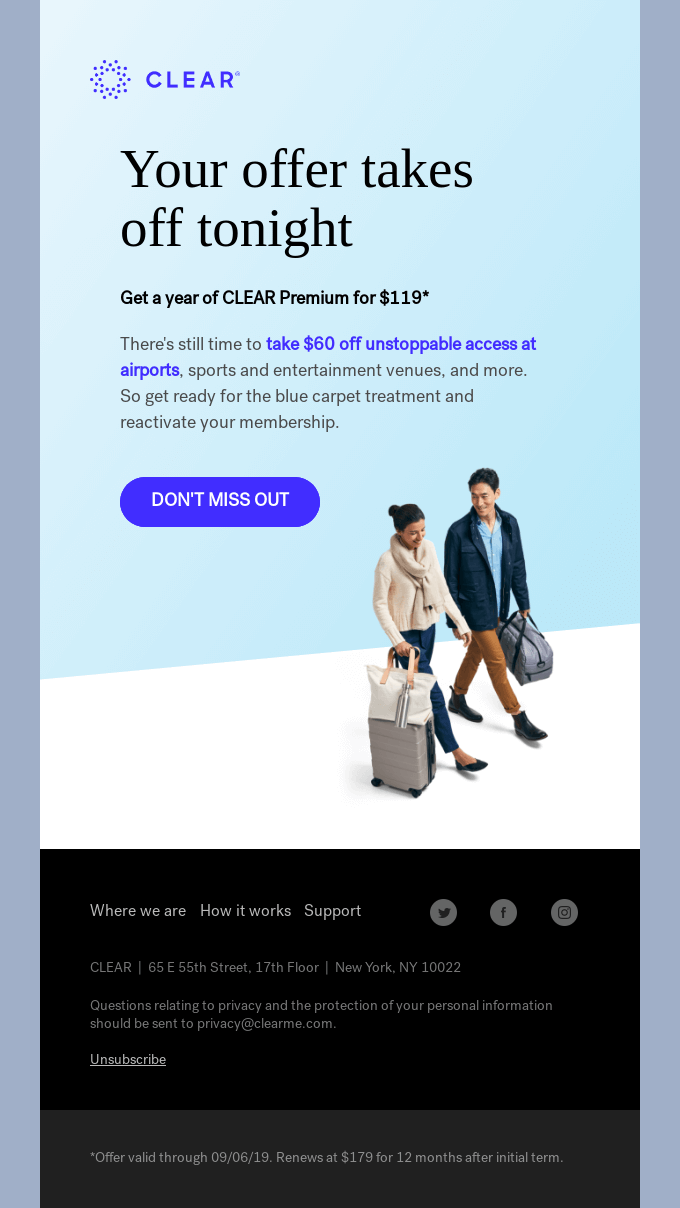
Going through my favorite emails the other day, I came across this email from Clear:

There's a lot going for this email: Live text, large CTA button, great color choices, image overlays, white space, timely messaging with urgency, and visual hierarchy. All of these things are held together with "the rice" of email, known as the code. If we want to look at any of these elements more closely, we'll need to pull it away from the HTML that is surrounding it.
Here's how you do that in RGE:
In the top left corner of every email on RGE, you'll see a "</> View Code" button. Here's what that looks like for this email we've been looking at:

Unlike the details view, here is where you can do some heavy dissecting because the code and email are being rendered in a live state. You'll see editable code on the left, and the email on the right.
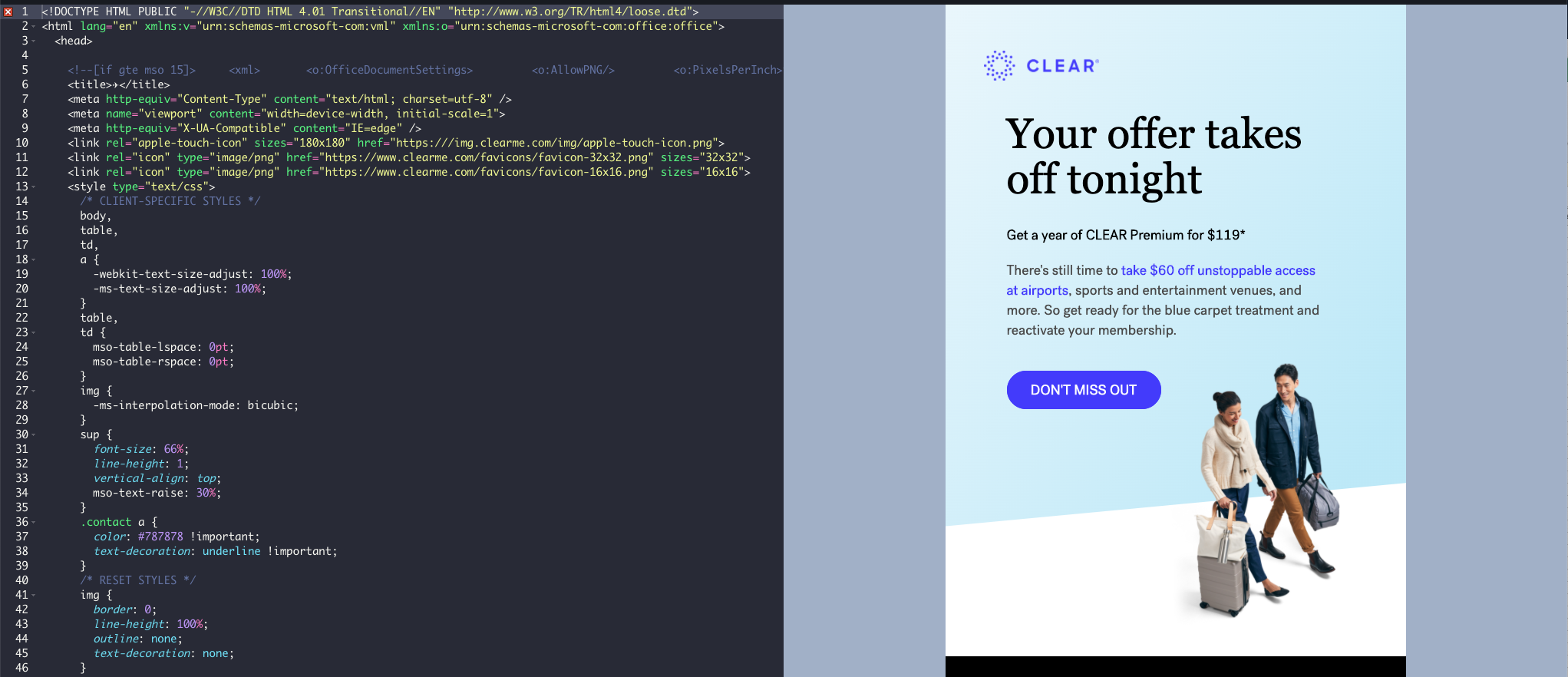
Much like sushi, you don't need to look at every grain of rice to understand what kind of roll you have - you just need to look at the big stuff. In this example, there are a few different things we can search for in the HTML, so let's start with the leading text "Your offer takes off tonight". Click into the code area and then hit command+f (on apple) or ctrl+f (on windows) to bring up the search bar in the top right corner of the code viewer.
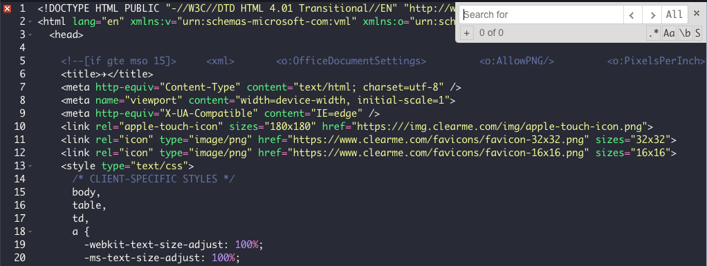
From there, search for the thing you are looking for, such as the text that the email starts with.

You can learn a few things right off the bat from this:
- The font being used is Lyon Text Regular 2 and the size is at 55px.
- There are no line breaks inserted between the words "takes" and "off", meaning that the text is wrapping naturally.
- The color being used is black (#000000).
- Most importantly, that the text in this email is coded (not baked into an image) so it is editable.
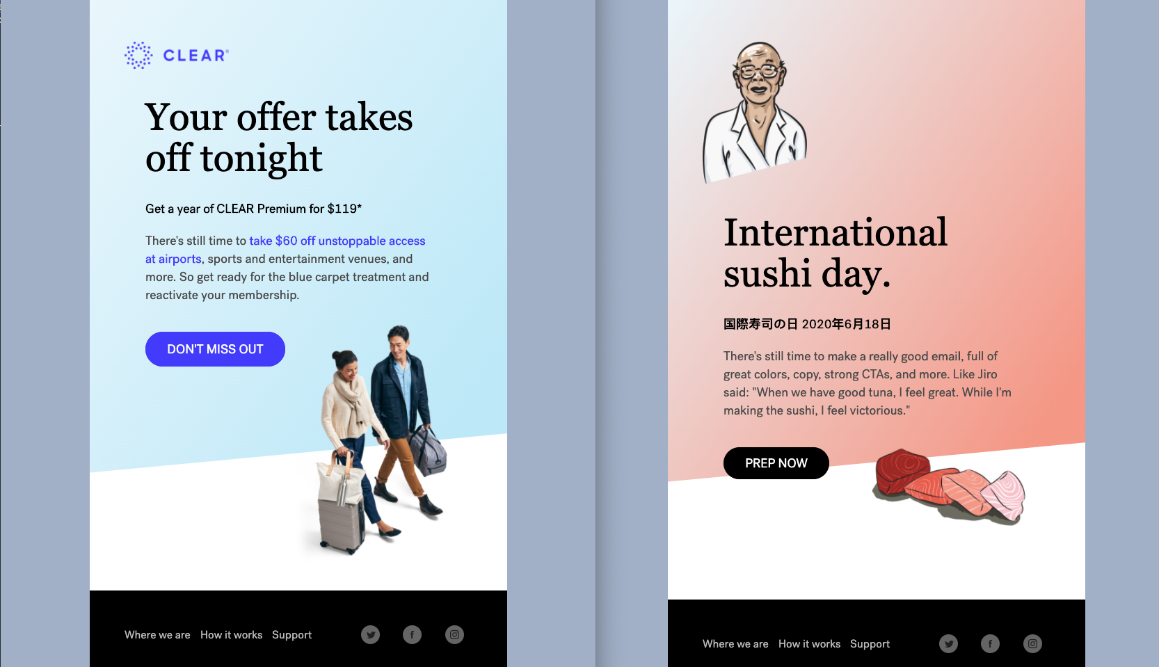
Let's go in there and change the text to our liking. Select the text you want to change, erase it, and write in what you want. For example, we could change that to "International sushi day" and see it rendered on the right side instantly.
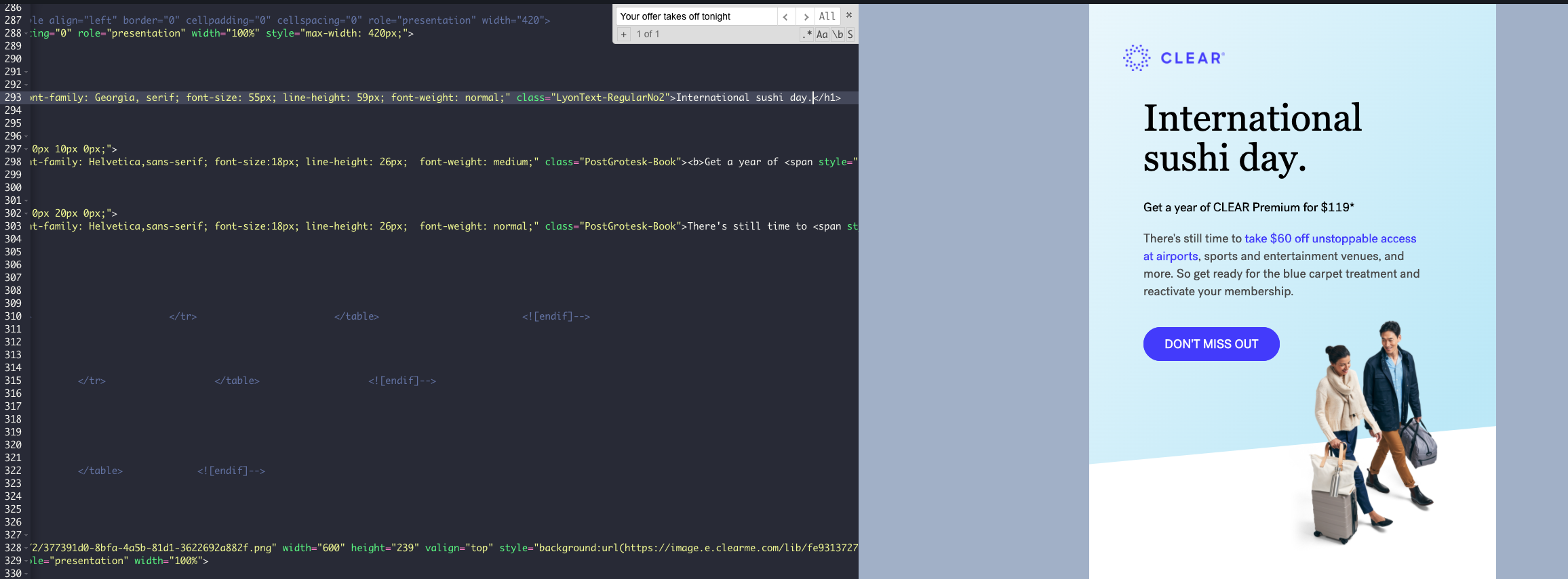
We haven't really changed the look and feel of the email at this point. It's still pretty much the same rolled up email we started with. But we have learned that Lyon Text Regular 2 at size 55px looks pretty good and would work with our wording we've chosen.
Before going on with this tutorial, it is important to mention that we are using this process to learn how people are building their emails, what we like about the layout and overall look, and how we can apply those same elements to emails we are working on (not copy the entire email). This process is a widely known strategy for developers. Places like Treehouse and Glitch emphasize breaking someone else's code as the best way to learn the code.
However, swapping out a logo, text, and an image and calling it your own creative work is like going into a sushi bar and drizzling a little bit of different sauce on an already-made roll and stating that you are a master sushi chef. It's also called stealing. What we are trying to show here is how playing around with the code can give you a better understanding and perspective of making your own emails better.
Now, let's go and change more text so that this email makes more sense with that header text about International sushi day and see what it would look like if we applied some of our own copy with the length we've been given, change out the font styles, etc:
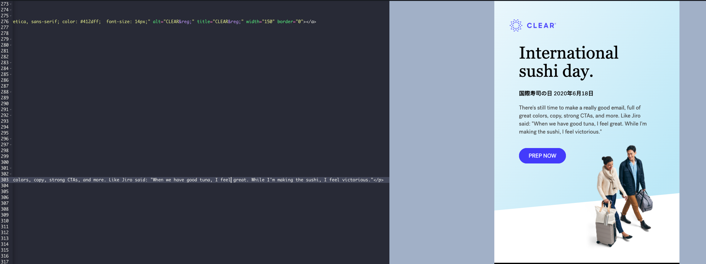
This isn't an email about a casual walk around an airport any more - it's about International Sushi so let's dress it up with some imagery that fits that. When we dig into the code, we see that this is actually a transparent image overlaid on top of the angled blue and white background. That's pretty cool and something we should teach ourselves how that is done.
First, let's change that out with an image that is transparent so we can keep the angled blue background. A quick way to find that image in the code is to right click on it and hit "Copy Image Address." If you are looking for something that isn't an image (such as a button, background color, etc), then use "inspect" in Chrome - which will highlight the element so that you can grab it and then search for that same thing in the code editor:
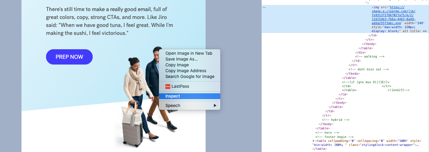
Just like we did for text, let's search and replace the image in the code editor for an image or illustration that works better for our vision of a sushi email. What happens when we insert a really tall image? A really short image? A really wide image? The code here is commented on really well so we can also see the other elements that this area relies on within the <! -- walking --> section, such as right alignment, padding, and width constraints. We can play around with those and see how it changes the look and feel. Let's make some adjustments and throw in our sushi illustration:

We can continue to tweak things here and there to our own taste. Breaking things along the way is part of the process. It helps teach you the structure and the variables that you can mess around with - and the things that you probably shouldn't. Let's try colors next.
Upon further discovery, the background blue color isn't an image but rather coded gradient. That's pretty dope. What happens when we change the colors around within the gradient? To do that, use a color picker plug-in or use a site like coolors.com that gives you a nice variety of colors that go well together. I settled on #F69883 and played around with some different options, eventually landing on this:

We could do this for hours, but this whole exercise has taken me about 35 minutes and you get the gist. We've learned some cool things in a short amount of time that we can apply to our own emails in the future, such as font choices, image overlays, and gradients. We can use this email and come back to how they built it if we get stuck building our own thing too.
But before you go and start serving up this new email you've made from the parts of another email, think twice. There's much more that goes into an email than swapping images, text, and colors. Like a master sushi chef, there's planning, organizing, and execution that makes all the difference. This code editing and breaking process, however, will get you more accustomed to how others build their emails and how you can use those elements in your own recipes.
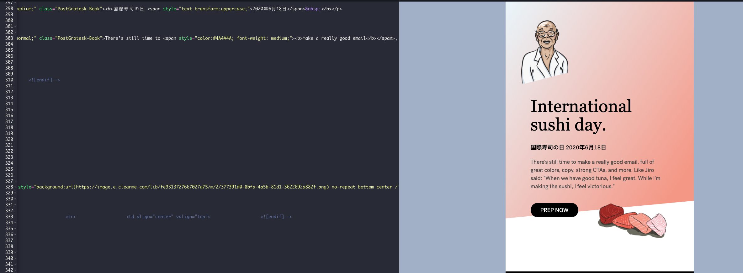
And it is pretty satisfying to compare the original when you've spent some time with the code and understanding how to make it different.

