Matt Helbig: Hello! Thanks for joining us today. I'm Matt Helbig, an Integrated Marketing Manager at Really Good Emails and Beefree.
We also have Justine Jordan from Beefree, Laura Sullivan from InboxMonster, and Kristy McCarley from Pure Firefly.

Justine, do you want to talk about yourself at Beefree?
Justine Jordan: I wear a lot of hats here. I'm working with Matt and Mike Nelson, whom you might remember from RGE. I do a little bit of support, a little bit of community, a little bit of content. So it's been a fun time.
I've known Laura for ages. Inbox Monster is a great tool, right? They do rendering deliverability checks. Kristy is the founder and managing director of Pure Firefly, an agency that does email work for nonprofits and small businesses. Both are excellent companies and incredible people.
Matt Helbig: Yes, Laura and Kristy are fantastic. Let's jump right into our hot take on email trends. So, what is a trend? Trends will not save your business, and neither is anything we share today. This is you; you're panicking, and your business is failing.
Unfortunately, all these email design trends will not save your business, but they will help you better communicate your message.
Justine Jordan: I couldn't agree with this more. For my entire career, I've primarily worked in B2B. So, when I look at what all the cool retail and e-comm brands are doing, B2B doesn't have to be boring. You can adopt trends, too, but that's not to say you don't have to know what suits your audience, brand, and company. So don't adopt a trend because it's the cool thing to do.
Matt Helbig: Focus on the foundations. Email trends come and go, but at the end of the day, the foundations are most important with your email marketing and understanding your audience.
What makes a really good email is that it is customer-centric and solves a problem that someone might have. A lot of the time, emails are very self-serving to the company. Remember that people on the other end are not just a dollar sign. They are people as well.
Another important point is that the email clearly states what you are making, why, and who it's for. It's important to communicate your message.
Justine, you're a big fan of this one; use human language, not corporate gobbledygook.
Justine Jordan: If we can have synergies that we leverage for the ultimate game changing... What am I even saying? Talk like a human. Don't talk like a corporate jargon generator.
Matt Helbig: Another point is that this email is delightful and surprising. You look forward to receiving it in your inbox. It's not just another annoyance, another filtered spam email. Send emails with a purpose. Consider how you can improve this person's day or surprise them in the inbox.
Accessibility is always a big thing when creating really good emails. We see many all-image emails; examples in this slide deck will be all-image. But you want to meet your readers where they are.
Suppose they're on a mobile device or have a disability and can't access your email temporarily or all the time; this is way beyond including something like alt text. In that case, it's ensuring your email is available on all devices they might be reading on.
Treat the inbox as a sacred, personal, and safe place. You should be responsible for what you send to your audience in this place.
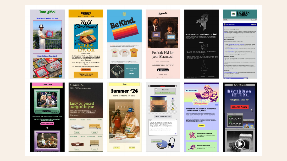
We can jump in to see the trends. But first, we have to go back in time. We've been looking at trends for a minute since 2016, and many of these trends we're still seeing are still very relevant today. People still think they're hot, new, and fresh, but we've been tracking them in 2016 and 2017. Let's keep that in mind. Many businesses still need help to meet different standards and have many issues with design. It's always interesting that some of these trends are old but still relevant today.
We will jump into the 2024 trends and beyond, as we still see many of these sticking around.
First off, raw and unfiltered.
Kristy McCarley: I am a huge fan of raw and unfiltered photography. As an amateur photographer, I'm always excited to see this trend continue to gain momentum. It's about capturing images in their raw, unfiltered, most natural state with minimal editing or retouching.
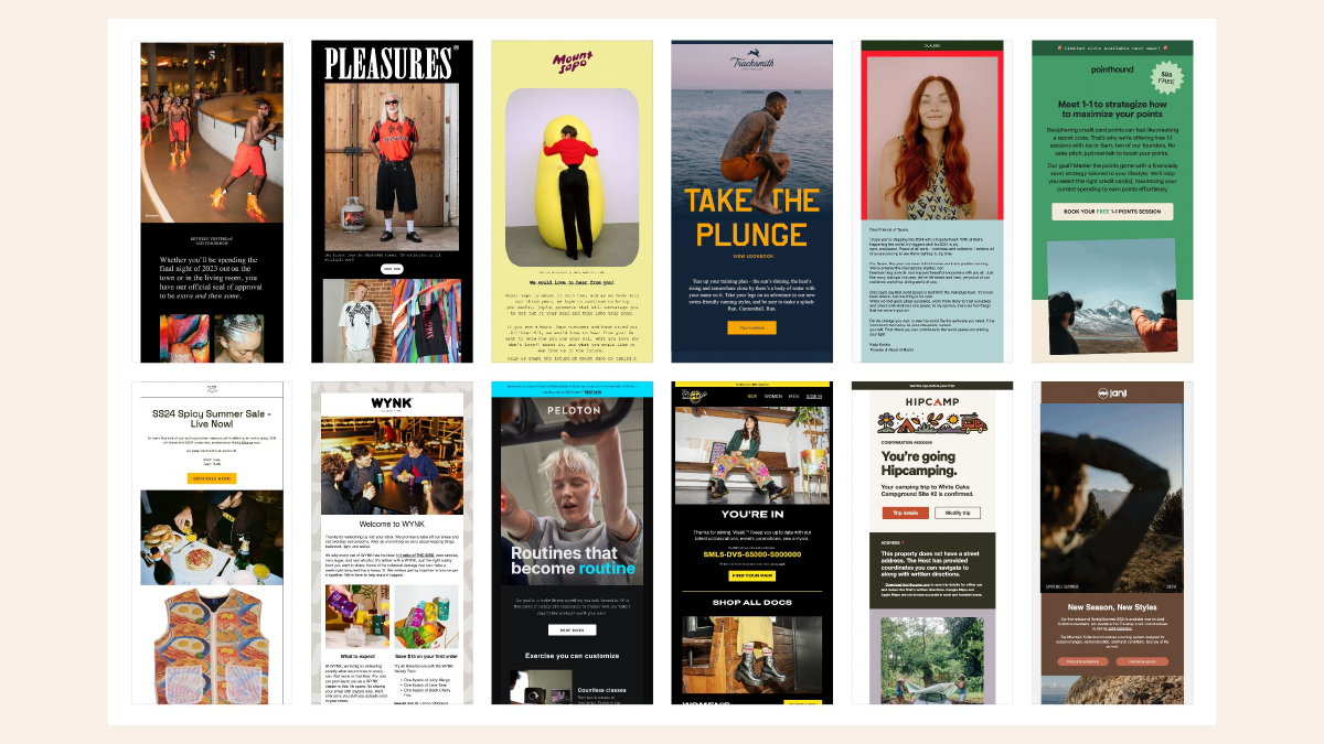
Unlike traditional stock photos or marketing images, which are often very produced, very stylized, very polished, raw, and unfiltered, they embrace imperfection, which is why I like this style and this trend. It shows real people and natural environments, and it captures genuine moments.
It's often characterized by natural lighting, minimal post-production editing, and authentic expressions and scenarios, making it feel spontaneous and candid.
Why is this trend becoming so popular? It's mainly due to social media. We're very used to seeing what at least appears to be authentic situations. Consumers demand more transparency from brands, and we are skeptical of overly polished images or images that we may feel are too photoshopped.
We tend to gravitate towards content that feels more relatable and relevant. Raw photography can connect in a human way that AI can't, making the messages more trustworthy.
Another plus of raw and unfiltered is that it can evoke a sense of nostalgia. It can also help strengthen your connection with your audience.
Finally, it can be very cost-effective. You don't have to pay for the big production, the expensive photographer, or all the editing. This style can be cost-effective for those trying to get the highest return on investment from their marketing. It can be quicker to produce and quicker to edit. If you do any editing, it allows for more agile content creation.
Justine Jordan: I also love it cause it's human. I already expressed my love for humanity earlier. The Patagonia example is such a good one. Who can't relate to the messy backseat of your car with the dog and like the indestructible bag? It just feels like more legit. It doesn't feel like you're being sold to.
Laura Sullivan: Exactly. I love this because if you're an email creative, the big photo shoot often does not happen for your channel. So you're just getting seconds from other channels, and this is something that you can do. You can pull it off.
Kristy McCarley: Even as an amateur photographer, you want it to feel authentic and genuine, but there's nothing wrong with a bit of production, like making sure that the eyes are looking in the right direction or that the shirt is placed in the right place—position to ensure your logo shows. So you can go only some of the way into total production. There's nothing wrong with planning a few photos and picking the one with the best lighting to represent your brand.
Matt Helbig: Why is this catching on? This trend feels anti-AI and feels more nostalgic and different. It stands out.
We'll keep moving on to extra chunky text, one of my favorite trends.
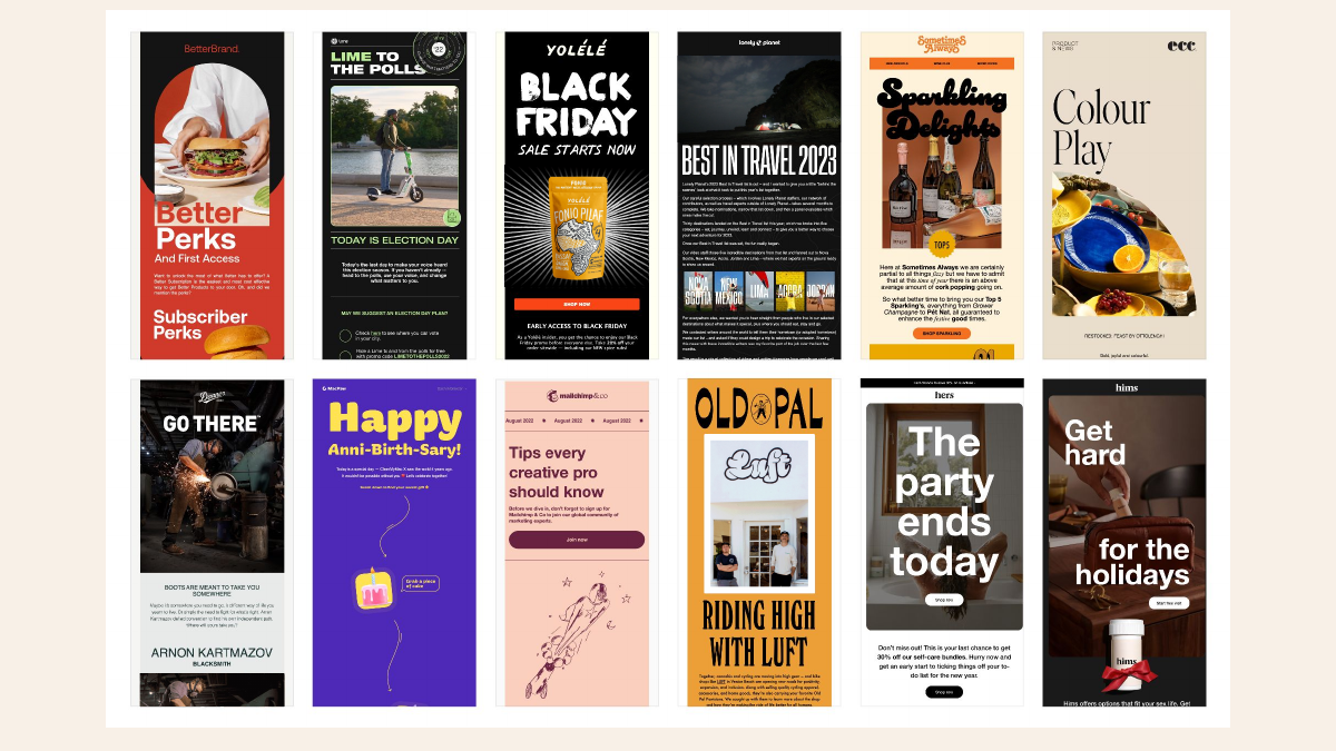
Kristy McCarley: Yeah. I'm a fan of this one, too. Oversized text dominates the visual space. If you're a design geek, this can be super fun to experiment with. It adds a sense of playfulness and grabs attention when the email is opened. It makes the text a primary visual element.
This trend is popular because of the rise in appreciation for minimalism and the need to create quick, digestible content. It allows you to convey that message as soon as you open the email, and it feels very powerful. You can concisely convey your message and grab your attention so that you don't swipe and go to the following email.
One consideration if you're deciding whether to experiment with this or if it is suitable for your brand is that you want it to be manageable. There is a balance between the size of the text and its chunkiness, and you want to maintain readability. You also don't want it to feel overwhelming or heavy or you have to scroll to see all the texts.
It's best for short, punchy headlines, compelling quotes that reinforce the brand, a brief mission statement, or if you're trying to convey an urgent promotion or something time-sensitive.
Justine Jordan: I've even seen some brands hire a typography designer to create a brand-specific font for these cases. It's a fun expression of your brand and something unusual and differentiating you can do. You don't want the whole email to be in your custom font, but it can be a real standout in the inbox for those like selected applications.
Matt Helbig: We have a little sub-trend here called weird fonts. Many brands use weirder fonts to capture people's attention in the inbox. These trends are not for every brand. In your B2B email, you can use a different font, but in e-commerce, many people try to stand out by using fun and cool fonts.
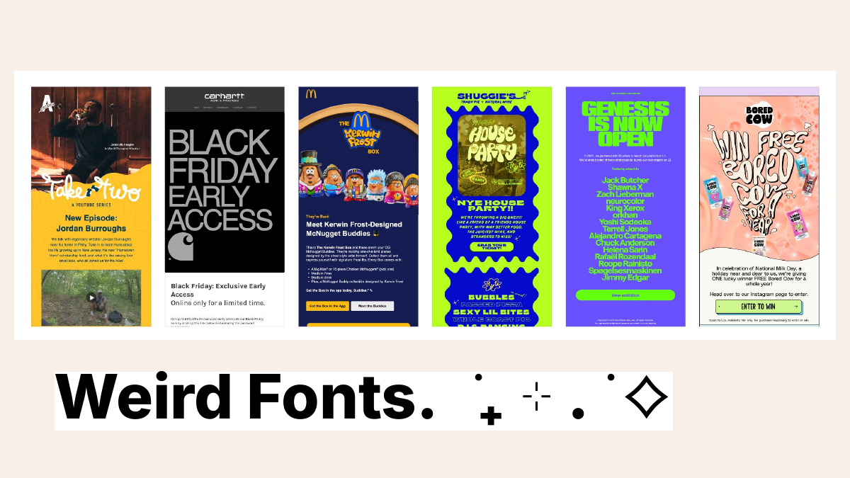
We have one other relevant subtrend: 3D text. It's been popular in the last couple of months, so we're seeing many more brands use 3D and make that text pop out on the screen. So I'm a big fan of this one.
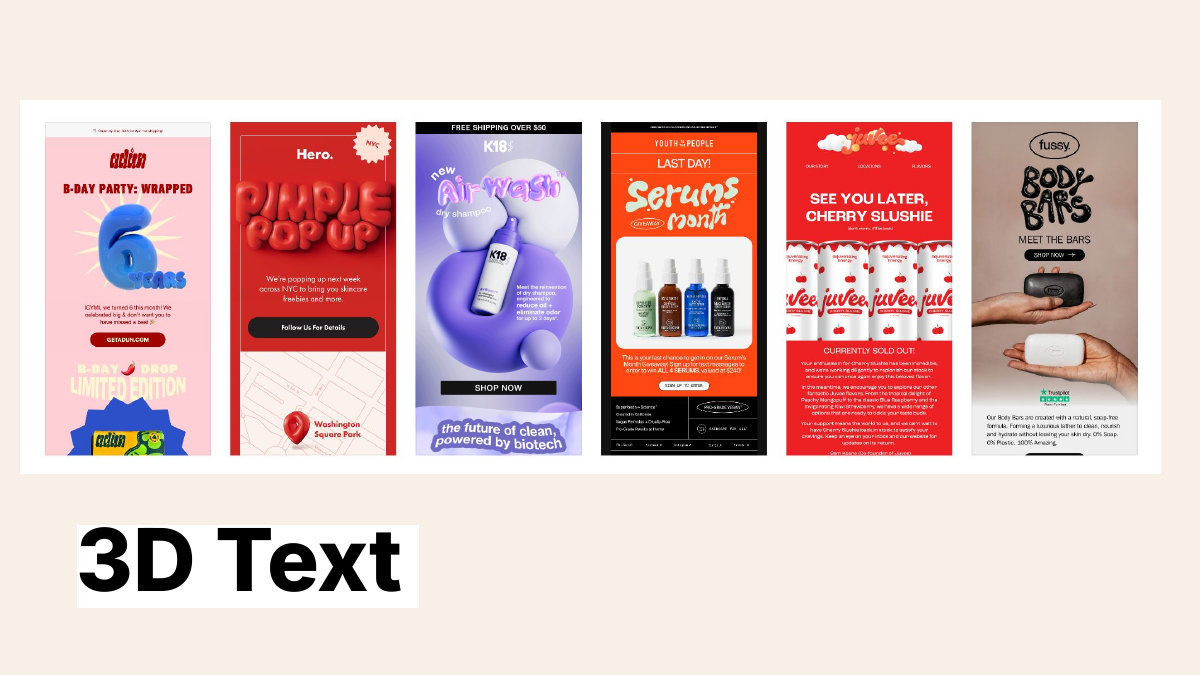
Kristy McCarley: Yeah, me too. It makes it stand out and fun. It just makes it feel so playful and, again, relatable. It's not for everyone or every brand but makes a statement.
Matt Helbig: As the chat says, this is not supported as a font. These are locked-up images. Keep that in mind when thinking about your accessibility, but some of these do a good job of balancing a little bit more live text with that hero image being just an image.
Justine Jordan: 100%. You have to think of trends and best practices as a bit of a spectrum just because we've been instructed, and I've even been a big advocate of live text and email. It's an important accessibility thing. It's important for many reasons, but we can't follow extremes, right? Just because something is a best practice. You can always have a balance.
I'll always use luxury brands as an example. If you're trying to sell expensive jewelry, you must show pictures. You're going to have to use images. That's a really impressive purchase.
For the B2B folks in the room, I'm not saying you can't do it. B2B doesn't have to be boring. You can use exciting fonts. Befree is a B2B brand. We market to many businesses, but because we're more design-forward, we can have some fun with our B2B product images. You have to know your audience and what's appropriate for you, but think of something as something other than all or nothing.
Matt Helbig: Why is this catching on? They're bold. They stand out in the inbox. They're thick. They get your message across quickly. People scan your emails. They only sometimes read the whole thing.
All right, we'll keep moving on to deep and dark.
Laura Sullivan: I love this trend, which may have been sparked or spurred by dark mode and its prevalence. We've moved way beyond that now. I love the spectrum of dark colors brands use to create this mood in their emails instantly. This trend is a reaction to so many pretty and pastel emails. I love this dark green example, which makes sense with the subject matter. God, look how beautiful this slide is.
But my cautionary tale is that I've worked with brands before and tried to pull this off one in particular, which was like a dark chocolate brown. And, of course, I tested the heck out of it beforehand. The brown turned into salmon pink for the few email clients with some partial color inversion. And it was like, ah, my eyes. You've got to test, test, test. When you do this, you want to avoid accidentally serving the audience wanting dark mode, something that's way outside your brand guidelines. Test away. This trend is a total winner.
Matt Helbig: It is cool that brands are also building out dark mode styling, but this dark theme becomes relevant around Black Friday. Many brands adopt this darker theme, change their style slightly, and make it feel unique in the inbox. And yeah, as people say, the contrast makes the images pop.
Laura Sullivan: I think of Jenny's ice cream as this bright, colorful brand, but for this particular topic and this flavor that they're calling out, they're using this dark maple color. Many brands can use this depending on your email's subject and content.
Matt Helbig: Why is it catching on? There's a rise in dark mode preference opt-in. And then again, a reaction to that over pastel use that we've seen in the past.
All right, we got color blocking with Justine.
Justine Jordan: Color blocking is what it says on the label. These big, bold areas of color usually help differentiate visual hierarchy and emails or, in this case, help a section stand out.
Looking at the history of color blocking, you will see that it was a big fashion trend in the 1960s. It feels retro like all these fashion trends are coming back and sneaking into the email world. However, I love how it creates this visual hierarchy. It helps separate sections of the email and adds a bold look to your style.
These three initial examples take very boxy approaches, so you can still block color without being so rectangular. I love the chocolate lovers one, where there's a little texture, but it's still this lovely flood of brown on the back. It's almost combining trends; you have these bold, darker colors and color blocking.
Some also have wavy or other slanted elements. That's still a subtrend where you're visually blocking the email. One reason this has been so popular is that ESPs are making it easy these days.
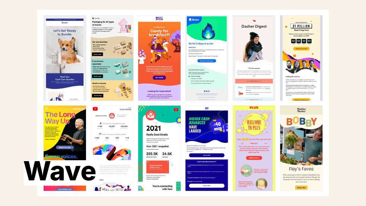
Over the last several months, I may have purchased an item or two of clothing with big, bold, complementary-color strikes on it. It's so much fun.
Matt Helbig: I'm a fan of this one. Wave has been overused too much. Every single email has a wave in it. There's a time and place to use it, and it does a great job of separating sections. Be careful with your wave. You don't want to give people seasickness.
Justine Jordan: What if we do the wave?
Matt Helbig: As Justine said, ESP content blocks are making it easier to separate these sections while this is catching on.
Justine Jordan: Editors like Befree make it easy to plug in that new content and create new blocks.
Matt Helbig: Alright, we have another one. Longing for dial-up as a trend with Justine.
Justine Jordan: I don't know how many of you are elder millennials, but Laura and I were talking about when we were kids, how we would grab the phone in our parent's kitchen and sneak around the corner and try to stretch that wire out as long as you could to get some privacy. Probably dating myself, but it's all making a comeback.
Or this one—what's this? "Call now" is a CTA in an email with this ridiculous gradient. That could be word art. I used word art, but this one takes word art to a new level and combines some super-like old-school nostalgia with a cassette tape. Again, like I had a cassette tape player in my first car, not showing my age here at all. That was in a recent Really Good Emails newsletter, the dancing baby GIFs.
It's like I got into a time machine, but not a hot tub time machine. There are many examples of this, and even some friends in the email industry, like Action Rocket's newsletter and the folks over at Sinch in their Email Camp, are having some fun with the Transformers throwback old school all the way. This is all about like the nineties being cool again.
I have attended many concerts this summer with nineties bands coming out and playing. I saw a Green Day show, and they played the entirety of Dookie because it was Dookie's, I think, 25th or 30th anniversary of being released. So, if that doesn't make you feel old, these emails certainly will.
Matt Helbig: It's a fun and nostalgic trend. I'm getting disposable camera vibes. I see it coming from the web more into email, and it's cool to see. But again, this is only for some brands. You have to know your audience and style, and then try some of this stuff and see if it works.
Laura Sullivan: I'm thinking about this with our brand as a company and saying, okay, maybe our monster, our little monster friend, would use some of these nostalgic nineties moves, but probably not our main brand, so it's finding a way to work it in, but don't do anything that feels wrong.
Justine Jordan: From all the concerts I've attended this summer, we can learn about email. They knew their audience. They knew that we were willing to pay to see them again. I was joking that night; I felt like I was 18 again the following day—maybe not so much, but I was willing to relive 18 for an evening. So, if you've got that demographic, take advantage of it.
Matt Helbig: You said the 90s are cool again, so that's why this trend is coming back around.
We have another newer one, ticker GIFs, a fun trend to watch out for.
Kristy McCarley: It is a fun trend. So ticker GIF, the repeating text, usually at the top of the email, grabs attention and makes the email feel lively and energetic with the movement. Similar to chunky text, it captures your attention right away. It's like a visual hook and immediately engages the reader with the motion and the excitement. It can add playfulness, similar to the chunky text, and it's eye-catching.
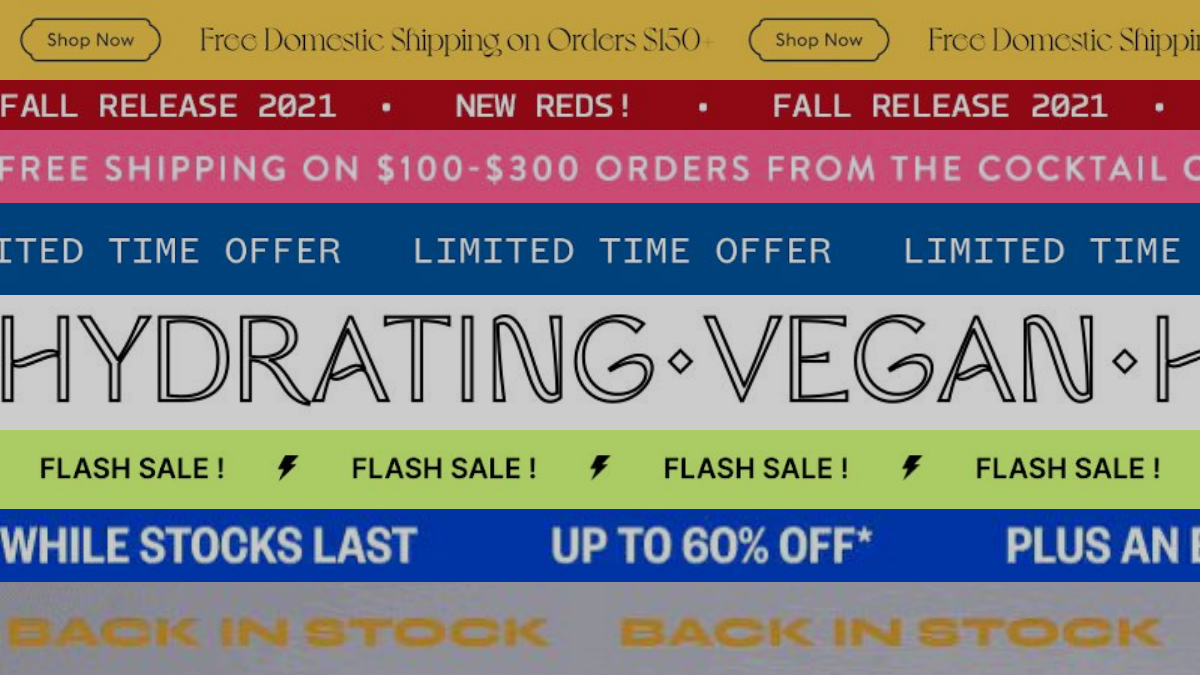
I'm on the fence with ticker text because I'm a person who is affected by movement in emails. So sometimes, if it's a little too fast or if it feels like it's too much, I will look away. But I know some other subscribers and audiences love and get into it. So I'm on the fence. Be very thoughtful about its use. Make sure you have enough contrast. If you're using it to highlight a key message, it can be great, or a sense of urgency for a promotion or limit time offer. Be aware that it can overwhelm some subscribers and may be distracting, and sometimes, there are better fits for the campaign. Consider the pros and cons.
Matt Helbig: I agree. This one can get overused quickly. This is my inbox in 2024, so you must be careful about how many trends you use. If it makes sense for your brand and grabs people's attention, it's good. It doesn't always need to communicate the main message of the email.
But as people say, there are new tools to make GIFs easier. If your brand works well with this, add it to the top of your email.
All right. We have another fun one here—a styled letter with Laura.
Laura Sullivan: This is blasphemy with a whole room full of people who love gorgeous emails, and I am definitely among them, but I noticed this trend. Even though you may have great imagery if you're a direct-to-consumer or big B2C brand, you should lead with text and a human voice instead of a product shot. I'm seeing this a lot.
You can style your text to make it scannable, highlighting certain things and bulleting things out. This will keep it easy to read, which is important because people dislike reading.
Leading with that human voice, it's the anti-AI that we were talking about before their spidey sense is up for things that aren't authentic, real, and in a human voice.
These are all great and well written and come from a human, like this one about the love connection between Beefree and Really Good Emails, which Justine writes in her voice. When I read it, I could hear her writing it.
Matt Helbig: This styled letter text is a good balance between using only plain text in your email and styling it, using some of your brand fonts and colors, and making it feel more personalized.
It makes it stand out. I like this one because it's a relatively low effort. You don't always need a designer to do something like this, but it's nice. You have a good plain text template. You can create this style letter, make things stand out, and use bullet points. That's a good balance between plain text and an evolution that resembles a text-type email.
Laura Sullivan: I love how you guys added a GIF here. Even though it is a style letter, it has a little moment of fun that keeps you going as you read it. That's in a great human voice.
I wanted to shut out Parcel here because they are the masters of this. And, of course, they create cool emails all the time. Here's an example of how they spent a lot of time and resources developing this interactive game. But then, if you flip to the next slide, there are other emails with great information they send from a human; they're just straight-up emails.
Naomi has tested, maybe not this particular one, but designed emails versus undesigned emails. This is challenging to swallow if you like pouring every detail into creating beautiful emails. Still, sometimes, in some situations, you need to get the information out there and show the humanity behind what you're doing.
Matt Helbig: Think of email almost as a tool belt. You can use a plain text email. You can use a well-designed email. It doesn't have to be one or the other. For the problem you're trying to solve, you can use these different types of sends and include various types of content to make your email stand out and get the job done.
Justine Jordan: And for the B2B folks in the room, this is a great example of how you can have a ton of fun. The first personal example had a bit of nostalgia, chunky font, and a whole bunch of these trends. Then, it's followed up with simple, plain text like email. So you have the best of both worlds.
Kristy McCarley: Yeah, the same goes for B2B. There, you give yourself options. You may not be able to use chunky text or much animation, but you see, you have so many different options that you can tiptoe into design. If your audience isn't ready for the full-blown 3D chunky text, you can use a little bit of the style letter format, maybe one small animation. You can experiment with it and see how your audience responds to it.
Matt Helbig: Why is it catching on? It's that human language and that little lower barrier of entry to email design. You don't need that whole team. You can do something on your own.
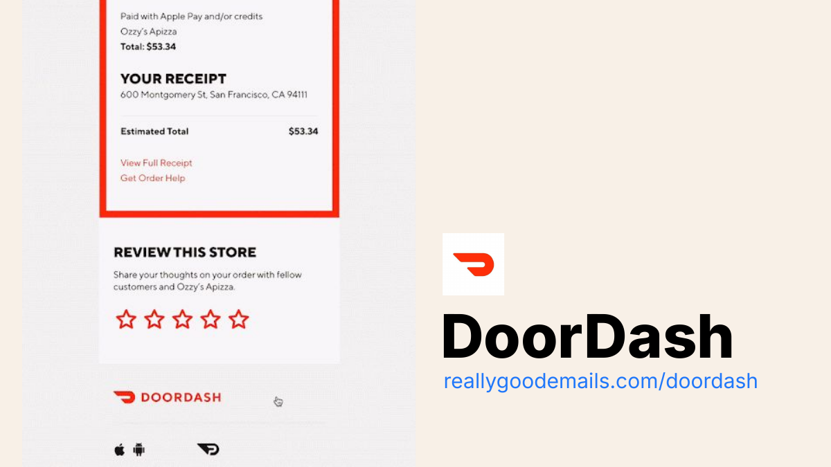
All right. We got my section with some fun development stuff. So we got some hover effects.
We are seeing brands do some cool, fun hover effects in emails. This DoorDash example stood out to me: hover effects over the stars on this rating in a receipt. It's a cool little touch that, on desktop, where it's supported, hopefully makes people engage with that section a little more.
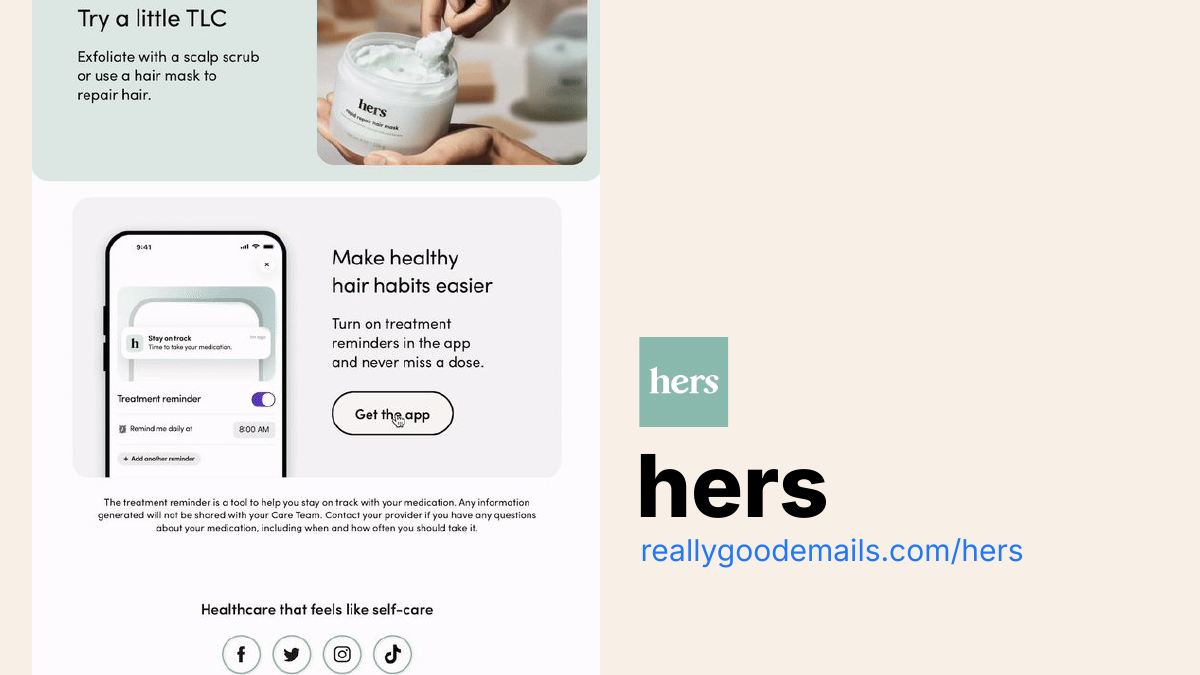
We are big fans of Hims and Hers. The brand has some great email developers. We've interviewed them, and they add a really good, effective hover effect to CTAs. To me, all buttons should have some hover effect. Again, maybe it's not supported on all the apps or mobile devices, but it's a good indicator that something is clickable with opacity or changing the style. It's a good way to tell people that something's clickable.
We saw this cool one from Macpaw, and I was like, okay, how do they do this one? It is an interactive email, but it's all done with hover effects, which stood out to me.
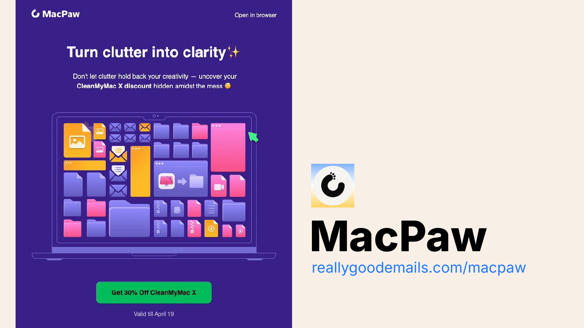
So, we're breaking this one down more. It's divided into three different sections here on desktop. When you hover over each section, the images swap out. I'm in the weeds regarding code, but seeing that happen is cool. And an unexpected little piece in the inbox that I was surprised by.
Why is it catching on? It's interactive. It catches your eye when you're scrolling, especially on a desktop environment where it's supported. Some of these, especially hover effects, are little things you can add at the end of the email that may not change the whole design, but they show that you are spending time and attention on your email designs and marketing.
Laura Sullivan: I love the example you showed. It works perfectly well as a static image for a fallback. No problem. It still gets the point across, but it's just an enhancement, an added fun element. So that's brilliant.
Matt Helbig: All right. We got some honorable mentions now. These are trends that may be partial trends, but there are still some cool ones that are worth mentioning.
This first one is hand models. Does anyone have any thoughts on hand models?
Laura Sullivan: I love this. I used to always talk to people about the disembodied hand or the disembodied head and like trying to get it out of design, but I love going and leaning right into it and having it poke out of the inbox.
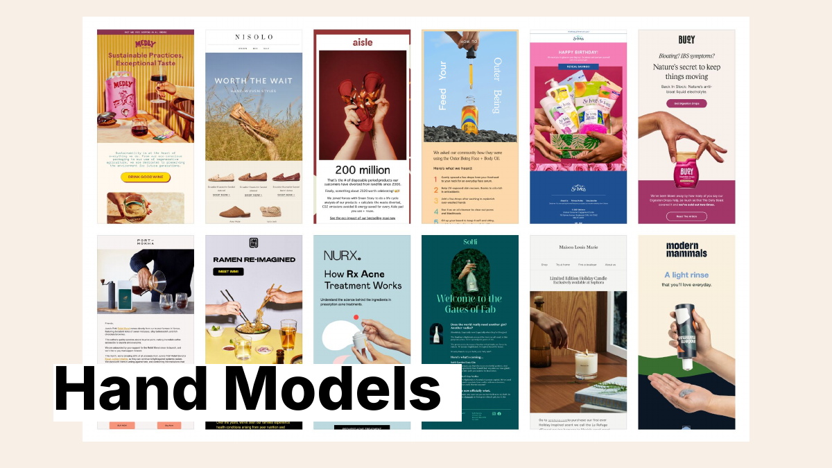
Justine Jordan: You took the words right out of my mouth. It feels so like stock, but I love it when you can take something we used to like side-eye, embrace it, and have fun with it. Reown it. The key here is to avoid one of those creepy stock photo hand situations. Do your photography here.
I like the one. Is it the Buoy where they're holding the container from the top?
Matt Helbig: Who are these people behind these hands? I'll never know, but this trend is great. This trend will stick around because people put a product in someone's hand and take a photo of it when in doubt. People use a fun, creative method of incorporating it into the email to separate these sections.
Okay, we got to stop looking at hands.
All right, choose your adventure. This one—it's a throwback—is not very accessible. There was a big push with interactive emails saying, "Okay, if you click this button, we'll show you this type of content."
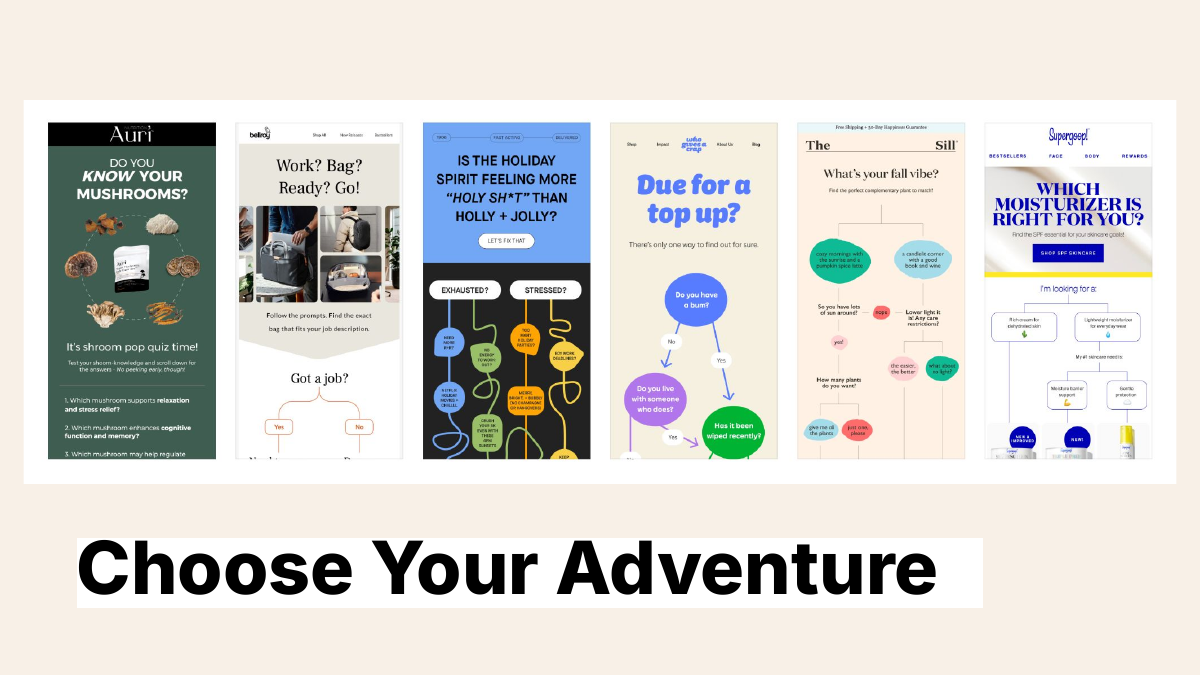
However, some of these brands are returning to a big image. They're trendy on the site, so if you're going into an email, you can follow along when you're scrolling and do this little mini-quiz. It's a big trend. We're seeing a lot more brands adopt this one.
Kristy McCarley: It makes you think and can hold your attention for a few minutes. It may increase engagement.
Justine Jordan: I love it. It makes it even more fun if interactivity, like the difficult coding thing, isn't an option for you. This can be a fun way to make your email feel interactive without having to do complicated coding gymnastics.
Matt Helbig: We got another newer trend I've been seeing a lot, and I'm a fan of it. I call it the 3D rotation. I was imagining a shoe rotating or sunglasses rotating. So this one is a GIF-heavy type of thing. The fallback may be the static image, but it's a cool way to stand out in the inbox and catch my attention more. I could see people overusing this one, but the 3D rotation is cool for some products.
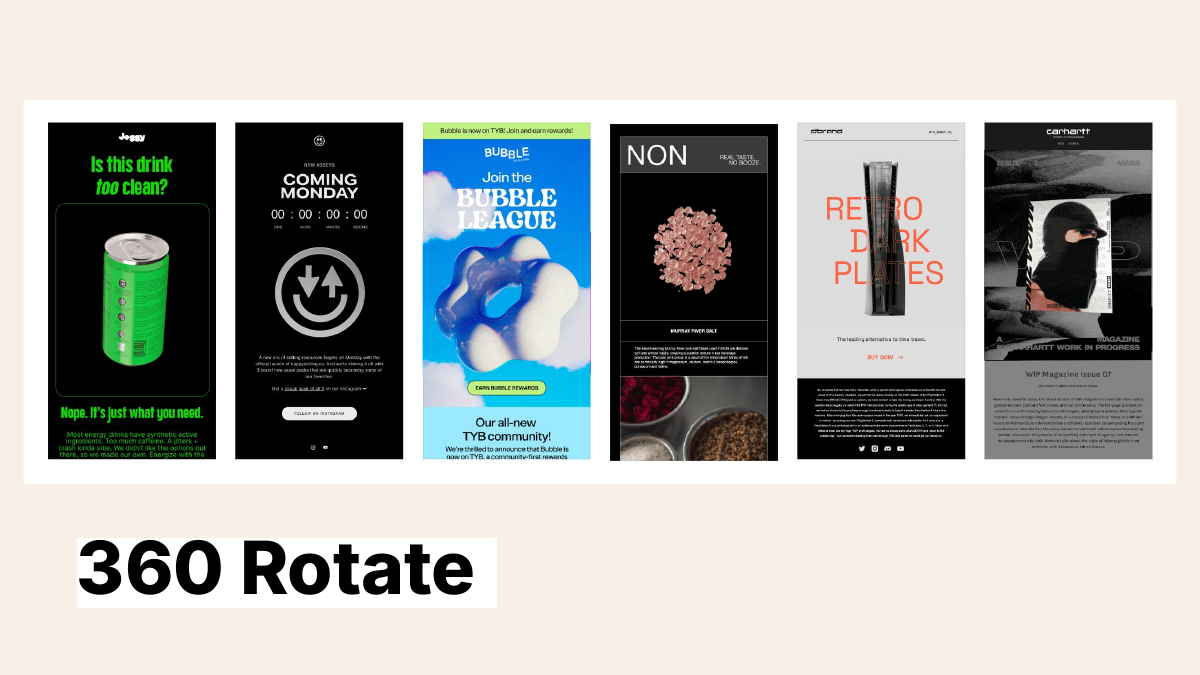
Laura Sullivan: I saw one example, Matt, where it was a hover state. So when you hovered over the product, it started triggering that, which was cool.
Kristy McCarley: Yeah, I like these better than the ticker text. I don't know; they don't feel as fast. It's the right speed. It doesn't feel as overwhelming.
Matt Helbig: It allows you to see the whole product, too, depending on what you're using, which could be helpful.
All right. This last trend that we've been seeing is sustainability.
Some of these are more Earth Day-type emails. Still, we have seen a trend with brands including messaging in their promotional emails or onboarding to let people know what they're doing for the environment and their mission statement.
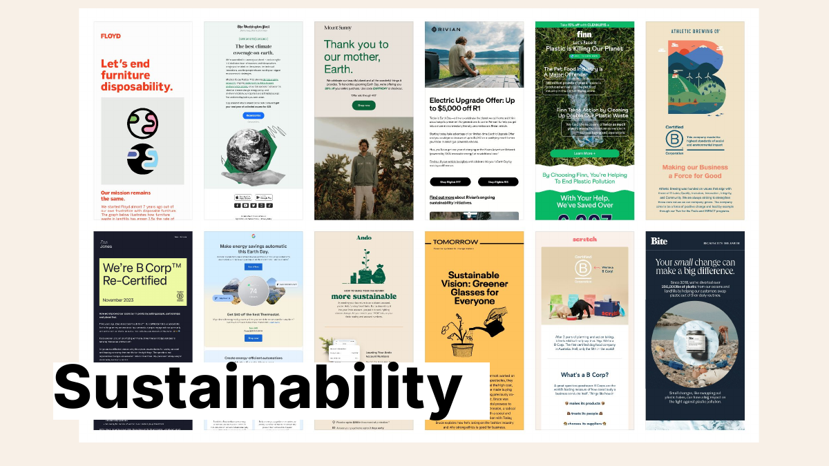
It's becoming important for many more consumers to understand what a brand stands for, and email can be an excellent way to communicate that.
Justine Jordan: Totally. This started even during the pandemic when brands wanted to communicate their values to their audience because we had to make many hard decisions about where we spend our time our money and what companies we want to invest in. Everyone suddenly reexamined what was important to them and their values.
I've worked for a company that got B Corp certified, and it takes work. You have to jump through some hoops and demonstrate your commitment. I love when brands not only say that they're sustainable or eco-friendly or whatever, but they also put in the effort to get the B Corp certification, stand for their values, and show them.
Laura Sullivan: Putting it in the hero differs from a bit of the standard sign-off in the footer. I love that.
Matt Helbig: That about wraps up the trends for 2024.
I'm sure we missed some, and you'll let us know if we missed any, but these are the ones that we're seeing on Really Good Emails. They're all interesting to try out. They might be somewhat hot ones you want to use for your brand, but at least you're informed about what other brands are doing in the space, and one of them will work for you.
And again, this is not an endorsement.
It might not be for your brand, but it's still cool to see.
With all the email trends, make sure whatever you do, continue to be really good and make some really good-looking emails.
Justine Jordan: So, if you're wondering how to build some of these things. Surprise, surprise, Beefree can be a giant help. This is a cool little like GIF. It's right on our homepage. It shows how easy it is to drag in different blocks and implement some of these trends or designs if you want to. RGE also has tons of inspiration, so we make it easier to go from being inspired by all these emails to creating them, that path to inspiration to creation.
Matt Helbig: Now we have some time for Q&A. There's a lot of questions.
Let's see. The first one is: Do you recommend any online courses for improving your email design skills?
Justine Jordan: Jason Rodriguez, a former colleague, has a great course called The Better Email.
Matt Helbig: Yeah, I know, Parcel. We've mentioned them before, but they also have a lot of good resources on their site regarding HTML coding.
Here is one: Is the CTA above the fold still relevant?
Laura Sullivan: Having tested it a lot, I can tell you that if the content in your email is really good, people will scroll and click on your CTA.
No matter where it is. No, that depends on a lot of things and having great content. Even in some cases, I've seen that people are more informed when they get to the CTA, which increases their qualifications for whatever you're trying to get them to do. So that's my two cents.
Kristy McCarley: It hinges on whether the content is relevant to the audience. We have seen many emails with irrelevant content, so it doesn't matter where you put the call to action. But if the content is what people want to read, learn more about, and are ready to act, they will scroll to the buy now, RSVP, or save my spot, whatever it is.
Matt Helbig: It helps if it's above the fold, but at the end of the day, it's about limiting the number of CTAs you include in the email and what you ask people. Trying to be concise about what next step you want them to take and having that be a clear CTA is more important than the placement.
If anything, a bottom CTA is more relevant. So, when they get to the bottom of a scroll, they have a catch-all CTA that they feel comfortable clicking on.
Our next question is: How do you create a hover effect in Beefree? Justine, I'll let you speak on that one.
Justine Jordan: Yeah. Beefree is a drag-and-drop WYSIWYG editor. Almost everything is no code, which is awesome until you want to code. So, we have an HTML block you can drag into your email. You need to create that code on your own, then use the HTML block, and be free to drop that code inside your email. So, it's possible.
Matt Helbig: All right. I knew this one would be around, too, because we love nonprofits and love to talk about them. Can you provide some examples or tips for nonprofits regarding creativity?
Kristy McCarley: I like the color blocking. It is one way to tiptoe into design, adding more design. You don't have to use color blocking with the rounded corners. You could start with the rectangular ones, which are safer. You could start by using shades of gray, white, or blue, which would be an excellent way to experiment. It depends on the content. If you're having a conference for a nonprofit, you could push the boundaries a bit more. You may have larger text because it's a conference, and you're trying to establish that human connection because you want people to attend.
It depends on the content, some other trends, and how they match what you're trying to convey.
Matt Helbig: If you look at Really Good Emails under our nonprofit category, there are still many good examples of brands like Charity Water using these trends or branded styles to make their emails stand out in the inbox.
So, there is some inspiration you can take from some of these, and hopefully, you can try them out.
Kristy McCarley: Raw, unfiltered photography conveys authenticity, which goes a long way with nonprofits. Again, raw photography is a great way to convey authentic, genuine moments and real people and establish trust between subscribers and the organization.
Laura Sullivan: I love Kiva.org. It is a nonprofit, like a micro-lending company, and it uses photography to show the impact beautifully. It is that raw photography.
Matt Helbig: Speaking of raw photography, we have a question about how you use B2B with raw and unfiltered. I've seen some cool software commercials about how your product solves that person's problem.
It could be a video, a short clip, or something. It could be something that lives more on social media or that you can use on other channels; it's like someone is late to their meeting, and your software service is helping them. There's a fun way to incorporate more raw and unfiltered trends while keeping B2B relevant.
Justine Jordan: Totally. Not all B2B brands need to sound corporate. Even though you're selling to businesses, you're selling to humans inside those businesses who want to connect with other people again.
I spent most of my career working in B2B and did a lot of testing around this, too. We'll put images with staff humans in our emails versus images, like screenshots of products or something. And the humans almost always do better.
So you can take that video with B2B, which has also become trendy on social media and LinkedIn, like founders or employees getting on and showing people their humanity. You can have some fun with the human trend, especially the raw and unfiltered, by introducing humans in their raw and unfiltered state without being scripted. Making mistakes is one interpretation of raw and unfiltered.
Matt Helbig: All right. Regarding the B2B SaaS landscape, do you have any subject line tips?
I know we didn't really talk about subject lines that much, but this person's question is: Are there any trendy buzzword types versus maybe more value props?
Many of the emails we've seen have subject lines that are either really short or long. We analyze less with Really Good Emails and subject lines, which is something we can do in the future.
It's about keeping it short and creating some mystery or anticipation around that or just being clear in your subject line so that someone is not surprised when they open. My biggest thing is opening an email or message and finding something different. Sometimes, it can rub me the wrong way, and I'll probably unsubscribe.
Laura Sullivan: Oh, I was going to say that we've changed our strategy with subject lines and preheaders, too, with Apple's release of the AI preview text. So we can't use mystery anymore because it will be given away. We had to change up our strategy as a SaaS company.
Justine Jordan: If you're looking at open rates, remember that open rates are a pretty unreliable metric. Render rates drive open rates, turning that single GIF on. Many ESPs will try to do real opens and filter around that.
But if you are relying just on open rates to determine subject line effectiveness, I suggest looking at click rates or even.
I've done a lot of A-B testing with subject lines. If you tease something further down in the email in the subject line, you can sometimes correlate whether or not the subject line affects people clicking through to that specific part of the email, which is fun. There is lots of testing there but beware of the open rate and your success metric.
Kristy McCarley: We are always also cautious. I always lean towards short; short is better if it's concise and to the point.
It can sometimes be frustrating when an email comes through with a subject line so long that on my phone, I can't read it all because it truncates, and that could affect your open rates.
So, I always lean more towards shorter, which is better, more concise, and gets to the point again.
As Matt says, you want to establish that trust, so you don't want to say you'll win 10,000 and then open the email and not win 10,000. It's something different. You also want to avoid tricking people into opening, but shorter is better.
Matt Helbig: Here's a really good one for you, Kristy, around desktop or mobile. Is there one that you're designing first more often? Are you seeing that split now where some industries are going more mobile-first versus a 50/50 desktop and mobile? How do you start with your client's designs?
Kristy McCarley: Usually, we start with desktop, honestly, but for our clients, our audiences are typically 50/50, 40/60 sometimes.
We usually start on desktop, but our audience is smaller businesses and nonprofits. I don't know how that translates to other larger businesses.
Matt Helbig: Mobile is a topic we monitor for the emails we feature on Really Good Emails. It's usually when the text gets too small, and mobile is the knock to where something scales down. It's a locked-up image, and someone can't read it. Designing something at least legible on mobile is a step even above other brands.
This one is around image size for GIFs and not compromising quality.
I have used EasyGIF, a cool tool I like to use. Limiting the number of frame rates within a GIF may help with compression. I usually hit under at least one megabyte on those GIFs. We often see graphics that only have three different frames, but you can do something with one or two or even one to five frames and keep that size down.
Here's another good one for Laura. Do you have any tips around dark mode? Are there any guides?
Laura Sullivan: Yes, there are many tips. You can optimize your emails for dark mode by using PNG to outline your logo. If you have any white text, you can even have fun with those things, like making your logo glow if it makes sense for your brand or doing other fun things. So there's those tips.
But then you can also target dark mode. This doesn't work for every single email client, but you can also serve up a custom email version for dark mode specifically, knowing that 40 percent plus, at least, of emails are being seen in dark mode views these days. That's a big percentage of your audience that you wouldn't want to leave high and dry.
Testing the heck out of it is going to be important. Our tool does a great job of showing the dark mode and light mode views side by side, but if you have an email that is not showing up in the way that you want for whatever reason, having some custom code in there to target and create a special version of your email is going to be important. It's worth it. It's worth the effort.
Matt Helbig: When the dark mode was first announced, some people thought many wouldn't opt in or be less than 5 percent of our list. But it is something to remember if you're forcing your colors and not allowing someone to have a dark mode style, overriding them somehow. It does go against what they're expecting in the inbox.
If I opt for dark mode, I like to see when brands take the time to tweak their design system and use some dark mode styling to meet the expectations of the person you're emailing. When I get an email that looks cool and dark, I'm like, wow, they spent the time to do it. It stands out to me, but it does take some time and effort, and it might not be the priority for your brand specifically.
Laura Sullivan: I love what you said in your design system because if you could optimize for it up front and not every single time you create something, you'd save your sanity.
Matt Helbig: We have two more questions that I was reading and would like to address.
Do any of the trends that we saw today will impact email deliverability?
Laura Sullivan: Deliverability is so complex, and so much goes into it for your audience. The number one way to positively impact your deliverability is to have the most engaging emails and send them to the right people. In some ways, it's good news. Suppose you're using some of these ideas, creating super engaging emails, and putting some love into the channel, which is the number one thing you can do for deliverability. Still, you have to use caution, especially if you're sending to a new audience or of a new IP or doing something out of the ordinary to ensure that you are monitoring your deliverability and not doing anything that surprises the mailbox providers. They love consistency. So, trying new things can be scary. So, keep tabs on that.
Justine Jordan: Some enduring myths about spam filtering and deliverability still seem to exist in the email industry. We've probably been hearing them for our lifetimes. Some of those are that, like any image in an email, we can go to the spam filter or that there are certain words like "free" that you can't put in a subject line.
Most deliverability problems are infrastructure or permission-related, meaning there's usually a data problem. You're sending it to people who still need to opt in. If you're in B2B, your sales team sends cold emails from your primary domain, and people are marking those as spam. It's affecting your marketing emails. There's something else going on there. It's typically not a trigger word or too many images.
Laura Sullivan: Absolutely. The mailbox providers have become so much more sophisticated on their end. Are they scanning imagery to make sure there isn't nefarious content in the imagery? Absolutely. That shouldn't stop you if you're a great sender. So yeah, most of the problems are either something with the way your data and your infrastructure are set up or you're sending to either an opted-in audience or not an engaged audience. That's the thing that you could concentrate on.
Justine Jordan: Thank you for validating my suspicion. I appreciate it. Maybe the next webinar will be a myth-busting webinar where we get on and shoot down all the persistent myths that will not disappear. So email is slow to evolve, but it does evolve.
Matt Helbig: All right. This is our last question. How important is it to know HTML to be an email marketer?
Justine Jordan: Oh, that is such a great question. Fifteen years ago, before, like WYSIWYG, tools, and drag-and-drop, editors got much better than they would have been. It is critical, but as email has become more sophisticated, there are more expectations, right? If you're in B2B, knowing the life cycle, like the strategy, is more important.
If you are in e-comm or retail, you need to know how to handle things like reactivation or card abandonment, or, again, if you are considering focusing more on the performance of the email channel.
Now, there are some brands. I always think of Megan at Email and Acid, who can be considered an expert in HTML development. Otherwise, if you know enough, you can troubleshoot a particular thing. While it's helpful to be familiar with HTML, it's only as necessary as it used to be if you want to specialize in that as a career path.
Kristy McCarley: You can be a good email marketer, but to be a great one, you should be familiar with it. You don't have to be like an HTML developer, the best one on the planet. You know it inside and out, but I think it helps that I go into the code, look at it, and say, "Oh, I need to change the padding or whatever it is." And I know how to do that, or I can Google it quickly and figure out how. You can be good, but it's worth learning the basics if you want to be great.
Justine Jordan: Totally. That way, if you open an HTML file, you can at least know what you're looking at.
Matt Helbig: I know enough to be dangerous. At Really Good Emails, there is code behind every email we feature. I started doing that on Really Good Emails because seeing how things are made is fun.
You see an image of a screenshot. And that's only sometimes a good representation of what that email is like with dynamic content and interactivity. There are a lot of things happening in that email that you might not see just from that screenshot. Diving into the code, learning how the sausage is made, and understanding what is possible with an email is a great way to work with other team members.
So when you go to a developer, you go to a designer and have an idea of what's possible on that platform and what's supported. You don't have to know every CSS selector known to man, but knowing what's important in the email space and how to make yourself stand out is relevant to me.
Justine Jordan: I'm just having too much fun. I don't want to say goodbye to you all. In the chat, Emily talked about how email alone is very lonely. I cannot relate to that sentiment more because I was the only person doing email design when I started my career. It was before the internet became this wonderful place where you could meet strangers that you like online.
That's why we started Unspam, so you don't have to feel alone anymore. That's why we have a Single Slice and webinars like this. We hope that we can make you feel less lonely and that you are never alone.
You have so many friends; if you are not email geek Slack, I recommend checking that out. For example, questions like "How do I get better at email design?" or "How do I get better at HTML?" and related resources are all over the place. If you identify as a woman, check out Women of Email, a Facebook group. So those are both two amazing places where you can feel less lonely. And, of course, Unspam. That's in person, though. So join us. We'll have 2025 dates soon.
Matt Helbig: We're not that scary. We're pretty accessible. We're totally nerds about email, and we love talking about it. So, hit us up.
Thank you all again for joining the chat and for our amazing panelists. I had a great time discussing these trends.
Do you have any plugs here at the end? Do you have any other shout-outs you'd like to give?
Laura Sullivan: Inbox Monster is a great tool for creative rendering. You should test your emails constantly and see how they appear in modern inboxes. So, in addition to deliverability, we also have some great creative tools. That's my shameless plug.
Kristy McCarley: If you have a small business or nonprofit, we are a full-service email marketing agency, and we'd love to support you.
Justine Jordan: Thank you so much for joining us. This was so much fun.
Matt Helbig: All right. Have a great rest of your week.
Laura Sullivan: Thanks again.
Justine Jordan: Thank you.
Kristy McCarley: Bye.