Tylor Loposser: Hello, everyone. My name is Tylor. For nearly a decade, I've been helping brands elevate their marketing, with a big part of my journey being in the world of email marketing. I started both as an email designer and a developer, which gave me this unique insight to consider a piece's functionality before I began to create it. While sometimes email can be a little hard to navigate, there is something extremely lovable about it. As my curiosity grew, I found that I had an interest in data and performance. All of that exploring equipped me with the tools to design and strategize emails that not only look really good but also function seamlessly with marketing teams.
They also delivered some strong results. Today, though, a lot of my work revolves around sharing that knowledge and helping grow, you know, designers—empowering them with the tools and the language to create, critique, and champion thoughtful design. And that’s why I’m honored to be in this room with all of these geniuses—I really appreciate this opportunity. What are we gonna talk about today? So, I’ll kick off things by diving into my design philosophy. This is just, you know, something that I’ve developed—some checklists or pillars that I use—and they’re at the core of all the work that I create, so I can feel excellent about sending it out to the world.
From there, we can talk about what I think about trends. You know—what are they, why do they matter, why should we care? Then we’ll get into the good stuff. We’ll start walking through some of those trends. And like Logan said, these were based on the existing data. You know, these are the trends that we can expect to see in 2025. We’ll also break those down together. We can look at the design elements and principles that make up the core of trends, and then we can also look at what these are actually saying to our audiences. And don’t worry if you didn’t spend four years working on a BFA—this Bozo did. I’ve got you covered.
Design elements and principles are just the building blocks any designer will use to create a visual composition. But knowing how to speak this sort of language helps cross-functional teams communicate very clearly, with intention, and, you know, with effectiveness. Then, after that, I would love to wrap this up with some unforgettable, life-changing design insights that will completely transform how you work. But I'll probably just thank you all graciously and wish you the absolute best. So, design philosophy. These are the two things that I came up with that I think make a really great design.
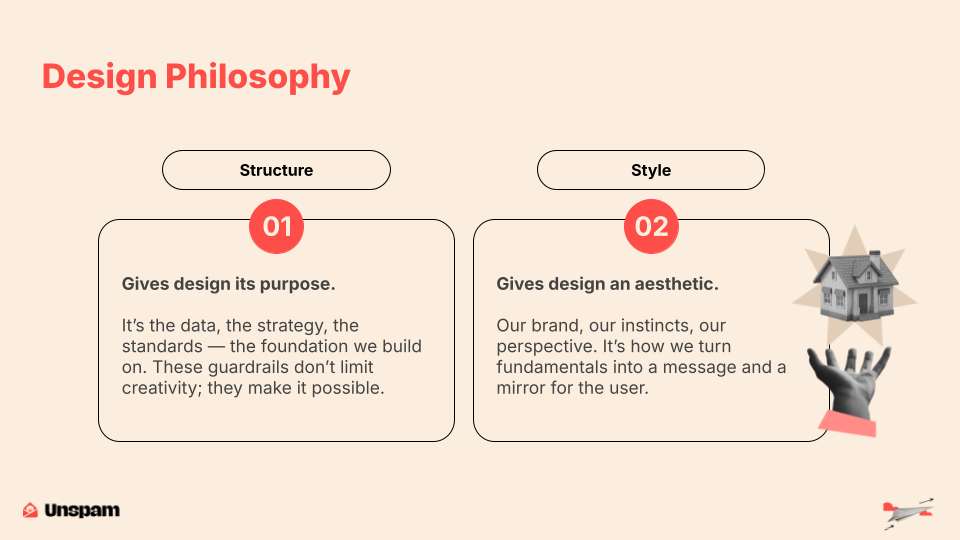
First, we've got structure. For me, this is what gives design purpose. It's the strategy, the data, and the users' behavior. So what are they doing? What would we like them to do? What do we want them to stop doing? It's our accessibility standards, our development constraints and capabilities, and tested modules and layouts—things that we know are working really well, so that we don't need to reinvent the wheel and use creative energy to work on those things.
But it's also those design principles that I spoke of, the elements, all of that stuff. These act as a really great foundation for the creative work that comes next for me. This gives me guardrails, and they don't limit my creativity, but they're what makes it possible. They actually give me more confidence to experiment and push ideas forward because I have this really strong framework underneath them. From there, we have style. Style is the aesthetic. It's the branding that we are typically given that we need to work within. It's my personal experience and how I've lived in this world. It's the education that I've received. It's all of those things that come together, and then it's how we take those brands and the things that they have created and how we put those two together. We shape this, you know, beautiful end piece, and sometimes it can be a portal that broadcasts messages out to people. Still, it is also a mirror that helps us to reflect who the people are, you know, that we're trying to attract.
When the style and structure align, we get a great design recipe. So, how do trends and good design play together? At their core, trends are just popular expressions of a human need, and those human needs can reflect themselves in many different ways. First, they can be a lot more than just visuals. Understanding the meaning behind trends is really important because this is how we understand what is being telegraphed to our audiences. Trends can reflect culture, but they can also push back on culture. So, we may see some examples today where some people sort of push back against AI-generated images, or really polished stock photography.
But at the same time, you can also see how designers are embracing trends that they see in headlines or even in fashion and stuff like that. And then lastly, you can use trends to enhance your brand identity. The best trends will always borrow from excellent design practices. Allowing yourself to take in a trend helps, and it gives you that opportunity to create an emotional connection with audiences, which is, you know, building an excellent brand. But at the same time, you can also see how designers are embracing trends that they see in headlines or even in fashion and things like that. And then lastly, you can use trends to enhance your brand identity. The best trends will always borrow from excellent design practices. Allowing yourself to take in a trend helps, and it gives you that opportunity to create an emotional connection with audiences, which is, you know, building an excellent brand.
I understand that, as a designer, it can be really tricky to take all of these trends and try to incorporate them into a particular brand. But again, I think it's about looking at what core pieces we really want to create. Most of the time, it is that emotional layer that we're trying to tap into. So let's look at the visuals that we can use to do that. It is time to get into these trends. I'm happy to present this year's categories for UNSPAM 2025.
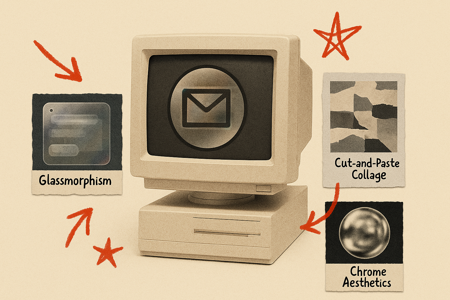
Imagine vivid colors and opaque backdrops so distant you need a pause before continuing. The trees are all gone. Only sheets of glass and acrylic remain, and the urge to leave a message is stronger than ever. This is your layer of protection, a blurred pane between you and the void, offering just enough clarity to bring focus. It says, here’s something important. Please don’t ignore the world around you. Don’t forget what came before it. Just see this for right now. The world is still out there, folks. This is glass, amorphism, and frosted layers.
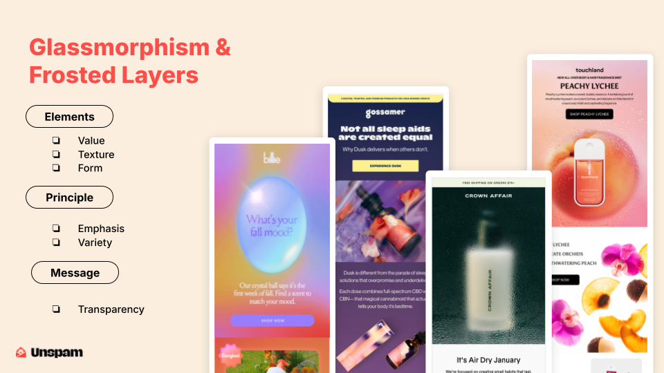
Yeah. This trend is a lot about depth and softness. One of the elements here that we see is value. And when I speak about value, I’m talking about how we use color hues, usually from light to dark. That’s where we see many of these background gradations, where we just see the play from light to dark. Texture is really coming in the form of the frosted layer that is present. It also creates form, which is like a 3D element. 3D elements can be created using 2D tools, but it's all about the illusion that we are playing with the eye.
There’s also emphasis, and emphasis can mean two different things here. Sometimes, when we lay things in front of the frosted layer, we are obviously bringing them to the forefront. We are emphasizing them. But I also think there’s something curiously interesting about putting them behind the glass, where they become intriguing and you want to know more about them. I think this is beyond just the visuals we see. It's really about transparency, and it's about choosing what we want to reveal and creating, you know, a sense of intimacy—like a peek behind the curtain. It's not always just about what we are hiding, but also about what we are choosing to show.
Trend number two. You said it was just a hobby. You even managed to convince everyone that more on top of more on top of more wasn't a bad thing. And you still remember exactly where you were when you heard the news. All Jo-Ann Fabric and craft stores were closing. Yes, all of them. But you didn't let that stop you. You found your way, one with fewer paper cuts and significantly less archival glue. Fellow makers, I give you maximalist cut-and-paste collages.
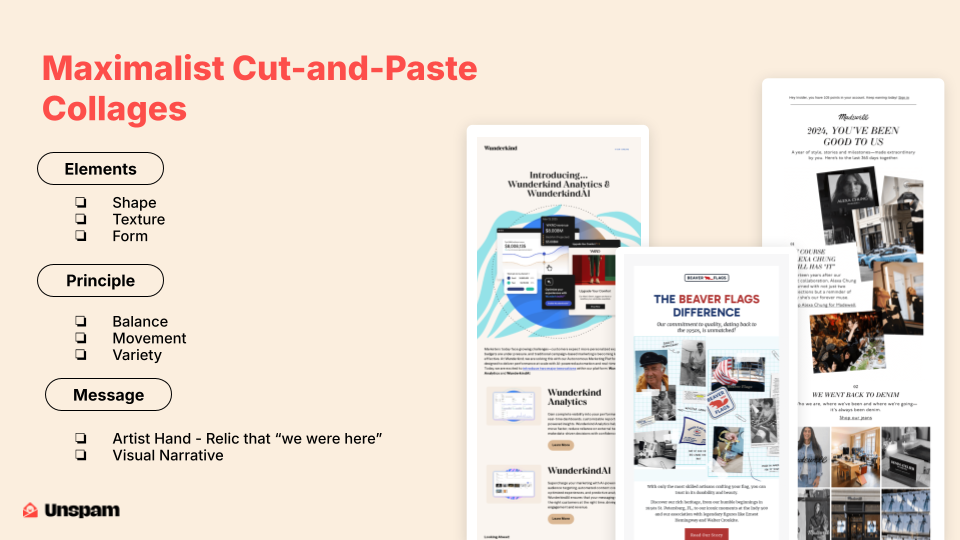
I feel like the trend here with collages is embracing shape. Whenever we start to cut out these images, we are really defining the space of the image. Shape becomes an essential factor here. We can also bring in texture because we start to layer those items. And anytime we're layering, we're also building forms, so 3D shapes and things like that.
There's something super refreshing about creating a layout like this, just with all the organic shapes. They break out of that usual format of an email. We don't just have a rectangular or square hero anymore. We've got something multidimensional, and it has this 3D, tactile feel to it. But like any good collage, there’s a method to the madness. It's all about balance. You can sit there and imagine for days how someone makes a very conscious decision about what goes where. There's also movement here. These slight tilts to the imagery just create flow. That sense of movement in a static space will always intrigue people.
I think what really stands out here is the personal feel. It feels handmade. It feels like someone made very conscious decisions—whether to actually cut these things out or just to create this arrangement on a screen. So I think it's whimsical, full of personality, and tells a story in a way that really cuts through many of the emails in our inboxes. I kind of feel like this is art in a way that we just rarely see.
Move on to trend number three. Oh, to be anywhere but planet Earth. You're not alone. I only have 30 minutes, guys. Lately, nothing feels particularly settled. Or maybe it's just the frustration of everything insisting on staying put. But what if we flipped it? What if nothing had to sit still for very long? Imagine a world of movement and mystery, where depth, dimension, and shifting perspectives are the norm. Because defying gravity is not just for witches in Green. Friends, I give you 3D floating elements.
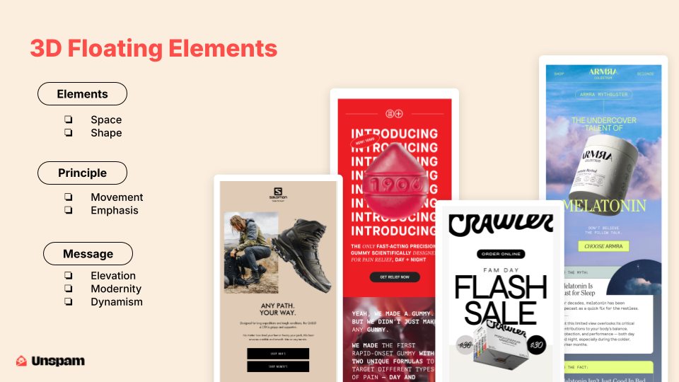
This trend is a lot about space and shape. Space means that we are really giving products a lot of space and suspending those things there, and then we have shape. I think that this style tends to work its way in when we have products that maybe have a unique shape. It's a really great way to highlight them by, of course, isolating them. But also, if you're making it float, then it really just adds this element of focus and elegance to it. I really think that these work well when the product is unique or maybe high-end or something like that.
It's just about saying that thing right here — it deserves my attention. And I think you do get a sense of movement. I mean, the gummy exercise is an animated G, but even with the other ones, you can see how these things could slip and fall at any moment, which is a bit exciting. The whole vibe, though, is about making products feel really special. This is a great technique if you want to elevate something, if a brand has something that is truly special and unique. I think this is an excellent way to follow that trend.
Four. Too busy to fumble for night vision goggles. Dreaming of a future where soft white and daylight aren’t your only lighting choices. No path has ever been lit this bright, with no direction. More vivid. Step with me into the glow—neon, hyper color, and everything in between. This is the journey into a world where light bends and color blends, and clarity lives somewhere in between. Follow me as we trip into the glow of neon and hyper-color gradients.
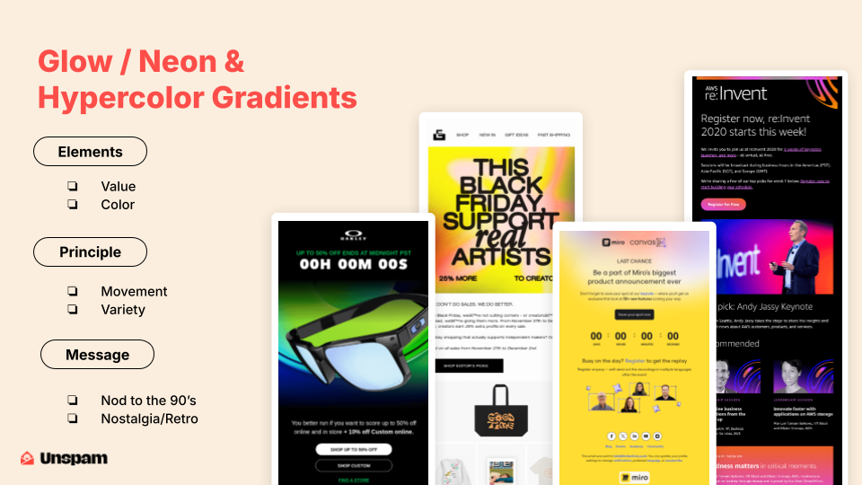
This trend is all about bold shifting gradients. We use gradients a lot in design, but we typically do subtle ones that may go from light blue to dark blue in some sort of progression. What is unique about these is that they use multiple different colors, often from different parts of the color wheel. What tends to happen when you do these particular types of things is that you get a glow. I think that’s what these are achieving well — this idea of glowing in the inbox, which is extremely rare. But it feels alive, and the color is doing something here.
Again, with gradients, we get movement. People’s eyes travel from one side to the other. It naturally pulls us, which is helpful — having great little wayfinders in email is always a good choice. It keeps attention and guides people where you want them to go. The variety of colors within the gradient is successful in this trend. It helps create something that isn’t flat — never dull, never boring. This trend is a throwback to the nineties retro-futuristic era. It’s super saturated and plays with a bit of nostalgia. If you grew up during that time, it feels like something new again. I think this is perfect for any brand that wants to stand out and bring some serious energy to their marketing mix.
Trend five. Tired of using every cone and rod in your eyes? Ready for a well-earned break from the crisp, shiny perfection your favorite AI generator spits out? Forget good quality — yuck. Give us grain. Give us grit. Give us 35-millimeter nostalgia. Contrast at its peak. Color, stripped to its essence. Distinguished guests, I present to you black and white ultra-minimalism.
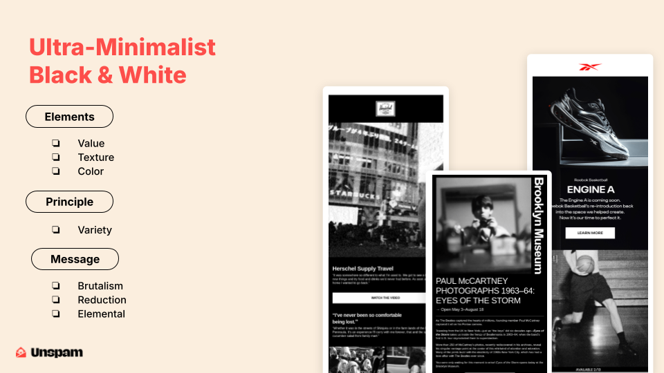
This trend leans into hard contrast. There are a lot of quick, guess-like movements from light to dark, so we've got our value in there. Textures come a lot from the grittiness of the images—again, that sort of contrast to what’s going on. And then there are colors—or maybe the lack thereof.
So, you know, this is a chromatic color scheme. It's rarer in the marketing landscape than you might think. I think this can sometimes be a risk, but it's also a great way to stand out in a crowd of colorful emails. There’s not a ton of variety in the types of images you're seeing here, but what you are seeing is extremely stripped back, really focused. Or like, you know, the way they cut into the basketball player at just the right moment. I think there's some excellent stuff happening here in terms of messaging. You know, there’s a hint of brutalism here. There’s reduction; there's, you know, stripping things back to their elements. It's definitely one of those "less is more" trends.
Trend number six: the company all-hands has you on the edge of your seat. Gripping topics like org chart updates and Q3 results, KPIs, and so on. The thrill never ends. Meanwhile, a rebellious thought appears somewhere between stock imagery and your eighth cup of coffee. What if I just drew a mustache on it?
A trend that adds humor, personality, and a delightful human touch. Plus, your teacher once said doodling wouldn’t get you anywhere. Ha. Turns out it gets you clicks. Welcome to 2025. Welcome to Doodles Over Images.
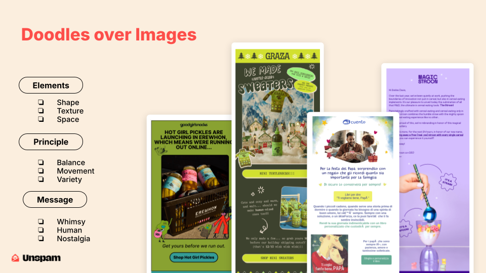
This trend is about bringing a lot more fun into the branding space. It shakes things up. There's a lot to be said here about shape. You know, those shapes can be—you can see the ovals being used. You can see the starbursts and the more organic shapes used by the illustrated characters. It introduces these new shapes into, you know, an otherwise pretty square and rectangular place.
Texture—you know, this is going to come in depending on the type of illustration being used. There could be brush strokes and many different ways you achieve this, but typically there's always going to be a new texture added. Space doodles are great at filling up some of the awkward or white space created by these layouts. And so I think that, especially with Magic Spoon, in that bottom section, you can see there’s just a lot of white space. Sometimes that can become dead space, but they’re taking the opportunity to fill it in with some brilliant things. And they’re doing that very texturally, which I think is engaging. So the principles—there is balance. You can see each of these has brilliant placement, and they’re sort of dotted around to keep users engaged. There’s movement here, so you can see how each of the illustrations falls down the page. You can really see how they move as they fall.
And then variety—I mean, variety happens because there is imagery, and it's paired with something illustrative. I think that variety is highly engaging to many people.
Message-wise, we’re going to get whimsy. We’re going to get humor. But overall, it’s fun. It’s personal. It’s full of charm. It’s a reminder that real people are at the other end of these brands. I think that’s something many people get excited about. But it also shows that maybe you’re a bit of a risk-taker and not afraid to scribble outside the lines. And so, yeah. Trend number seven. Can someone please just tell me where to go, where not to be, and what lines not to cross—but do it smoothly? You know, like a cat eyeing a box in a house full of deliveries—like perfect frames for a narrow-faced email. These outlines shape our stories. They gently guide our eyes, defining images and modules with just enough warmth.
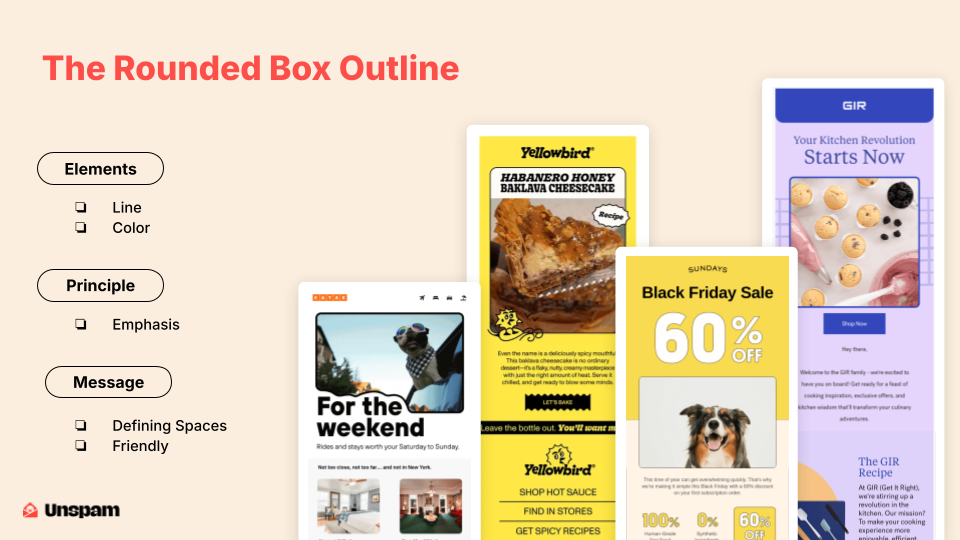
I give you the rounded box outline—like a cozy blanket wrapped around the content. This trend is all about using lines. At its core, it's simply a line. Then there's the element of color. While not many examples show it here, sometimes, when you're working with stock imagery or reusing existing images, you can enhance them with a color outline. I truly believe this is a way to make your mark. You can say, “These are our images, and this is how we present them.” The main idea here is emphasis. Whenever you wrap a line around something, you’re drawing attention to it. These outlines help guide the viewer’s eye to specific content.
They provide a clear sense of purpose without being loud. That kayak version with the bite taken out of it is really nice—clever and visually satisfying. We have a star here—great work. It's a smart, elegant way to bring different pieces together.
Overall, the vibe is clean, warm, and inviting—like a visual hug. Rounded edges play a key role. If you're working with industries like wellness, hospitality, or food, anything that benefits from a softer touch, rounded edges are especially effective. They project warmth more clearly than right angles.
Now, trend eight. Please tell me what I’ve been doing for the past year, with stalker-like precision and maybe a hint of emotional blackmail. You’ve been collecting all this data on me. Could you at least organize it in a visually appealing way? Maybe even tell me who I am, at my core? Give me a cute little category to spiral about. Or at the very least, tell me what you’ve been up to. How’s business? What are your trends? My friends, I present to you: the year in review.
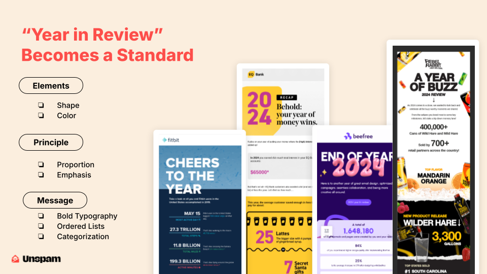
Here, we’re stepping away from a purely visual trend. This is more of a campaign trend. Still, some elements are consistent across these types of emails. They tend to feature bold shapes and even bolder type. Typography shines in these designs, as you can see in the examples. Large, colorful letterforms immediately make these designs feel unique and lively. It’s also a smart way to differentiate these from your usual emails, which probably lead with an image. This type of email lets you showcase parts of your brand you might not typically use. Many brands have secondary color palettes that rarely get used. These emails are a great opportunity to bring them in, especially when breaking out multiple categories. It’s a chance to embrace a trend or experiment with underused brand elements, because these are meant to stand out.
Proportion is key here. Big numbers take center stage, while explanations are kept minimal. It’s all about balance: large figures, short text, clear emphasis. This naturally brings in typographic hierarchy and strong messaging. Bold type says you have something to say. Ordered lists work especially well—they offer clarity, make the content easy to digest, and suggest a confident, directional tone. You’re guiding the reader toward a point of view. So they do well. And then, of course, categorization is really common in these two. I think categories are another way to define your expertise as a brand. It shows that you know how to edit content and group it in a way that makes sense for many of your users.
Trend number nine simply reflects life as a shopper in late-stage capitalism—unrewarded and overwhelmed. Instead of genuine value, we’re hit with point systems that feel like they require a made-up PhD to understand, along with a quiet panic over whether your points are expiring at that very moment. Do you enjoy being told how special you are by a brand, only to be handed a secret code of point tiers to decode? Are you anxiously awaiting the magical day you finally reach gold status? Is your key ring begging for one of those tiny plastic badges of honor to prove your consumer loyalty? This is the Loyalty Program Emo trend.
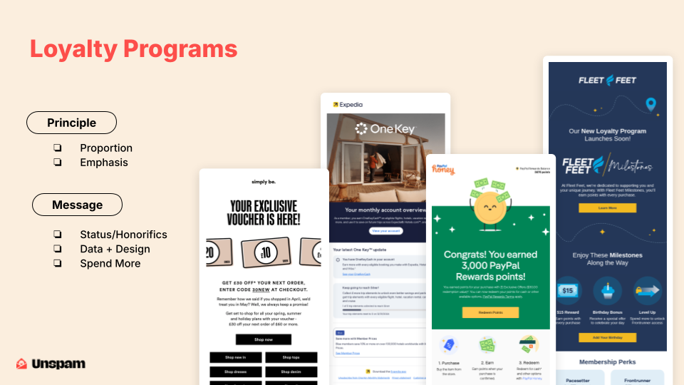
It’s more about a style of email communication, but we’re seeing a lot of similar patterns: proportion and emphasis, giving lots of space to that top section, and clearly telling people where they stand and what their value is. The goal is to get people excited about moving forward, ideally spending more money. Layouts are usually very clean, with a clear structure that highlights the value upfront. The tone isn’t just about perks; it’s about elevating your status. We’re seeing progress bars, honorifics like Gold Member and Elite, and similar elements. It’s all about making people feel like part of something exclusive. It can be a compelling blend of data and design, encouraging users to level up and become someone more.
Trend number ten. The holidays are spread far apart, and frankly, we’ll take any excuse to celebrate. So let’s broaden our festive horizons and embrace the unconventional. To my knowledge, there’s no law against creating a holiday with your team, especially if it helps sell a product or strengthen your brand. Your email marketing could use some levity. These campaigns give you a chance to show off your brand’s lighter side—infusing personality, humor, and a celebratory spirit into your strategy. Friends and family, I present non-traditional holiday campaigns.
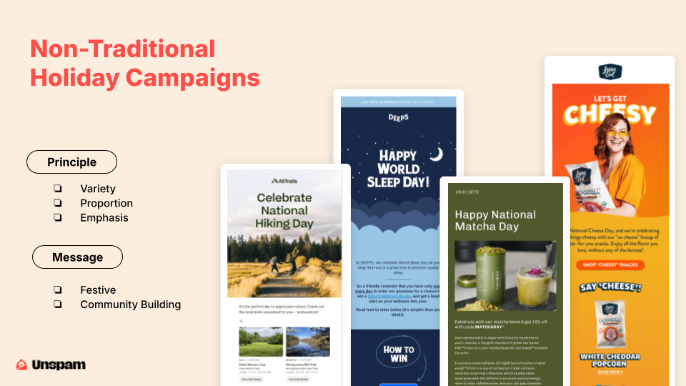
There’s no single design trick here. What makes these emails stand out is how well they execute the basics. Clean layouts, smart spacing, and visual clarity come together for a solid impact. Like most holidays, color does much of the heavy lifting. If you’re going to create a non-traditional holiday, you need a signature color. These campaigns demonstrate how color associations become shorthand for celebration and mood, doing an excellent job at reinforcing their themes.
There are plenty of festive visuals, like someone with a bag of cheese puffs or people thrilled about National Hiking Day. These campaigns dig deep to find reasons to celebrate, rallying people around invented but relatable moments. More than anything, these emails are about community and connection. They make recipients feel like they’re part of a group with shared interests. It’s refreshing that they don’t just feel like another promotion. Sure, they might help sell chips, but that doesn’t seem like the core purpose. These are creative and would make a strong addition to anyone’s marketing mix.
Trend number eleven brings high-gloss finishes, metallic gradients, and futuristic vibes directly to your inbox. It’s part sci-fi, part TRL-era nostalgia, and entirely focused on grabbing attention. Picture Missy Elliot visuals meets Blade Runner sleekness. Bold, shining, dramatic—this trend is not here to whisper. It’s here to glow. Brands are using it to transform emails into full-on art moments that stop the scroll. Rebels, welcome to liquid metal and chrome aesthetics.
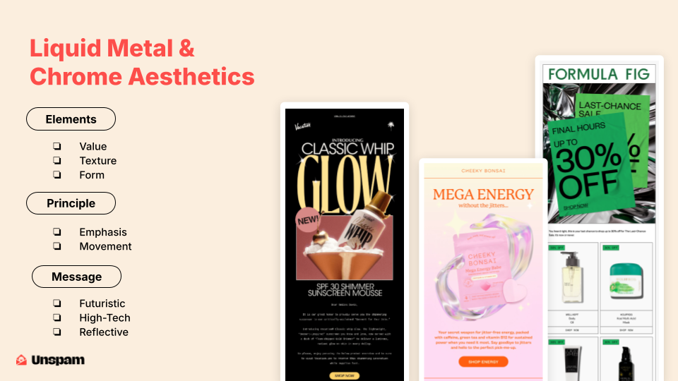
The metallic trend is undeniably cool. It has a magical quality, shifting and shimmering like it’s alive. It’s incredibly sleek. At times, it might feel too polished for the email format, but that’s what makes it so interesting. It creates a strange, frozen-in-time sensation—like catching a glimpse of something just before it changes. So I think it's almost hypnotic in a way. Design-wise, reflective surfaces always grab your attention, whether they're highlighting text or wrapping around a product. They create a moment of pause: stare, wait, see what's happening. The overall tone here feels futuristic, but also refined. It brings shiny, high-energy tech vibes. It's spotless and highly presentational, which makes it great for showcasing products in a positive light.
Trend twelve: In a world full of loud, high-energy visuals, a quieter design trend is emerging. It's a calm shift that replaces bold contrast with pastel colors, rounded edges, and emotionally resonant photography. This isn’t just an aesthetic choice. It’s a response to overstimulation and digital fatigue. Brands are leaning into a more human touch to build trust, connection, and ease. Think fewer flash sales and more safe spaces. Let’s explore how gentle visual language is helping emails feel more authentic—and why that’s resonating right now. Welcome to the era of Comfort-Driven Design.

A big part of this is color—it does a lot of the heavy lifting and sets the mood immediately. It's also interesting to see companies like Google and the New York Times embracing softer palettes, which is somewhat uncommon for their industries. But it's not just about color. Rounded edges, serif and script fonts, and smooth transitions between sections all work together to create something calming. They're thinking beyond just the hero image or color scheme—they’re considering the entire email experience.
The flow is smooth. Each section glides into the next, and everything feels connected. But it's more than just visual cohesion. This trend speaks to what people are craving: honesty, warmth, and a human touch. It moves away from the bold, edgy styles we’ve seen and favors a more relaxing, emotionally aware approach. These examples land that idea well.
Trend thirteen is a surrealist design wave that’s flooding inboxes with warped typography, fluid gradients, and dreamlike visuals. Imagine colors from another dimension, layouts like melted lava lamps, and a vibe that feels more like a trippy art show than a marketing email—psychedelic, but reimagined for the digital age. This aesthetic is bold, hypnotic, and impossible to ignore. It’s more than design—it’s an experience. Let’s dive into the chaos and explore why bending reality might be just what your email strategy needs.
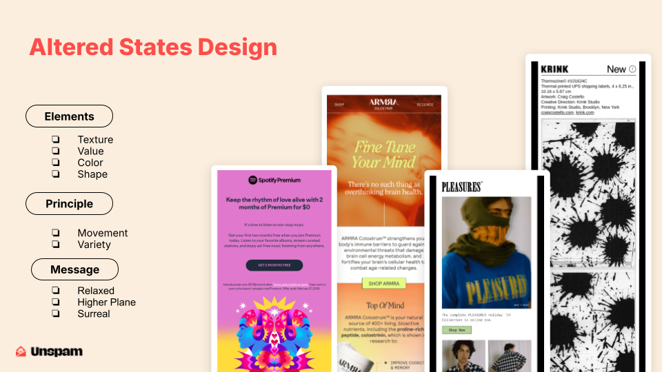
These designs focus heavily on texture and color. You'll see blurs, grain, and a soft application of noise that all contribute to a dreamlike statement. The colors can go in two directions: either hyper-bright and surreal or earthy and warm. This versatility lets the trend push and break traditional boundaries. Movement also plays a big role. Gradients and blurs suggest motion, guiding the user’s eye through the design. There’s even a clever use of texture—like visible paper grain—that creates a tactile illusion on mobile, making it feel like you’re touching the design.
The tone is chill but intriguing. It hints at a higher plane or a surreal mindset meant to inspire or impress. There’s a strange aspirational quality to it—like it’s trying to reach another level. Trend fourteen, running on a 12% battery. Avoiding small talk in the takeout line. Or maybe it’s 2:00 AM, the lights are too bright, and you're deep in a scroll spiral. Whatever the reason, sometimes the dark side just feels better. And it doesn’t have to be evil—it can be sleek, even elegant. Let’s dim the lights and explore email designs embracing dark mode.
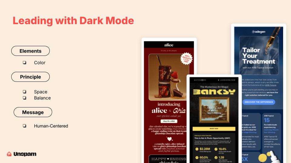
The focus here is on color, specifically rich, deep palettes. Think charcoals and navies, punctuated by bold pops of crimson, yellow, or electric blue. It’s all about balancing light within darkness. A fully dark design can feel too heavy, but when done right, these layouts can hold more content and fill the space without feeling overwhelming. That’s what makes them unique. They feel content-rich but not cluttered. Using a dark background allows for more density while maintaining clarity. Overall, the vibe is confident and polished. It respects user preferences—more than 40% of people now use dark mode. Designing with that in mind shows a thoughtful, forward-thinking approach.
These layouts also have a certain elegance. If your brand is leaning toward a more elevated aesthetic, this is a strong direction. As we’ve seen, trends come and go. But great email design always lives at the intersection of structure and style. Structure provides clarity and consistency, giving us the confidence to be more creative. Style brings in your brand’s voice—what makes it unique—and helps you connect emotionally with your audience.
We shouldn't just follow trends blindly. We should translate them, then figure out how to incorporate them in a way that fits our brand. Hopefully, these trends sparked some ideas you can take back to your teams. I know not everyone here is a designer, but maybe this helps you have better conversations with the people who are, or advocate for ideas you believe in.
Consider this your permission to play. Go make something great. Maybe one day I’ll be up here showing your work. That’s it. Thank you.