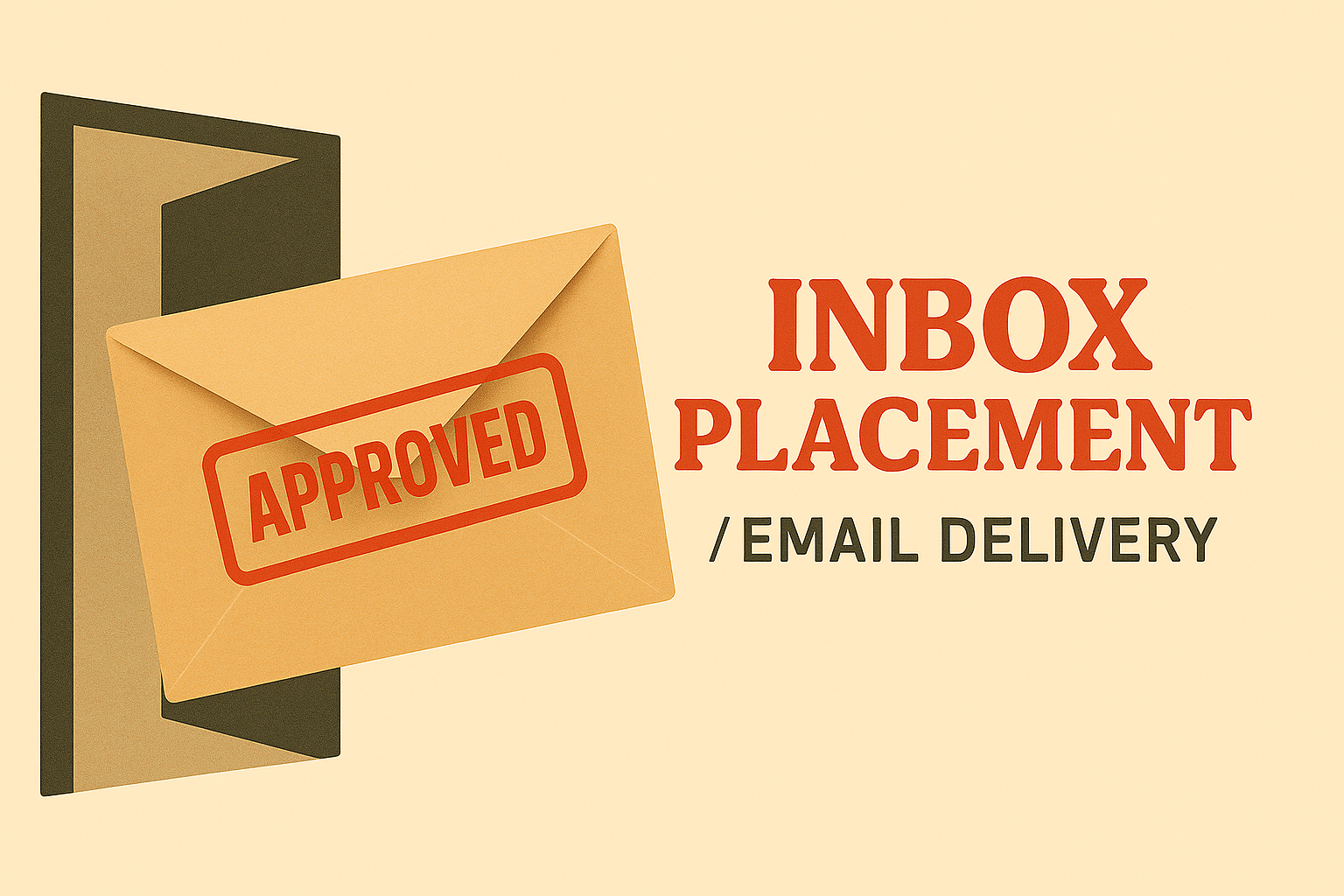
Your SPF and DKIM are airtight. Your list is opt-in. So what else can you do to help hit the inbox that first time?
Turns out, inboxes have bouncers at the door like Berlin's Berghain, quietly turning you away based on how you look.
Even if your setup is pristine and your recipients opted in with eyes wide open, design choices can tip your message from the inbox into the spam box. This isn’t a guide for shady senders trying to game the system. It’s for marketers who’ve done the hard work and still get filtered out because they may be under- or overdressed for the email party.
When everything else is optimized, design becomes your silent hero—or your inbox saboteur.
That’s where the Visual Triage Model comes in: a framework we've been working on for understanding how email design subtly influences those first emails in the inbox. Based on new research from Folderly (which analyzed 10,000+ campaigns for this article), we’ve mapped the visual traits that separate trusted messages from ones that raise red flags.
The backstory
While at Unspam this year, Mike (RGE’s Co-founder) raised a question:
"Does design impact a sender's reputation, or is it just the text and setup that an inbox cares about?" We had the data. So we went digging.
Why design matters for deliverability (Beyond Tech setup)
Yes, SPF, DKIM, and a clean list matter. Let that be the absolute starting point. But here’s what often gets overlooked: Gmail, Outlook, and friends don't just check headers, they evaluate the whole email. They’re using behavioral filters and machine-learning systems trained on millions of user interactions. Design plays a huge role in that judgment.
For example, in Folderly’s study:
- Emails with clean HTML structure and no orphaned tags had a 42% higher inbox rate than those with messy code.
- Messages using 1–2 web-safe fonts (like Arial or Verdana) outperformed stylized fonts by 27% in inbox visibility.
- Layouts that mimicked conversational email (single column, minimal branding) performed best in Gmail’s Primary tab.
Google’s own sender guidelines confirm that formatting (especially image-to-text balance and promotional structure) can affect tab placement in Gmail.
Postmark and Mailgun echo this, pointing out that image weight, button-to-text ratios, and layout complexity are all used as quality heuristics, especially when you’re still establishing trust.
What we did with that research
We paired Folderly’s campaign-level data with audits across hundreds of Really Good Emails examples to spot what reliably works and what consistently hurts your chances.
What emerged is a set of visual signals that inbox providers are picking up on, whether you realize it or not. Enter the Visual Triage Model.
The visual Triage Model: inbox, promotions, or spam
Think of inbox placement like a security checkpoint:
- Clear design gets waved through.
- Promotional layouts get a bag check.
- Spammy stuff goes straight to holding.
INBOX: clean, structured, human
Traits that whisper, "this is someone you know":
- Text-forward with web-safe fonts (Arial, Verdana, Tahoma)
- Max 1–2 fonts, no web or display fonts
- Clean HTML with semantic structure, no broken tags
- No flashy headers, GIFs, or oversized logos
- Real “From” names (not noreply@)
- One CTA with minimal formatting
- Plaintext version included
Design TL;DR: Look like a human who understands that this is probably the first time they are seeing your message.
PROMOTIONS: polished, branded, clearly marketing
These aren't bad emails, but they often end up in one folder down from where you want to be.
Traits that say, “this is legit, but also trying to sell me something”:
- Balanced visuals (~35% image / 65% text ratio)
- Branded headers, but not overwhelming
- Multiple CTAs or product showcases
- Centered text
- Mobile-friendly layout (600–800px)
- Clean two-column structure
- Some recipient reason (e.g., “you recently viewed”)
Design TL;DR: Good vibes. Branded vibes. But probably a promo.
SPAM: Deceptive, Cluttered, or Sloppy
Traits that make inbox filters (and users) hit the 🚫:
- ALL CAPS, excessive punctuation, red CTAs
- Too many emojis, GIFs, or blinking elements
- Image-only layouts with no alt text
- Font size < 12px or weird spacing
- Link shorteners (bit.ly) or redirect chains
- Image files over 100KB
- Large attachments or missing plaintext
- Weird background colors
Design TL;DR: Trying too hard and saying too little.
Real talk: what about image-heavy welcome emails?
You’ve seen them on Really Good Emails. You’ve probably sent them. And they’re gorgeous. So why do welcome emails get a pass? Because they’re:
- Sent to opt-ins
- Expected and timely
- From reputable, warmed-up senders
In these cases, inbox placement is helped by trust, aggregated behavior, and timing. If your brand is known, and your infrastructure’s strong, you can go heavier on the visuals. But if you’re new to someone’s inbox, simplicity is still your safest bet.
Deliverability isn’t just design
Design is the handshake but it’s not the whole relationship. You could have the most elegant email in the world (meticulously styled, perfectly branded), but if your backend’s not in shape, it won’t matter. Inbox placement is a team effort.
Filters triangulate across:
- Technical setup (SPF, DKIM, DMARC)
- Reputation and engagement (open/click rates)
- Sending patterns (volume, frequency)
- List hygiene (opt-in, bounce history)
Design is what they see, but they're also asking:
- How often are you talking to people?
- Do they care about what you’re saying?
- Do your tech signals back up your identity?
No one element works in isolation. Design isn’t a silver bullet—it’s the polish that only works when everything else is aligned.
Triage design when you’ve done everything else right
Back to our club analogy: If SPF is your ticket, design is your outfit. Show up dressed like a trusted friend and you’ll probably get waved through. Show up shouting in neon Comic Sans with a flashing “BUY NOW” badge and you’re not getting past the velvet rope. Design doesn’t just dress your content. It shapes your reputation. Treat it like inbox insurance—because looking trustworthy is the first step to being trusted.